Notice: This material is excerpted from Special Edition Using HTML, 2nd Edition, ISBN: 0-7897-0758-6. This material has not yet been through the final proof reading stage that it will pass through before being published in printed form. Some errors may exist here that will be corrected before the book is published. This material is provided "as is" without any warranty of any kind.
by Mark Brown
The hardest part of learning to swim is overcoming your fears and getting into the pool. That's what this chapter is for. If you're contemplating putting up your own personal or corporate Web site but aren't quite sure where to begin, in this chapter you find HTML templates for each type so that you can get into the pool.
Before you start, though, you might want to refer to chapter 3, "Distributing Information with HTML," where you learn what should go on Web pages, and how and why. After you get your feet wet, then come back and dive right in.
You don't jump off into the deep end, though. In this chapter, you don't get in over your head. You learn how to put together some simple but attractive Web pages that you can easily modify and build up to create custom personal and professional Web pages to meet a variety of needs. You don't get into advanced HTML coding, CGI-bin programming, or anything like that.
After you've mastered the basic strokes, you might want to move on to
chapters 21, "Forms and How They Work,"
and 22, "Form Layout and Design," which
go in-depth into the design and development of two advanced ![]() Web
sites with multiple pages and lots of elements. That's the place where
you begin training for the Olympics.
Web
sites with multiple pages and lots of elements. That's the place where
you begin training for the Olympics.
In this chapter, you discover the following:
To make the process of creating personal Web pages easy, follow along with a newbie Web developer who is going through the process of putting up his first Web page. He may know more than you do; he may know less. That doesn't matter, because the steps are the same no matter what your level of expertise.
Out there among you is a guy named Fred who's been reading this book at about the same pace you have, and who is starting to think he might know just about enough to put his own home page on the Web.
He has read and re-read chapter 3 and has a pretty good idea of what kinds of information are appropriate (and inappropriate) for Web sites. He's been thinking about what subject he might focus on, because he remembers that the number one rule for creating an appealing Web site is to focus the topic.
Fred likes ![]() golf
more than about anything else in the world, but thousands of Web sites
cover the topic of
golf
more than about anything else in the world, but thousands of Web sites
cover the topic of ![]() golf.
Besides, "golf" just isn't focused enough. Putting up a
golf.
Besides, "golf" just isn't focused enough. Putting up a ![]() golf
page would be almost as bad as putting up a page for "sports"
in general.
golf
page would be almost as bad as putting up a page for "sports"
in general.
The most important corollary to the principle of focusing your topic is to pick a focal point about which you know something extra. That way, you can present new, fresh information that isn't just a rehash of what's already on the Web. Because if it's already there somewhere, why put up the information again? On the Web, all you have to do is provide a link to the other sites, and you're done. You don't have to re-create the same information.
After carefully considering his options, Fred has decided to build a
![]() Web
site devoted to the subject of "
Web
site devoted to the subject of "![]() Making
Your Own Golf Clubs."
Making
Your Own Golf Clubs."
Fred started making his own clubs because he's a good player, and he thought he could get a little better if he had some really top-of-the-line clubs. Problem is, they cost a fortune. Not only that, but Fred is a bit on the diminutive side-and left-handed, to boot-so finding clubs that fit him is a problem. So he lined up some suppliers, bought a couple of tools, made a few mistakes, and eventually put together an excellent set of custom clubs for himself at a fraction of the cost of a top-quality name-brand pro set.
After Fred started playing his own custom clubs, other players began to admire them, and he started making a few for other people on the side. At first, he did this for only a few friends, but his hobby soon expanded into a garage business that is now making him a couple hundred bucks every month.
Fred knows a lot about the topic and thinks that sharing what he knows might be fun. He believes that people would show an interest because he's already found a lot of interest among his friends and acquaintances. He's searched Yahoo!, Webcrawler, and Lycos and couldn't find a thing about making golf clubs, so he knows that his site will be unique.
Fred's not concerned about drumming up business-word of mouth is giving him all the business he wants. He just wants some fame and glory and perhaps a thank you note in his e-mail box once in a while.
![]() Fred's
first impulse is to gather together a bunch of cool
Fred's
first impulse is to gather together a bunch of cool ![]() golf-related
graphics and start creating his page. He's about to dive in when he remembers
that the second step is not to create but to plan. So he sits down with
pencil and paper and thinks about what he might want to put on-line.
golf-related
graphics and start creating his page. He's about to dive in when he remembers
that the second step is not to create but to plan. So he sits down with
pencil and paper and thinks about what he might want to put on-line.
After a few false starts, some whittling down, and some inspirational additions, Fred finally comes up with the following list of things he definitely wants on his Web site:
The ![]() video
is a real inspiration. His friend Sheila runs the multimedia lab at the
local university, and a quick call to her confirms that she can get studio
time to videotape the whole golf club creation process and digitize it
into an .avi file that can be uploaded to his site. She thinks the project
is interesting, and is looking forward to doing it. Problem is, her schedule
is full, and she can't do anything until next month. Rather than let Sheila's
schedule be a setback and just omit the video, Fred decides to make a "Coming
Soon!" tag to let people know that it's on the way. That will keep
them coming back.
video
is a real inspiration. His friend Sheila runs the multimedia lab at the
local university, and a quick call to her confirms that she can get studio
time to videotape the whole golf club creation process and digitize it
into an .avi file that can be uploaded to his site. She thinks the project
is interesting, and is looking forward to doing it. Problem is, her schedule
is full, and she can't do anything until next month. Rather than let Sheila's
schedule be a setback and just omit the video, Fred decides to make a "Coming
Soon!" tag to let people know that it's on the way. That will keep
them coming back.
Fred has a lot of excellent information on his list, and every element is relevant to his focus topic. This, he thinks, is going to be a great Web site!
Fred knows that he needs to organize first, so he decides to just jump right in and create his home page. He figures it's just as easy to outline right on the HTML page as it is to come up with some artificial outline first and then try to figure out how to "HTML-ize" it. And he's right.
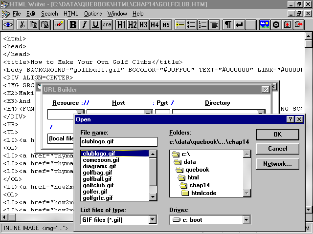
He knows he can use any word processor or text editor to create an HTML document, but he's checked out the CD-ROM in the back of this book and has been playing around with HTML Writer, so he thinks he'll use it instead. Fred thinks that HTML Writer might help him remember and keep track of what all those HTML tags are for. He's right again. (See fig. 14.1.)
![]() HTML
Writer is an excellent
HTML
Writer is an excellent ![]() HTML
editor that can provide a level of comfort and support during the
HTML
editor that can provide a level of comfort and support during the ![]() Web
page-creation process.
Web
page-creation process.
Fred begins by laying out a ![]() generic
minimum HTML document, using chapters 4, "Building
Blocks of HTML," and 5, "The TITLE, HEAD,
and HTML Tags," as a guide:
generic
minimum HTML document, using chapters 4, "Building
Blocks of HTML," and 5, "The TITLE, HEAD,
and HTML Tags," as a guide:
<HTML>
<HEAD>
<TITLE></TITLE>
</HEAD>
<BODY>
</BODY>
</HTML>
He knows that every HTML document needs to be surrounded by <HTML></HTML> containers, and it must have a HEAD section, a TITLE section inside the HEAD, and a BODY section, in that order.
Fred decides that he wants a title and a subtitle for sure, so he adds two generic lines:
<H1>Title</H1>
<H2>Subtitle</H2>
He knows that what he puts between the <TITLE></TITLE>
tags is actually just the name that will appear in the browser's window
border. His Title and ![]() Subtitle
lines are in the big H1 and H2 heading styles, so they'll be really visible.
Subtitle
lines are in the big H1 and H2 heading styles, so they'll be really visible.
Fred knows that the polite practice is to tell viewers when a page was
last updated and to provide an easy means for them to e-mail comments.
So, Fred adds three more lines of ![]() HTML
at the end of the document, just before the closing </BODY></HTML>
tags:
HTML
at the end of the document, just before the closing </BODY></HTML>
tags:
<HR>
Last Updated DATE.<br>
Please address all questions or comments to ADDRESS
The <HR> adds a horizontal rule to set off these lines from the rest of the page. Fred can't quite remember how to make the last line a link to e-mail him automatically when someone clicks it, so he just puts in the word ADDRESS for now.
Fred thinks a bit about how he wants to organize his information and decides that he wants to keep his home page small (no more than two display screens tall), with links that will jump to other pages with the actual information. (Good for him!) So he makes a list of links that are enticing titles for his subject matter. He decides to put them in a list, like this:
<UL>
<LI>Menu
</UL>
The <UL></UL> container makes this list "unordered," or bulleted. Each menu item will have its own <LI> line when he is through.
Fred then checks the list he made on paper before starting and remembers that he wants to have some links to other golf-related Web sites. Because his list of links is bigger than he wants to include on his home page, he decides to give the list its own page, too. On his home page, he can just link to the list with this line near the bottom of the page, above the bottom horizontal rule:
<STRONG>CLICK <A HREF="">HERE</A> FOR A LIST OF LINKS!</STRONG>
He doesn't have a URL for his links page yet, so he leaves the HREF="" part empty.
This is what Fred's home page looks like so far:
<HTML>
<HEAD>
<TITLE></TITLE>
</HEAD>
<BODY>
<H1>Title</H1>
<H2>Subtitle</H2>
<HR>
<UL>
<LI>Menu
</UL>
<STRONG>CLICK <A HREF="">HERE</A> FOR A LIST OF LINKS!</STRONG>
<HR>
Last Updated DATE.<br>
Please address all questions or comments to ADDRESS
</body>
</html>
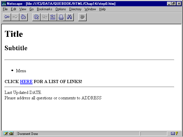
Fred saves his work and clicks the big ![]() eyeball
icon on the
eyeball
icon on the ![]() HTML
Writer screen, which previews his work in Netscape, as shown in figure
14.2.
HTML
Writer screen, which previews his work in Netscape, as shown in figure
14.2.
![]() Fred's
bare-bones Web page is previewed in
Fred's
bare-bones Web page is previewed in ![]() Netscape
Navigator 2.0.
Netscape
Navigator 2.0.
Fred's pretty pumped about the fact that his first effort has actually resulted in something being displayed in Netscape. Maybe this HTML stuff isn't so tough after all!
Now he buckles down. First, he fleshes out the top of the page. Because the top is what people will see first, it's got to draw them in.
<HEAD>
<TITLE>How to Make Your Own Golf Clubs</TITLE>
</HEAD>
<BODY>
<H1>[How To Make Your Own Golf Clubs]</H1>
<H2>Making Your Own Clubs is Fun</H2>
<H3>And Profitable Too!</H3>
<H4>*COMING SOON!* Online Video Instructions! *COMING SOON!*</H4>
<HR>
Fred makes the ![]() window
TITLE "How to Make Your Own Golf Clubs" to match the H1 header.
As he's typing in the H1 header, though, he realizes that he doesn't really
want a header. He wants a graphic logo. It's the first item on his list,
and he forgot it! Oh, well. For now, he types [How To Make Your Own Golf
Clubs] in as an H1 header. He surrounds the text with brackets []
to remind himself that this title is just a placeholder for a graphic he
has yet to create.
window
TITLE "How to Make Your Own Golf Clubs" to match the H1 header.
As he's typing in the H1 header, though, he realizes that he doesn't really
want a header. He wants a graphic logo. It's the first item on his list,
and he forgot it! Oh, well. For now, he types [How To Make Your Own Golf
Clubs] in as an H1 header. He surrounds the text with brackets []
to remind himself that this title is just a placeholder for a graphic he
has yet to create.
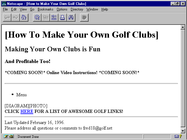
He rounds out the header information with H2 and H3 headers that proclaim how fun and profitable making golf clubs can be, and he finishes up with an H4 header with the announcement about the video, surrounded by *COMING SOON* notes. He adds a horizontal rule to separate the header information from the rest of his home page.
Having learned from the title graphic fiasco, he checks his list to see whether he wants to add any other graphics, and sees that his site will contain both diagrams and photos. Though he knows now that they will appear on separate pages, he decides that a small graphic for each of them should go on his home page with a link to the pages that actually contain the images. So he adds this line, just to remind himself later that he has to make some "icon" graphics:
[DIAGRAM][PHOTO]<BR>
He finishes off by adding the date to his update line and his e-mail address in place of ADDRESS (though he still hasn't figured out how to link it). Here's Fred's home page so far:
<HTML>
<HEAD>
<TITLE>How to Make Your Own Golf Clubs</TITLE>
</HEAD>
<BODY>
<H1>[How To Make Your Own Golf Clubs]</H1>
<H2>Making Your Own Clubs is Fun</H2>
<H3>And Profitable Too!</H3>
<H4>*COMING SOON!* Online Video Instructions! *COMING SOON!*</H4>
<HR>
<UL>
<LI>Menu
</UL>
[DIAGRAM][PHOTO]<BR>
<STRONG>CLICK <a href="golflink.htm">HERE</a>
FOR A LIST OF AWESOME GOLF LINKS!</STRONG>
<HR>
Last Updated February 16, 1996.
Please address all questions or comments to fred18@golf.net
</BODY>
</HTML>
Figure 14.3 shows what Fred's page looks like now.
Fred's home page is coming along fine. Though still pretty generic, it has most of the elements in place.
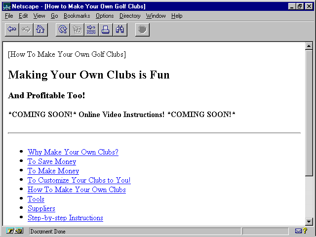
Though things are progressing nicely, the time has come for Fred to make a few decisions. He decides he's definitely going to have three documents besides his home page: one for the Why arguments, one for the How instructions, and one for his list of links. He decides to name them why2make.htm, how2make.htm, and golflink.htm. Now he can go ahead and create his menu list.
First, Fred makes a list of menu items:
<UL>
<LI>Why Make Your Own Clubs?
<LI>To Save Money
<LI>To Make Money
<LI>To Customize Your Clubs to You!
<LI>How To Make Your Own Clubs
<LI>Tools
<LI>Suppliers
<LI>Step-by-step Instructions
</UL>
Each of these lines is a link, so Fred adds an <A></A> anchor container to each line, with the URL of the appropriate page:
<UL>
<LI><A HREF="why2make.htm">Why Make Your Own Clubs?</A>
<LI><A HREF="why2make.htm">To Save Money</A>
<LI><A HREF="why2make.htm">To Make Money</A>
<LI><A HREF="why2make.htm">To Customize Your Clubs to You!</A>
<LI><A HREF="how2make.htm">How To Make Your Own Clubs</A>
<LI><A HREF="how2make.htm">Tools</A>
<LI><A HREF="how2make.htm">Suppliers</A>
<LI><A HREF="how2make.htm">Step-by-step Instructions</A>
</UL>
The list is good, but Fred thinks that something just doesn't feel right
about it. He thinks for a minute and then realizes that all eight of his
links go to just two destinations. That doesn't seem very helpful. A little
page-turning through this book reveals that a link can lead not only to
a whole ![]() Web
page, but to a particular spot on that page. So, Fred decides that only
one link each should go to the tops of the two pages, and he adds the syntax
for jumping to a named anchor for each of the rest. Because he doesn't
know the names yet, he just puts in the octothorpe (#) so that
he knows to add the names later:
Web
page, but to a particular spot on that page. So, Fred decides that only
one link each should go to the tops of the two pages, and he adds the syntax
for jumping to a named anchor for each of the rest. Because he doesn't
know the names yet, he just puts in the octothorpe (#) so that
he knows to add the names later:
<UL>
<LI><A HREF="why2make.htm">Why Make Your Own Clubs?</A>
<LI><A HREF="why2make.htm#">To Save Money</A>
<LI><A HREF="why2make.htm#">To Make Money</A>
<LI><A HREF="why2make.htm#">To Customize Your Clubs to You!</A>
<LI><A HREF="how2make.htm">How To Make Your Own Clubs</A>
<LI><A HREF="how2make.htm#">Tools</A>
<LI><A HREF="how2make.htm#">Suppliers</A>
<LI><A HREF="how2make.htm#">Step-by-step Instructions</A>
</UL>
Fred's named anchors will be created on the how2make.htm and why2make.
htm pages using the
<A NAME="tools">Tools</A>
In this example, the preceding line would appear in the how2make.htm file in the spot where Fred wanted this link from his home page to jump to
<A HREF="how2make.htm#tools">Tools</A>
The
Finally, Fred has figured out that his automatic ![]() e-mail
line at the bottom of the page needs a
e-mail
line at the bottom of the page needs a ![]() mailto:
reference, and he encloses the whole line with the ADDRESS text
format, as follows:
mailto:
reference, and he encloses the whole line with the ADDRESS text
format, as follows:
<ADDRESS>Please address all questions or comments to <A HREF="mailto:fred18@golf.net">fred18@golf.net</A></ADDRESS>
His home page now looks like the following, and appears as shown in figure 14.4.
<HTML>
<HEAD>
<TITLE>How to Make Your Own Golf Clubs</TITLE>
</HEAD>
<BODY>
[How To Make Your Own Golf Clubs]
<H2>Making Your Own Clubs is Fun</H2>
<H3>And Profitable Too!</H3>
<H4>*COMING SOON!* Online Video Instructions! *COMING SOON!*</H4>
<HR>
<UL>
<LI><A HREF="why2make.htm">Why Make Your Own Clubs?</A>
<LI><A HREF="why2make.htm#">To Save Money</A>
<LI><A HREF="why2make.htm#">To Make Money</A>
<LI><A HREF="why2make.htm#">To Customize Your Clubs to You!</A>
<LI><A HREF="how2make.htm">How To Make Your Own Clubs</A>
<LI><A HREF="how2make.htm#">Tools</A>
<LI><A HREF="how2make.htm#">Suppliers</A>
<LI><A HREF="how2make.htm#">Step-by-step Instructions</A>
</UL>
[Diagrams][Photos]<BR>
<STRONG>CLICK <a href="golflink.htm">HERE</a> FOR A LIST OF AWESOME GOLF LINKS!</STRONG>
<HR>
<EM>Last Updated February 16, 1996.</EM>
<ADDRESS>Please address all questions or comments to <A HREF="mailto:fred18@golf.net">fred18@golf.net</A></ADDRESS>
</BODY>
</HTML>
Fred's home page is shaping up nicely. Now it's time to add some graphics!
There's no putting it off any longer-Fred knows it's time to buckle
down and create some ![]() graphics.
Though he's not much of an artist, he does have a CD-ROM full of clip art
at hand, and he manages to find some golf-related images that should do
nicely with a little modification.
graphics.
Though he's not much of an artist, he does have a CD-ROM full of clip art
at hand, and he manages to find some golf-related images that should do
nicely with a little modification.
Remember not to use any copyrighted materials on your Web pages. Though Fred's CD-ROM collection of clip art is copyrighted, the end-user license agreement specifically allows him use of the images without paying royalties.
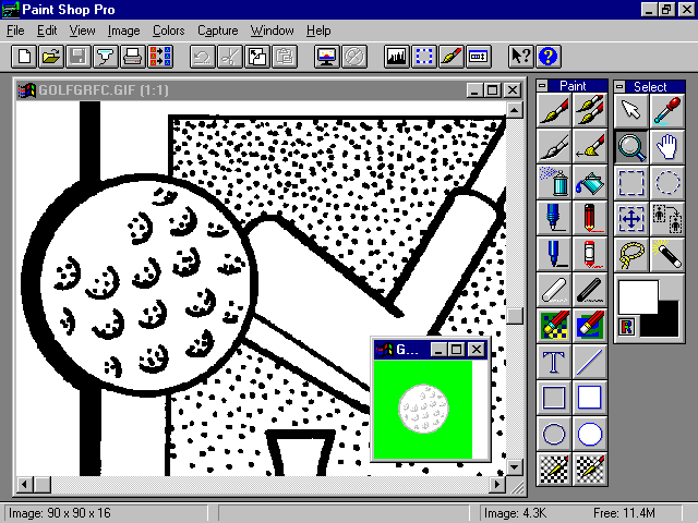
Fred fires up his copy of ![]() Paint
Shop Pro (see fig. 14.5) and goes to work.
Paint
Shop Pro (see fig. 14.5) and goes to work.
A good ![]() graphics
program is indispensable for
graphics
program is indispensable for ![]() Web
page creation. A shareware program like Paint Shop Pro, shown here, works
fine.
Web
page creation. A shareware program like Paint Shop Pro, shown here, works
fine.
Knowing that he wants his ![]() home
page to look good on any
home
page to look good on any ![]() graphic
browser, Fred opts to keep his
graphic
browser, Fred opts to keep his ![]() graphics
to the 16 standard Windows colors, and to format them so they'll look good
on a 640X480 screen. This way, they load faster, too. He checks his list
and sees he's got three images to create for his home page:
graphics
to the 16 standard Windows colors, and to format them so they'll look good
on a 640X480 screen. This way, they load faster, too. He checks his list
and sees he's got three images to create for his home page:
After Fred looks back at the preview of his page in Netscape, he realizes that he'd really love to have two more graphics:
He knows he can get into big trouble if his background pattern is too gaudy, and it's a browser-specific design, but Fred figures if he's careful, he can come up with something tasteful that won't get in the way, and that won't really be missed on browsers that can't display it.
Figure 14.5 shows what he found-a huge
golf ball that he had to trim, resize, and recolor in subtler (not black
and white) shades. He also trimmed, resized, recolored, and generally mucked
around with clip art images of a ![]() golf
bag and a set of three
golf
bag and a set of three ![]() golf
clubs to get his photo icon and logo. The diagram icon he finally ended
up drawing by hand so that it would look like a diagram. He made the two
icon images the same size so they'd look good side-by-side, and made the
logo big enough to make an eye-catching display without taking over the
entire screen.
golf
clubs to get his photo icon and logo. The diagram icon he finally ended
up drawing by hand so that it would look like a diagram. He made the two
icon images the same size so they'd look good side-by-side, and made the
logo big enough to make an eye-catching display without taking over the
entire screen.
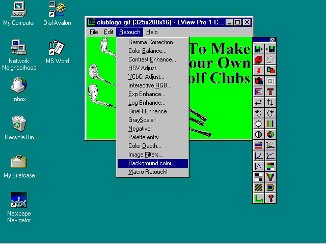
Fred has been ![]() reading
chapter 10, "Adding Graphics to Your Home Page,"
though, and wants to make the background of his logo transparent so that
the background graphic will shine through.
reading
chapter 10, "Adding Graphics to Your Home Page,"
though, and wants to make the background of his logo transparent so that
the background graphic will shine through. ![]() Paint
Shop Pro doesn't create transparent
Paint
Shop Pro doesn't create transparent ![]() GIF
images, so Fred converts his logo by using LView Pro (see
fig. 14.6), which is used by many Web page designers for just this
purpose.
GIF
images, so Fred converts his logo by using LView Pro (see
fig. 14.6), which is used by many Web page designers for just this
purpose.
![]() LView
Pro is an excellent Windows/Win95 tool for creating transparent
LView
Pro is an excellent Windows/Win95 tool for creating transparent ![]() GIF
images for
GIF
images for ![]() Web
pages.
Web
pages.
Fred's home page is nearly done. He adds anchor links to all the graphics
he's created and keeps the placeholder names he was using as ALT
definitions for non-graphical browsers. He goes back and fills in names
for the named anchors in his list items. Finally, Fred adds background
color and a background graphic to the ![]() BODY
tag, and his
BODY
tag, and his ![]() home
page looks like this:
home
page looks like this:
<HTML>
<HEAD>
<TITLE>How to Make Your Own Golf Clubs</TITLE>
</HEAD>
<BODY BGCOLOR=#00ff00 BACKGROUND="golfball.gif">
<IMG SRC="clublogo.gif" ALT="[How To Make Your Own Golf Clubs]">
<H2>Making Your Own Clubs is Fun</H2>
<H3>And Profitable Too!</H3>
<H4><IMG SRC="comesoon.gif" ALT="*COMING SOON!*"> Online
 Video Instructions! <IMG SRC="comesoon.gif" ALT="*COMING SOON!*"></H4>
<HR>
<UL>
<LI><A HREF="why2make.htm">Why Make Your Own Clubs?</A>
<LI><A HREF="why2make.htm#savemoney">To Save Money</A>
<LI><A HREF="why2make.htm#makemoney">To Make Money</A>
<LI><A HREF="why2make.htm#customize">To Customize Your Clubs to You!</A>
<LI><A HREF="how2make.htm">How To Make Your Own Clubs</A>
<LI><A HREF="how2make.htm#tools">Tools</A>
<LI><A HREF="how2make.htm#suppliers">Suppliers</A>
<LI><A HREF="how2make.htm#steps">Step-by-step Instructions</A>
</UL>
<A HREF="how2make.htm/#diagrams><IMG SRC="diagrams.gif" ALT="[Diagrams]"></A>
<A HREF="why2make.htm/#photos><IMG SRC="photos.gif" ALT="[Photos]"></A>
<BR>
<STRONG>CLICK <a href="golflink.htm">HERE</a> FOR A LIST OF
 AWESOME GOLF LINKS!</STRONG>
<HR>
<EM>Last Updated February 16, 1996.</EM>
<ADDRESS>Please address all questions or comments to <A HREF="mailto:fred18@golf.net">fred18@golf.net</A></ADDRESS>
</BODY>
</HTML>
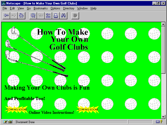
When Fred loads his page into Netscape, he is thrilled to see all his graphics come through with flying colors. His background color is putting-green green, and everything looks great (see fig. 14.7).
Fred's home page is almost done. He just needs to align a few things better, and he's got a home page!
For a short discourse on color names and values, see the sidebar "What's in a Color Name?" in chapter 16
Except...
Nothing is centered. He forgot about centering. And the little "Coming
Soon!" ![]() graphics
aren't aligned properly with the text. Then, too, his list just doesn't
look right. Fred needs to break it up into two main categories, with three
subcategories under each. He decides to leave bullets for the main categories
but number the subcategories using the OL (ordered list) tag.
Now his Web page looks like this:
graphics
aren't aligned properly with the text. Then, too, his list just doesn't
look right. Fred needs to break it up into two main categories, with three
subcategories under each. He decides to leave bullets for the main categories
but number the subcategories using the OL (ordered list) tag.
Now his Web page looks like this:
<HTML>
<HEAD>
<TITLE>How to Make Your Own Golf Clubs</TITLE>
</HEAD>
<BODY BACKGROUND="golfball.gif" BGCOLOR="#00FF00" TEXT="#000000"
LINK="#0000FF" VLINK="#008888">
<DIV ALIGN=CENTER>
<IMG SRC="clublogo.gif" ALT="[How To Make Your Own Golf Clubs]">
<H2>Making Your Own Clubs is Fun</H2>
<H3>And <FONT COLOR=#FF0000>Profitable</FONT> Too!</H3>
<H4><IMG SRC="comesoon.gif" ALIGN=MIDDLE ALT="*COMING SOON!*">
Online Video Instructions! <IMG SRC="comesoon.gif" ALIGN=MIDDLE
ALT="*COMING SOON!*"></H4>
</DIV>
<HR>
<UL>
<LI><A HREF="why2make.htm">Why Make Your Own Clubs?</A>
<OL>
<LI><A HREF="why2make.htm#">To Save Money</A>
<LI><A HREF="why2make.htm#">To Make Money</A>
<LI><A HREF="why2make.htm#">To Customize Your Clubs to You!</A>
</OL>
<LI><A HREF="how2make.htm">How To Make Your Own Clubs</A>
<OL>
<LI><A HREF="how2make.htm#">Tools</A>
<LI><A HREF="how2make.htm#">Suppliers</A>
<LI><A HREF="how2make.htm#">Step-by-step Instructions</A>
</OL>
</UL>
<DIV ALIGN=CENTER>
<A HREF="how2make.htm/#diagrams"><IMG SRC="diagrams.gif" ALT="[Diagrams]">
<A HREF="why2make.htm/#photos"><IMG SRC="photos.gif" ALT="[Photos]">
<BR>
<STRONG>CLICK <A Href="golflink.htm">HERE</A> FOR A LIST OF
 AWESOME GOLF LINKS!</STRONG>
<HR>
<EM>Last Updated February 16, 1996.</EM>
<ADDRESS>Please address all questions or comments to <A HREF="mailto:fred18@golf.net">fred18@golf.net</A></ADDRESS>
</DIV>
</BODY>
</HTML>
Rather than use ![]() Netscape's
non-standard CENTER tag, Fred opts for the
Netscape's
non-standard CENTER tag, Fred opts for the ![]() HTML
3.0 standard <
HTML
3.0 standard <![]() DIV
ALIGN=CENTER> option, just to be "legal." He's also added
TEXT, LINK, and VLINK color attributes to the
BODY tag, just to make sure that his text shows up on that green
background.
DIV
ALIGN=CENTER> option, just to be "legal." He's also added
TEXT, LINK, and VLINK color attributes to the
BODY tag, just to make sure that his text shows up on that green
background.
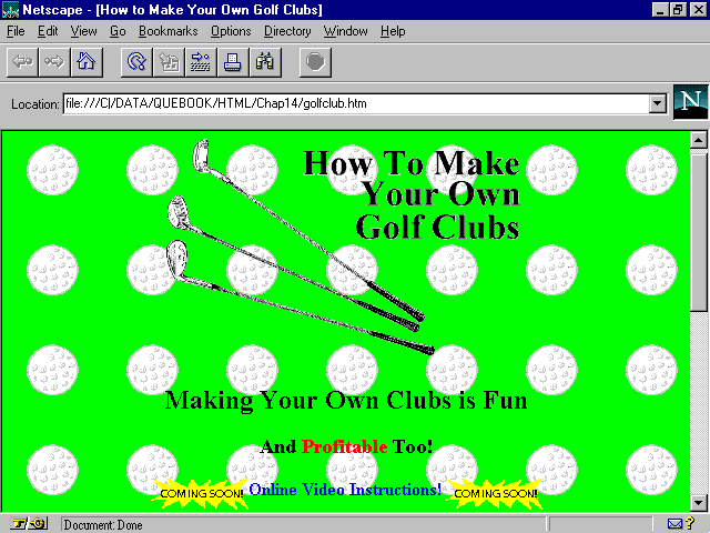
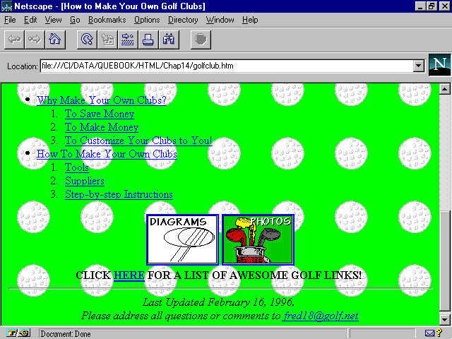
A final check in Netscape (see fig. 14.8 and fig. 14.9) shows that all is well with Fred's home page. It looks great!
Fred's home page is done, and it looks great!
Even the bottom half of Fred's home page looks good!
He's not done, of course. He still has a lot of work ahead of him preparing the content pages to which his home page links. But Fred is off to a very good start.
The steps involved in developing a ![]() Web
presence for your company are not much different from those for building
a quality personal home page. In fact, if you're developing a business
site, you have one big advantage. You already know the message you want
to deliver on the Web-you want to sell something!
Web
presence for your company are not much different from those for building
a quality personal home page. In fact, if you're developing a business
site, you have one big advantage. You already know the message you want
to deliver on the Web-you want to sell something!
You have to hone that generic goal down a bit, of course, to whether you want to sell a product, a service, an image, your stock, or something else. But the bottom line is simply that whatever you put on the Web should in some way positively affect your bottom line.
For the next example, see what Honest Joe has done with his Web site for Honest Joe's Used Cars.
"You're putting a used car lot on the Web? Har, Har, Har!" was the reaction of Joe's main competitor when he found out what Joe had in mind. Since then, Joe has had the last laugh-all the way to the bank.
You see, even though Joe knows it's the "World Wide" Web,
he also knows two other things: (1) Being on the Web is almost free, and
(2) the "world" includes Milwaukee, where he sells cars. In fact,
a lot of high-tech companies are located in the Milwaukee area. He knows.
He's already sold cars to hundreds of their employees. In fact, thousands
upon thousands of Web-browsing potential customers reside in the ![]() Milwaukee
area. Joe knows that lots of them are techie-types who might not be comfortable
shopping for a car on a used car lot. But they love shopping for one on
the Web!
Milwaukee
area. Joe knows that lots of them are techie-types who might not be comfortable
shopping for a car on a used car lot. But they love shopping for one on
the Web!
Joe introduced computers into his car ![]() showroom
in the early '80s and has supervised upgrade installations a half dozen
times since then. He knows computers pretty well. He studied this book
until he got a pretty good handle on HTML; then he sat down and put together
a set of Web pages that he felt would appeal to his potential techie customers.
showroom
in the early '80s and has supervised upgrade installations a half dozen
times since then. He knows computers pretty well. He studied this book
until he got a pretty good handle on HTML; then he sat down and put together
a set of Web pages that he felt would appeal to his potential techie customers.
Joe knew he wanted to tell them four major points:
Joe knew that the convenience of car shopping on the Web would draw in customers, and the immediacy of seeing new listings daily would keep them coming back until they bought from him.
Joe decided to put a few "hot" listings up front on his home page, along with a flashy, easy-to-use clickable image map to send his customers off to information pages about credit, quality, and so on. Problem is, he really had no clue about how to create a clickable image map. He knew it involved CGI-bin programming, which sounded scary. But he thought about it, experimented a bit, and came up with a design that worked well without requiring any fancy stuff.
See chapter 12, "Graphics Navigation with Imagemaps," and chapter 15, "Netscape-Specific Extensions to HTML"
Joe's solution involved putting six small ![]() graphics
together on the page in two rows of three, with this
graphics
together on the page in two rows of three, with this ![]() HTML
code:
HTML
code:
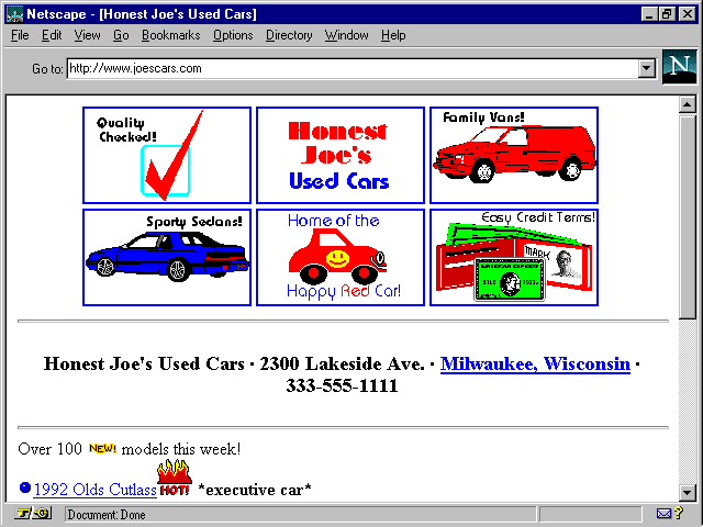
<center>
<a href="quality.htm"><img src="chekmark.gif" alt="[Quality Checkmark]"></a>
<a href="aboutjoe.htm"><img src="joetop.gif" alt="[Honest Joe's Used Cars]"></a>
<a href="vans.htm"><img src="2doorvan.gif" alt="[Family Vans]"></a>
<br>
<a href="cars.htm"><img src="blusedan.gif" alt="[Sporty Sedans]"></a>
<a href="happycar.htm"><img src="joebottm.gif" alt="[Home of the Happy Red Car!]"></a>
<a href="terms.htm"><img src="wallet.gif" alt="[Cash or Credit!]"></a>
Each image is the same size as all the others, so the resulting grid
is a symmetrical rectangular area with six ![]() clickable
areas, as shown in figure 14.10.
clickable
areas, as shown in figure 14.10.
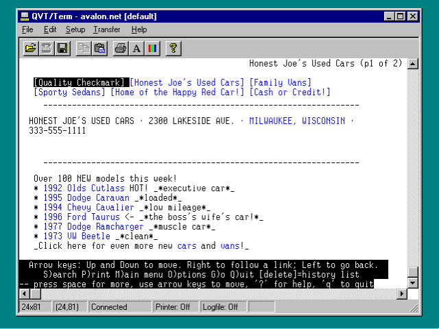
![]() Honest
Joe's Used Car's simulates a
Honest
Joe's Used Car's simulates a ![]() clickable
image map by stacking six linked images. This view is in Netscape Navigator
2.0.
clickable
image map by stacking six linked images. This view is in Netscape Navigator
2.0.
Of course, the solution isn't perfect. It leaves a colored link rectangle around each image. But Joe figures he can live with it for now, and it looks okay. In fact, it has a kind of windowpane effect.
Joe could get rid of the
<BODY BGCOLOR=#ffffff TEXT=#000000 LINK=#ffffff VLINK=#ffffff>
This line sets the page's background color to white, the text color to black, and the color of both followed and unfollowed links to white. Because links are the same color as the background, the windowpanes would go away.
Unfortunately, so would the text of all the text links on the page, so this solution just isn't very friendly. However, Joe can use it in situations in which he doesn't have any text links to worry about.
Two of the outside ![]() graphics
link to
graphics
link to ![]() Joe's
latest up-to-date (Joe updates it himself daily) list of used sedans and
Joe's
latest up-to-date (Joe updates it himself daily) list of used sedans and
![]() vans.
The graphic in the upper left goes to a page that describes Joe's 12-point
quality inspection and guarantee. The lower-right image leads to a page
about Joe's friendly credit terms.
vans.
The graphic in the upper left goes to a page that describes Joe's 12-point
quality inspection and guarantee. The lower-right image leads to a page
about Joe's friendly credit terms.
Joe has bowed to vanity a bit on this page-the top middle ![]() graphic
jumps to a page that tells all about the dealership, complete with pictures
of all the salesmen. This link is not totally for vanity's sake-Joe wants
repeat customers, and the best way to get them back is to remind them who
they dealt with last time and how nice they were. The bottom middle graphic
goes to a page that talks about the "Happy Red Car," an Honest
Joe's trademark for over 30 years. Everyone in Milwaukee knows about the
graphic
jumps to a page that tells all about the dealership, complete with pictures
of all the salesmen. This link is not totally for vanity's sake-Joe wants
repeat customers, and the best way to get them back is to remind them who
they dealt with last time and how nice they were. The bottom middle graphic
goes to a page that talks about the "Happy Red Car," an Honest
Joe's trademark for over 30 years. Everyone in Milwaukee knows about the
![]() Happy
Red Car. It's in all of Honest Joe's TV commercials on the late news, and
it's in all the parades in the Milwaukee area from St. Patrick's Day (when
it's painted green, and Joe drives it dressed up like a leprechaun) to
Thanksgiving. In other words, the
Happy
Red Car. It's in all of Honest Joe's TV commercials on the late news, and
it's in all the parades in the Milwaukee area from St. Patrick's Day (when
it's painted green, and Joe drives it dressed up like a leprechaun) to
Thanksgiving. In other words, the ![]() Happy
Red Car link is a good tie-in to Joe's other
Happy
Red Car link is a good tie-in to Joe's other ![]() promotional
efforts.
promotional
efforts.
Before you begin building your corporate Web pages, sit down and ask yourself just what exactly it is you are trying to do. Chapter 3 provides some guidance, and lots of good advice is also available on the Web.
One good place to start is Dr. Ralph F. Wilson's "12
Yahoo! offers a list of helpful sites at http://www.yahoo.com/Computers_and_Internet/Internet/World_Wide_Web/Authoring.
Joe follows the grid of images with a ![]() tagline
giving the address and phone number of his car lot. Being civic-minded,
he makes the "Milwaukee, Wisconsin" part of his address a link
to the local Chamber of Commerce promotional page for the city, as follows:
tagline
giving the address and phone number of his car lot. Being civic-minded,
he makes the "Milwaukee, Wisconsin" part of his address a link
to the local Chamber of Commerce promotional page for the city, as follows:
<hr>
<h3>Honest Joe's Used Cars  2300 Lakeside Ave.  <a href="http://www.milwaukee.net/">Milwaukee, Wisconsin</a>
333-555-1111</h3>
<hr>
</center>
After these lines, he's done with header stuff, so he adds a horizontal rule to divide the rest of the page and turns off centering.
Unlike Fred, Joe uses the non-standard <CENTER> tag rather than the HTML 3.0 <
Now come the car listings. First, Joe tells people that over 100 new
cars are available; then he lists just six of them. Man, that Joe is a
salesman! Only the best "featured" cars are listed on ![]() Joe's
home page, and he offers an irresistible blurb and
Joe's
home page, and he offers an irresistible blurb and ![]() hotlink
to each. Each featured car has its own page, complete with
hotlink
to each. Each featured car has its own page, complete with ![]() digitized
picture and full sales pitch, and they're updated weekly. Finally, he provides
links that lead to two separate pages for all the rest-one for sedans and
one for vans. These links are the same as those for the graphic sedan and
van links in the image map at the top of the page:
digitized
picture and full sales pitch, and they're updated weekly. Finally, he provides
links that lead to two separate pages for all the rest-one for sedans and
one for vans. These links are the same as those for the graphic sedan and
van links in the image map at the top of the page:
Over 100 <img src="new.gif" alt="NEW"> models this week!<br>
<img src="bulletbl.gif" alt="*"><a href="92cutlas.htm">1992 Olds Cutlass</a><img src="hot.gif" alt="HOT!"> <b>*executive car*</b><br>
<img src="bulletbl.gif" alt="*"><a href="95carvan.htm">1995 Dodge Caravan</a> <b>*loaded*</b><br>
<img src="bulletbl.gif" alt="*"><a href="94cavlir.htm">1994 Chevy Cavalier</a> <b>*low mileage*</b><br>
<img src="bulletbl.gif" alt="*"><a href="96taurus.htm">1996 Ford Taurus</a><img src="hand.gif" alt="<-"> <b>*the boss's wife's car!*</b><br>
<img src="bulletbl.gif" alt="*"><a href="77ramchg.htm">1977 Dodge Ramcharger</a> <b>*muscle car*</b><br>
<img src="bulletbl.gif" alt="*"><a href="73beetle.htm">1973 VW Beetle</a> <b>*clean*</b><br>
<b>Click here for even more new <a href="cars.htm">cars</a> and <a href="vans.htm">vans</a>!</b>
<p>
Joe could use a bulleted list for his featured autos, but he wants to use fancy graphic bullets instead.
Finally, Joe finishes up with the electronic equivalent of a hearty handshake and an invitation to come back again:
<center>
<hr>
<i>New cars and vans are arriving every day!<br>
<b>Bookmark</b> this page and come back often!</i><br>
<strong>Thanks for visiting Honest Joe's Used Cars.</strong>
</center>
<hr>
<strong>Page last updated April 1, 1996</strong>
<address>Email comments to: <a href="mailto:joe@joescars.com">joe@joescars.com</a></address>
<a href="http://www.joescars.com">http://www.joescars.com</a>
Here's the entire home page for Honest Joe's Used Cars:
<html>
<head>
</head>
<title>Honest Joe's Used Cars</title>
<!-- milwaukee wisconsin used cars pre-owned autos automobiles
bargains deals easy credit terms -->
<body>
<center>
<a href="quality.htm"><img src="chekmark.gif" alt="[Quality Checkmark]"></a>
<a href="aboutjoe.htm"><img src="joetop.gif" alt="[Honest Joe's Used Cars]"></a>
<a href="vans.htm"><img src="2doorvan.gif" alt="[Family Vans]"></a>
<br>
<a href="cars.htm"><img src="blusedan.gif" alt="[Sporty Sedans]"></a>
<a href="happycar.htm"><img src="joebottm.gif" alt="[Home of the Happy Red Car!]"></a>
<a href="terms.htm"><img src="wallet.gif" alt="[Cash or Credit!]"></a>
<hr>
<h3>Honest Joe's Used Cars  2300 Lakeside Ave.  <a href="http://www.milwaukee.net/">Milwaukee, Wisconsin</a>
333-555-1111</h3>
<hr>
</center>
Over 100 <img src="new.gif" alt="NEW"> models this week!<br>
<img src="bulletbl.gif" alt="*"><a href="92cutlas.htm">1992 Olds Cutlass</a><img src="hot.gif" alt="HOT!"> <b>*executive car*</b><br>
<img src="bulletbl.gif" alt="*"><a href="95carvan.htm">1995 Dodge Caravan</a> <b>*loaded*</b><br>
<img src="bulletbl.gif" alt="*"><a href="94cavlir.htm">1994 Chevy Cavalier</a> <b>*low mileage*</b><br>
<img src="bulletbl.gif" alt="*"><a href="96taurus.htm">1996 Ford Taurus</a><img src="hand.gif" alt="<-"> <b>*the boss's wife's car!*</b><br>
<img src="bulletbl.gif" alt="*"><a href="77ramchg.htm">1977 Dodge Ramcharger</a> <b>*muscle car*</b><br>
<img src="bulletbl.gif" alt="*"><a href="73beetle.htm">1973 VW Beetle</a> <b>*clean*</b><br>
<b>Click here for even more new <a href="cars.htm">cars</a> and <a href="vans.htm">vans</a>!</b>
<p>
<center>
<hr>
<i>New cars and vans are arriving every day!<br>
<b>Bookmark</b> this page and come back often!</i><br>
<strong>Thanks for visiting Honest Joe's Used Cars.</strong>
</center>
<hr>
<strong>Page last updated April 1, 1996</strong>
<address>Email comments to: <a href="mailto:joe@joescars.com">joe@joescars.com</a></address>
<a href="http://www.joescars.com">http://www.joescars.com</a>
</body>
</html>
Joe doesn't bother setting any fancy background images or colors, or the text colors for his page. He wants everyone to be able to see his pages. But he does make the backgrounds of all his GIF graphics (including the bullets) transparent so that whatever colors his customers pick in their browsers will shine right through.
Joe has read all about how Webcrawler robot indexing programs work, so he's added this comment line near the top of his home page:
<!-- milwaukee wisconsin used cars pre-owned autos
He figures that the robots will pick out all these terms and add them to their index lists. That way, if a user checks for any of these keywords in an index that has "crawled" his
Pretty sharp, that Joe.
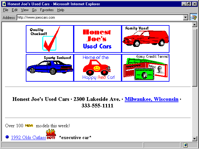
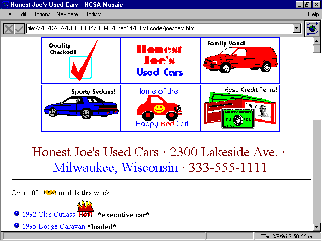
Joe's already checked his page with Netscape (fig. 14.10), but he goes the extra mile to make sure that it looks good in Microsoft's Internet Explorer and NCSA Mosaic, too (see fig. 14.11 and fig. 14.12).
![]() Honest
Joe's home page looks just as good in Explorer as it does in Netscape,
as shown in figure 14.10.
Honest
Joe's home page looks just as good in Explorer as it does in Netscape,
as shown in figure 14.10.
Though it looks a bit different in NCSA Mosaic, Joe's home page is fine here, too.
But Joe has also sold a lot of cars to students from the ![]() University
of Wisconsin and to engineers and programmers at a big
University
of Wisconsin and to engineers and programmers at a big ![]() UNIX-oriented
research center in a
UNIX-oriented
research center in a ![]() Milwaukee
suburb. He knows that they regularly browse the Web using an all-text Web
browser called Lynx. Just to make sure, he checks out his Web page with
Lynx, too (see fig. 14.13).
Milwaukee
suburb. He knows that they regularly browse the Web using an all-text Web
browser called Lynx. Just to make sure, he checks out his Web page with
Lynx, too (see fig. 14.13).
Though not as pretty, ![]() Joe's
Web page works fine on the all-text browser
Joe's
Web page works fine on the all-text browser ![]() Lynx.
Lynx.
Joe, like Fred in the previous example, still has a lot of work to do to create pages for credit, quality, and the other issues he wants to address on his site. He's also going to have to hustle to keep his lists up-to-date. But at least his home page looks good, and he's off to an excellent start.
A Client-Side Image Map
Joe easily figured out how to implement his home page using a client-side image map. The trouble is, if he uses an image map, NCSA Mosaic users can't access the page, and he would have to make separate provisions for his Lynx customers. If Joe decides to use a client-side image map, here's how he can do it:
First, he must combine all six of his image graphics into one big graphic with the same arrangement. Each individual frame is 150 pixels wide by 85 pixels high, so he would end up with a map 450 pixels wide by 170 pixels high.
Here's the
<MAP NAME="joesmap">
<AREA SHAPE="RECT" COORDS="0,0,149,84" HREF="quality.htm">
<AREA SHAPE="RECT" COORDS="150,0,299,84" HREF="aboutjoe.htm">
<AREA SHAPE="RECT" COORDS="300,0,449,84" HREF="vans.htm">
<AREA SHAPE="RECT" COORDS="0,85,149,169" HREF="cars.htm">
<AREA SHAPE="RECT" COORDS="150,85,299,169" HREF="happycar.htm">
<AREA SHAPE="RECT" COORDS="300,85,449,169" HREF="terms.htm">
</MAP>
<IMG SRC="joesmap.gif" USEMAP="#joesmap">
This map, of course, has the advantage that the links are invisible, and it doesn't get broken up into
For more on the subject, see the section "Client-Side Image Maps" in chapter 15
![]() Web
page lists can easily grow to unwieldy sizes, but there are no built-in
provisions in HTML to create nice, neat hierarchical lists. If you are
planning a site with lots of lists, this section can help you figure out
how to keep things from getting out of hand.
Web
page lists can easily grow to unwieldy sizes, but there are no built-in
provisions in HTML to create nice, neat hierarchical lists. If you are
planning a site with lots of lists, this section can help you figure out
how to keep things from getting out of hand.
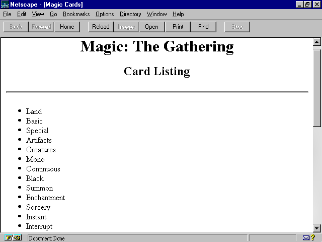
The first trick of list building is to make your lists hierarchical, or nested; that is, don't list everything at one level. This example is exactly the wrong way to go:
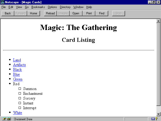
<HTML>
<HEAD>
<TITLE>Magic Cards</TITLE>
<HEAD>
<BODY>
<DIV ALIGN=CENTER>
<H1>Magic: The Gathering</H1>
<H2>Card Listing</H2>
</DIV>
<HR>
<UL>
<LI>Land
<LI>Basic
<LI>Special
<LI>Artifacts
<LI>Creatures
<LI>Mono
<LI>Continuous
<LI>Black
<LI>Summon
<LI>Enchantment
<LI>Sorcery
<LI>Instant
<LI>Interrupt
<LI>Blue
<LI>Summon
<LI>Enchantment
<LI>Sorcery
<LI>Instant
<LI>Interrupt
<LI>Green
<LI>Summon
<LI>Enchantment
<LI>Sorcery
<LI>Instant
<LI>Interrupt
<LI>Red
<LI>Summon
<LI>Enchantment
<LI>Sorcery
<LI>Instant
<LI>Interrupt
<LI>White
<LI>Summon
<LI>Enchantment
<LI>Sorcery
<LI>Instant
<LI>Interrupt
</UL>
</BODY>
</HTML>
Though this page is perfectly "legal," the list is almost unusable because it has no structure (see fig. 14.14).
This unstructured list is confusing. It needs some hierarchies.
A better method is to move subservient portions of the list to their own sublevel, creating a hierarchical list, like this:
<UL>
<LI>Land
<UL>
<LI>Basic
<LI>Special
</UL>
<LI>Artifacts
<UL>
<LI>Creatures
<LI>Mono
<LI>Continuous
</UL>
<LI>Black
<UL>
<LI>Summon
<LI>Enchantment
<LI>Sorcery
<LI>Instant
<LI>Interrupt
</UL>
<LI>Blue
<UL>
<LI>Summon
<LI>Enchantment
<LI>Sorcery
<LI>Instant
<LI>Interrupt
</UL>
<LI>Green
<UL>
<LI>Summon
<LI>Enchantment
<LI>Sorcery
<LI>Instant
<LI>Interrupt
</UL>
<LI>Red
<UL>
<LI>Summon
<LI>Enchantment
<LI>Sorcery
<LI>Instant
<LI>Interrupt
</UL>
<LI>White
<UL>
<LI>Summon
<LI>Enchantment
<LI>Sorcery
<LI>Instant
<LI>Interrupt
</UL>
</UL>
This list is shown in figure 14.15.
A hierarchical list like this is much easier to comprehend.
The various levels of indentation and different bullets for different levels really help you track what goes where.
Each level of a hierarchical list can have its own format. For example, you could have made the second level for each secondary level in the preceding list an ordered (numbered) list by substituting <OL></OL> tags for all the second-level <UL></UL> tags.
Reading through the HTML code for nested lists like these can be somewhat confusing, especially if the lists have three or four levels of depth. Mentally breaking down things helps if you consider each new level as a single element in the previous list, like this:
<UL>
<LI>Land
<UL><LI>Basic<LI>Special</UL>
<LI>Artifacts
<UL><LI>Creatures<LI>Mono<LI>Continuous</UL>
<LI>Black
<UL><LI>Summon<LI>Enchantment<LI>Sorcery<LI>Instant<LI>Interrupt</UL>
<LI>Blue
<UL><LI>Summon<LI>Enchantment<LI>Sorcery<LI>Instant<LI>Interrupt</UL>
<LI>Green
<UL><LI>Summon<LI>Enchantment<LI>Sorcery<LI>Instant<LI>Interrupt</UL>
<LI>Red
<UL><LI>Summon<LI>Enchantment<LI>Sorcery<LI>Instant<LI>Interrupt</UL>
<LI>White
<UL><LI>Summon<LI>Enchantment<LI>Sorcery<LI>Instant<LI>Interrupt</UL>
</UL>
Now you can easily see that the main list is made up of both individual
list elements <LI> and sublists enclosed in <UL></UL>
pairs. It's also easier to tell which </UL> tags end what
lists. ![]() HTML
code even works just fine when it's written this way, if that helps you
to keep track of things.
HTML
code even works just fine when it's written this way, if that helps you
to keep track of things.
The problem with the list so far is that it's still huge. Even though the nested list is organized much better than before, it scrolls off the screen and just keeps scrolling, and scrolling, and scrolling...like the Energizer Bunny of lists.
Now see if you can bring the list under better control. Start by compressing the list to just the first level, as follows:
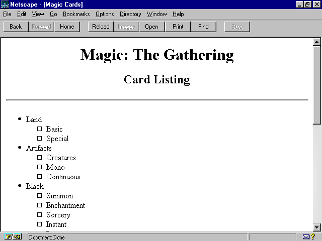
<UL>
<LI>Land
<LI>Artifacts
<LI>Black
<LI>Blue
<LI>Green
<LI>Red
<LI>White
</UL>
This shortened list is easier to read, but you lose detail (see fig. 14.16).
This list is easy to read but doesn't include as much information.
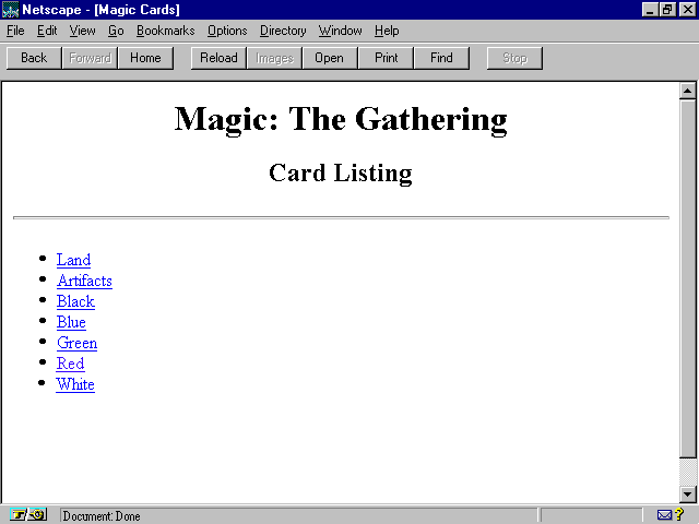
Now make each list item a link to another page, like this:
<UL>
<LI><A HREF="land.htm">Land</A>
<LI><A HREF="artifact.htm">Artifacts</A>
<LI><A HREF="black.htm">Black</A>
<LI><A HREF="blue.htm">Blue</A>
<LI><A HREF="green.htm">Green</A>
<LI><A HREF="red.htm">Red</A>
<LI><A HREF="white.htm">White</A>
</UL>
This page looks just like the previous one (see fig. 14.16) with the exception that every item is a link. Clicking on, say, the list item for Red makes you jump to the page red.htm. Here's the code for that page:
<UL>
<LI><A HREF="land.htm">Land</A>
<LI><A HREF="artifact.htm">Artifacts</A>
<LI><A HREF="black.htm">Black</A>
<LI><A HREF="blue.htm">Blue</A>
<LI><A HREF="green.htm">Green</A>
<LI>Red
<UL>
<LI>Summon
<LI>Enchantment
<LI>Sorcery
<LI>Instant
<LI>Interrupt
</UL>
<LI><A HREF="white.htm">White</A>
</UL>
This page is the same as the previous one, except that the ![]() Red
item has no link. Instead, the sublist below Red has been expanded
to show all the subitems for Red, as shown in figure
14.17.
Red
item has no link. Instead, the sublist below Red has been expanded
to show all the subitems for Red, as shown in figure
14.17.
Clicking the link for Red in the previous screen expands the sublist under it.
Though this technique demands that you create a separate page for each sublist, all are identical except for the sublist information. Because you load many pages clicking back and forth in such lists, you don't want graphic elements on these pages to slow down the load times, especially over slow modem connections.
However, this technique is excellent for making lists user-friendly-and it keeps the pages short.
Expandable lists are so useful that the
One final note about creating lists: Remember to pick the right kind of list for what you want to do. Besides ordered <OL> and unordered <UL> lists, you also can use menu <MENU>, directory <DIR>, and definition <DEF> list tags. Netscape and HTML 3.0 add many options to each of these elements. Check out chapter 9, "Displaying Text in Lists," for insights into the uses and format of each of these list types.
Many helpful tools are available to help get you started creating your own Web pages. Two of the most useful are the page-creation pages on the Web itself and add-on Web page templates for popular word processors.
Several sites on the ![]() Web
feature on-line forms that, when filled out, create a
Web
feature on-line forms that, when filled out, create a ![]() Web
page for you. All you need to do is fill in a few blanks and save the HTML
code of the page that's created. Though pages created by these sites tend
to be generic, you might use this approach to get the bare-bones HTML code
that you can modify to make your own page.
Web
page for you. All you need to do is fill in a few blanks and save the HTML
code of the page that's created. Though pages created by these sites tend
to be generic, you might use this approach to get the bare-bones HTML code
that you can modify to make your own page.
Yahoo! keeps a list of such resources at http://www.yahoo.com/Computers_and_Internet/Internet/World_Wide_Web/Authoring/. But here are three to get you started:
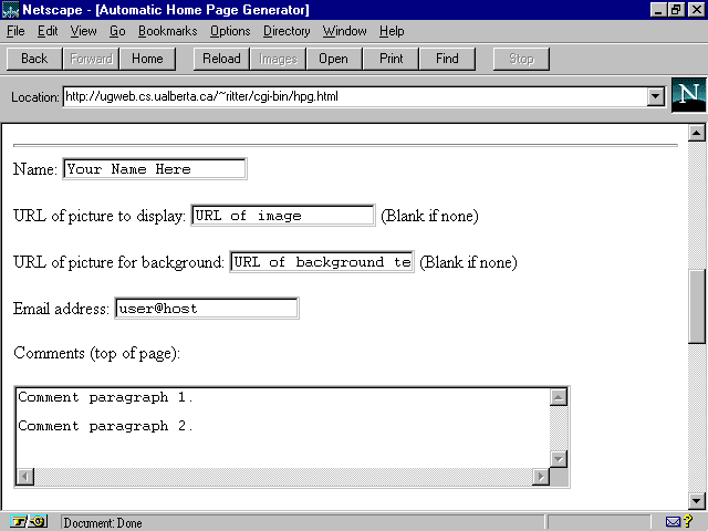
The ![]() Home
Page Generator is just one of many forms-driven
Home
Page Generator is just one of many forms-driven ![]() HTML
page-creation sites on the Web.
HTML
page-creation sites on the Web.
If you're the type who's married to your word processor, you might prefer creating Web pages in that old, familiar environment. Fortunately, many templates are available. They plug right into your existing word processor, effectively turning it into an HTML editing machine.
As usual, Yahoo! has an index of such templates; it's at http://www.yahoo.com/Computers_and_Internet/Internet/World_Wide_Web/HTML_Converters/.
Microsoft's free HTML editing template for Word, Internet Assistant, and Quarterdeck's Word template, WebAuthor, are so powerful that this book contains an entire chapter dedicated to each. If you're a Word user, check out chapters 29 and 30.
See chapter 29, "Microsoft Internet Assistant" and chapter 30, "Quarterdeck WebAuthor"
If you're a Microsoft Word user, download a copy of the shareware template
ANT_HTML (or ANT_PLUS) from ftp.einet.net/einet/pc.
Both are Word templates that convert ![]() Word
documents to
Word
documents to ![]() HTML,
or let you create HTML documents in place. ANT works on both Mac and Windows
in the latest international versions of Word.
HTML,
or let you create HTML documents in place. ANT works on both Mac and Windows
in the latest international versions of Word.
EasyHelp/Web from ![]() Eon
Solutions is for all recent versions of Word. It lets you create Windows
Help files as well as HTML pages. You can get more information at http://www.u-net.com/eon/easyhelp/easyhelp.htm.
Eon
Solutions is for all recent versions of Word. It lets you create Windows
Help files as well as HTML pages. You can get more information at http://www.u-net.com/eon/easyhelp/easyhelp.htm.
CU_HTML.DOT is another Word for ![]() Windows
2.0 and 6.0
Windows
2.0 and 6.0 ![]() HTML
template that you can download from ftp://ftp.cuhk.hk/pub/www/windows/util.
HTML
template that you can download from ftp://ftp.cuhk.hk/pub/www/windows/util.
WordPerfect users might want to check out Wp2Html, a WordPerfect template that converts DOS WP documents to HTML with tables, equations, and figures intact. You can get an evaluation copy from http://www.res.bbsrc.ac.uk/wp2html/.
You might also want to check out Internet Publisher from Novell, a free HTML creation add-on to WordPerfect 6.1 for Windows, downloadable from http://wp.novell.com/elecpub/intpub.htm.
If AmiPro is your word processor of choice, you've got AmiWeb, an HTML add-on. You can get more information at http://www.cs.nott.ac.uk/~sbx/amiweb.html.
These add-ons are all well and good, you say, but what if you want to convert from HTML to something else?


Internet & New Technologies Home Page - Que Home Page
For technical support for our books and software contact support@mcp.com
© 1996, Que Corporation

