![]()
![]()
![]()
In this chapter, we'll walk through some simple examples of pages and presentations that you might find out on the Web. (Actually, you won't find these particular pages out on the Web; I developed these examples specifically for this chapter.) Each of these Web presentations is either typical of the kind of information being provided on the Web today or shows some unique method for solving problems you might run into while developing your own presentations. In particular, you'll explore the following Web presentations:
In each example, I note some of the more interesting features of the page as well as some of the issues that you might want to consider as you develop your own pages and presentations.
The code for these examples is included on the CD-ROM accompanying this book.
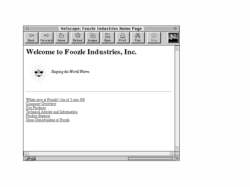
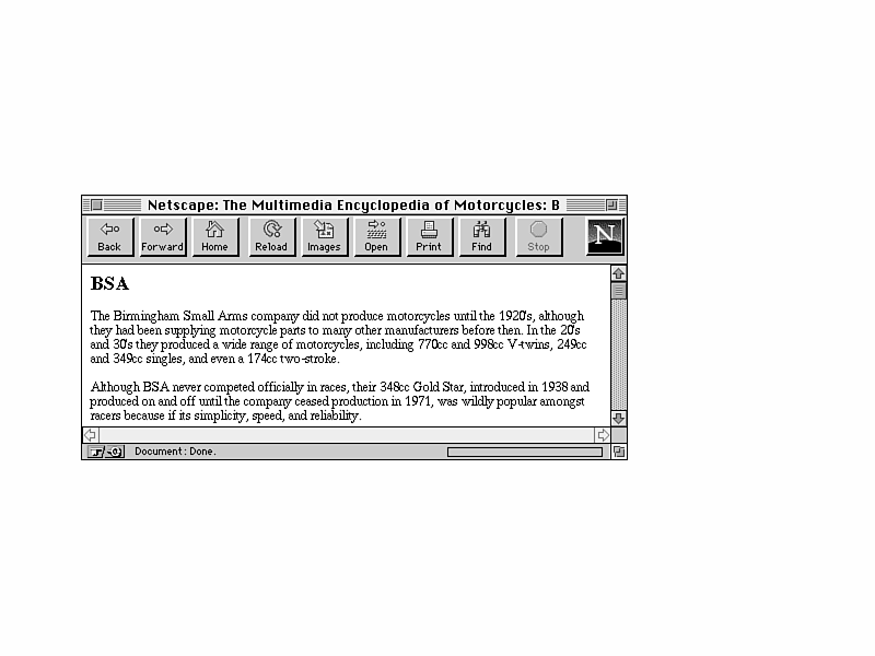
Foozle Industries, Inc., makes a wide variety of sweaters for all occasions. (They were responsible for the demon sweater mentioned in Chapter 3, "Begin with the Basics.") Customers visiting the Foozle Industries Web server would first be presented with the Foozle Industries Home Page (Figure 12.1).
Figure 12.1. Foozle Industries home page.
From this simple and unpretentious home page, the customer has several choices of pages to visit on Foozle's Web site, arranged in a link menu. I won't describe all of them in this section, just a few that provide interesting features.
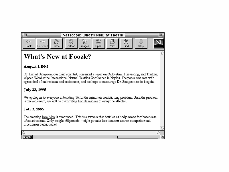
The first link to check out from the Foozle home page is the What's New page. The link to this page has been time stamped, noting the last time it changed. Selecting the What's New link takes you, appropriately, to the What's New page (Figure 12.2).
Figure 12.2. The Foozle What's New page.
Organized in reverse chronological order (from the most recent event backwards), the What's New page contains information about interesting things going on at Foozle Industries, both inside and outside the company. This page is useful for announcing new products to customers on the Web, or just for providing information about the site, the company, and other Foozle information. What's New pages, in general, are useful for sites that are visited repeatedly and frequently, as they allow your readers to find the new information on your site quickly and easily without having to search for it.
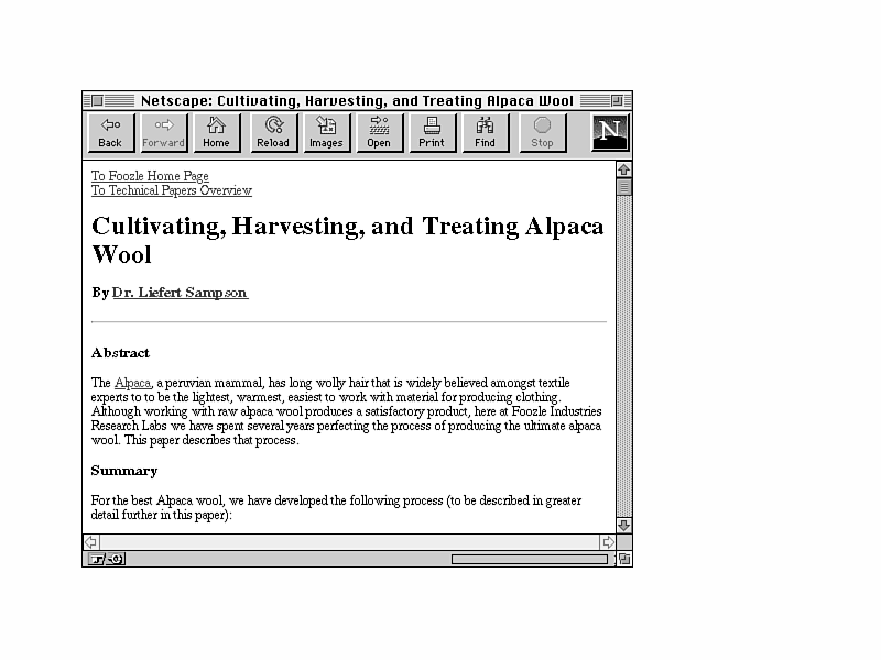
In this What's New page, the topmost item in the list of new things is a note about a paper presented by the Foozle chief scientist at a conference in Naples. That item has a link attached to it, implying that the paper itself is on the other side of that link, and, sure enough, it is (Figure 12.3).
Figure 12.3. All about Foozle Alpaca wool.
Alpaca wool is fascinating, but where do you go from here? The links at the top of the page indicate that the reader has two navigation choices: back up to the Foozle home page, or go to an overview of technical papers.
We've visited the home page already, so let's go on to the technical papers.
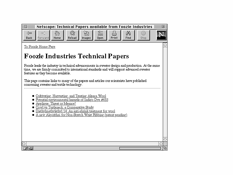
The Technical Papers section of the Foozle Web site (Figure 12.4) provides a list of the papers Foozle has published describing technical issues surrounding the making of sweaters. (Didn't know there were any, did you?)
Figure 12.4. The Technical Papers section.
Each link in the list takes you to the paper it describes. You can't see it in the figure, of course, but the link to the Alpaca wool paper is in a different color, indicating that it has already been visited.
From here, the reader can move down in the hierarchy and read any of the papers, or go back up the hierarchy to the overview page. From the overview page, the reader would then have the choice of exploring the other portions of the Web site: the company overview, the product descriptions, or the listing of open opportunities.
This Web presentation for a simple company profile is quite straightforward in terms of design; the structure is a simple hierarchy, with link menus for navigation to the appropriate pages. Extending it is a simple matter of adding additional "limbs" to the hierarchy by adding new links to the top-level page.
However, note the path we took through the few pages in this Web site. In a classic hierarchy the reader visits each "limb" in turn, exploring downward, and then creeping back up levels to visit new pages. However, remember the link between the What's New page and the paper on Alpaca wool? This link caused the reader to move sideways from one limb (the What's New page) to another (the Technical Papers section).
In this example, of course, given its simplicity, there is little confusion. But given a hierarchy much more complicated than this, with multiple levels and sub-trees, having links that cross hierarchical boundaries and allow the reader to break out of the structure can be confusing. After a few lateral links it is difficult to figure out where you are in the hierarchy. This is a common problem with most hypertext systems, and is often referred to as "getting lost in hyperspace."
Few really good solutions exist to the problem of getting lost. I prefer to avoid the problem by trying not to create lateral links across a hierarchy. If you stick with the rigid structure of the hierarchy and provide only navigational links, readers can usually figure out where they are, and if not, they usually have only two main choices: move back up in the hierarchy to a known point, or drill deeper into the hierarchy for more detailed information.
The Multimedia Encyclopedia of Motorcycles is a set of Web pages that provides extensive information about motorcycles and their makers. In addition to text information about each motorcycle maker, the multimedia encyclopedia includes photographs, sounds (engine noises!), and video for many of the motorcycles listed.
The index is organized alphabetically, one page per letter (A.html, B.html, and so on). To help navigate into the body of the encyclopedia, the home page for this presentation is an overview page.
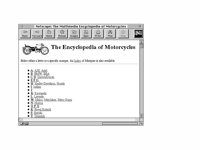
The overview page is the main entry point into the body of the encyclopedia (Figure 12.5).
Figure 12.5. The Motorcycle Encyclopedia overview page.
This page provides two main ways to get into the encyclopedia: by selecting the first letter of the marque or by selecting the name of one of the specific marques mentioned in the list itself.
 A marque is a fancy term used by motorcycle and sports car fanatics to refer to manufacturers of a vehicle.
So, for example, if you wanted to find out information about the Norton motorcycle company, you could select N for Norton and then scroll down to the appropriate entry in the N page. But since Norton is one of the major manufacturers listed next to the N link, you could select that link instead and go straight to the entry for Norton.
Each individual page contains entries for all the marques starting with that letter. If the reader has chosen a specific manufacturer, the link points directly to that specific entry (for example, the entry for Norton, shown in Figure 12.6). Each entry contains information about the marque and the various motorcycles it has produced over the years.
Figure 12.6. Entry for Norton.
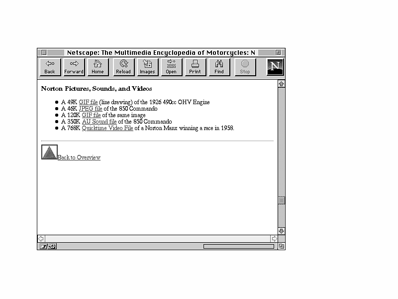
So where are the pictures? This was supposed to be a multimedia encyclopedia, wasn't it? In addition to the text describing Norton itself, the entry includes a list of external media files: images of various motorcycles, sound clips of what they sound like, and film of famous riders on their Nortons (Figure 12.7).
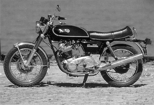
Each media file is described in text and contains links to those files so you can download them if you want to. For example, selecting the 850 Commando link accesses a JPEG image of the 850 Commando (Figure 12.8).
Figure 12.7. The list of external media.
Figure 12.8. The Norton 850 Commando.
Note also that in each point in the text where another manufacturer is mentioned, that manufacturer is linked to its own entry. For example, selecting the word BSA in the last paragraph takes you to the entry for BSA (Figure 12.9).
In this way, the reader can jump from link to link and manufacturer to manufacturer, exploring the information the encyclopedia contains based on what interests them. After they're done exploring, however, getting back to a known point is always important. For just this purpose, each entry in the encyclopedia contains a "Back to Overview" link. The duplication of this link in each entry means that the reader never has to scroll far to the top or bottom of the page in order to find the link back to the overview.
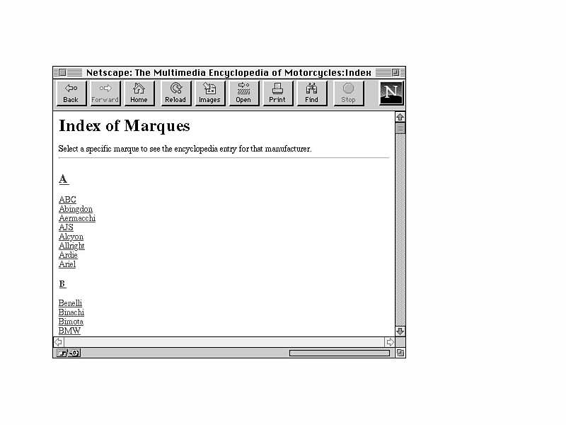
Back on the main overview page, there's one more feature I'd like to point out: The overview also contains a link to an Index of Marques, an alphabetical listing of all the manufacturers of motorcycles mentioned in the encyclopedia (Figure 12.10).
Figure 12.10. The Index of Marques.
Each name in the index is, as you might expect, a link to the entry for that manufacturer in the encyclopedia itself, allowing you yet another way to quickly navigate into the alphabetic listings.
Probably the best feature of the design of this encyclopedia is the overview page. In many cases, an online encyclopedia of this sort would provide links to each letter in the alphabet, and leave it at that. If you wanted to check out Norton motorcycles, you would select the link for "N" and then scroll down to the entry for Norton. By providing links to some of the more popular motorcycle makers on the overview page itself, the author of this Web page provides a simple quick-reference that shortens the scrolling time and takes its readers directly to where they want to be.
The addition of the Index of Marques is also a nice touch, as it enables readers to jump directly to the entry of a particular manufacturer's name, reducing the amount of scrolling required to find the entry they want. Again, it's the same content in the encyclopedia. The overview page simply provides several different ways to find the information readers might be look-ing for.
The encyclopedia itself is structured in a loosely based Web pattern, making it possible for readers to jump in just about anywhere and then follow cross-references and graze through the available information, uncovering connections between motorcycles and marques and motorcycle history that might be difficult to uncover in a traditional paper encyclopedia. Also, by providing all the media files external to the pages themselves, the author of this Web presentation not only allows the encyclopedia to be used equally well by graphical and text-only browsers, but also keeps the size of the individual files for each letter small so they can be quickly loaded over the Net.
Finally, note that every listing in each letter has a link back to the overview page. If there were more than a single link, they would clutter the page and look ugly. The only explicit navigation choice is back to the overview, so including a single link enables readers to quickly and easily get back out of the encyclopedia, rather than having to scroll to the top or the bottom of a very long page to get to a set of navigation choices.
The biggest issue with developing a Web presentation of this kind is in setup and main-tenance. Depending on the amount of material you have to put online, the task of arranging it all (Do you use exactly 26 files, one for each letter of the alphabet? Or more? Or less?) and creating the links for all the cross-references and all the external media can be daunting indeed. Fortunately, a presentation of this sort does not have to be updated very often, so after the initial work is done, the maintenance is not all that difficult.
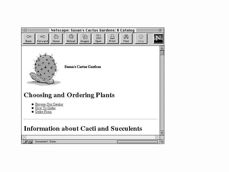
Susan's Cactus Gardens is a commercial nursery specializing in growing and shipping cacti and succulents. It offers over 120 species of cacti and succulents as well as books and other cactus-related items. Figure 12.11 shows the home page for Susan's Cactus Gardens.
Figure 12.11. Susan's Cactus Gardens home page.
From here, customers have several choices: Read some background about the nursery itself, get information about specials and new plants, browse the catalog, get information about ordering, and actually order the cacti or succulents they have chosen.
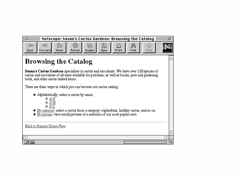
Selecting the Browse Our Catalog link takes customers to another menu page, where they have several choices for how they want to browse the catalog (Figure 12.12).
Figure 12.12. How to browse the catalog.
By providing several different views of the catalog, the author is serving many different kinds of customers: those who know about cacti and succulents and just want to look up a specific variety, in which case the alphabetic index is most appropriate; those who know they would like, say, an Easter Cactus with pink flowers but are not sure which particular variety they want (the listing by category); as well as those who don't really know or care about the names but would like something that looks nice (the photo gallery).
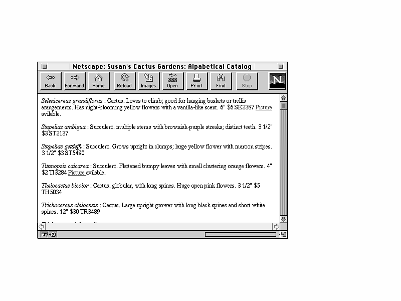
The alphabetical links (A—F, G—R, S—Z) take customers to an alphabetical listing of the plants available for purchase. Figure 12.13 shows a sample listing from the alphabetical catalog.
Figure 12.13. The Cactus Catalog, arranged alphabetically.
Each item indicates the Latin or scientific name of the cactus, a common name (if any), a simple description, size, order number, and price. If a photograph of this cactus is available in the photo gallery section of the catalog, a link is provided to that photograph so that readers can see what this cactus looks like before they buy it.
The catalog is also cross-referenced by each cactus's common name, if any. The link from the common name takes you back to the primary entry for the cactus. So if you really wanted a plant called Crown of Thorns, selecting that entry would take you to the true entry for that plant, Euphorbia Milii.
Each section of the alphabetical catalog also includes navigation buttons for returning back to the list of catalog views (Browsing the Catalog), or for returning to the home page.
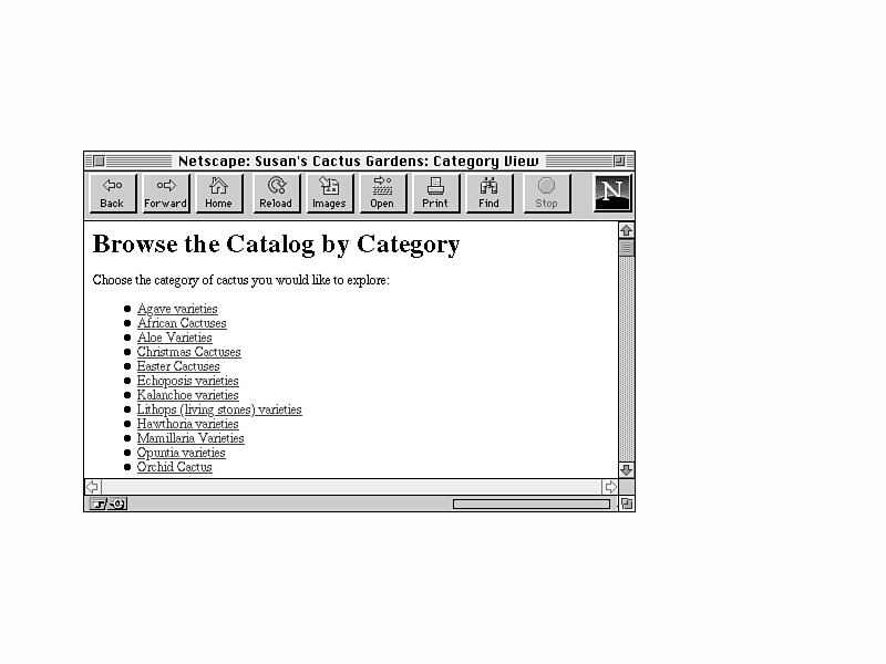
The second view of the catalog (accessible from the Browsing the Catalog page) is the category view. Selecting this link takes the reader to yet another page of menus, listing the available categories (Figure 12.14).
Figure 12.14. The category view.
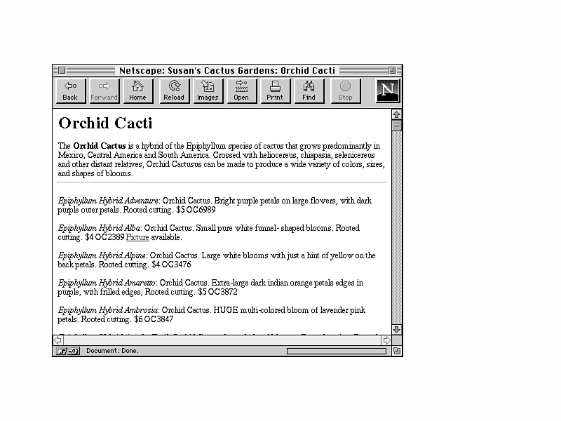
Selecting a particular category—for example, Orchid Cacti—takes customers to a list of the available plants in that category. Each element in the list should look familiar; they're the same elements as in the alphabetical list, sorted in a different order (Figure 12.15).
Figure 12.15. The Cactus Catalog by category.
From the category index, customers can go back to the list of categories (one step up), or back to the list of catalog views (two steps up). On the Browsing the Catalog page, there's one more catalog view to examine: the photo gallery.
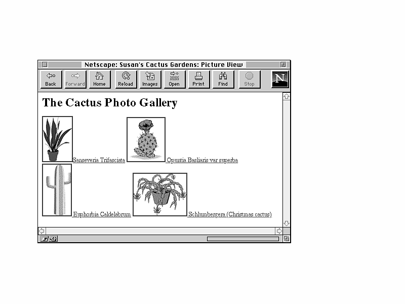
The photo gallery enables customers to browse many of the cacti available at the nursery by looking at pictures of them, rather than having to know their scientific names. This feature is obviously available only to graphical browsers but provides an excellent way to browse for interesting cacti.
The photo gallery page (shown in Figure 12.16) is organized as a series of icons, with each small picture of the cactus linked to a larger JPEG equivalent. The text description of each picture also takes you back to the appropriate entry in the main catalog.
Figure 12.16. The Cactus Catalog photo gallery.
After customers have finished browsing the catalog and they have an idea of the cacti they want to order, they can jump back up to the home page for Susan's Cactus Gardens and find out how to order. (It's the second bullet in the list shown previously in Figure 12.11.)
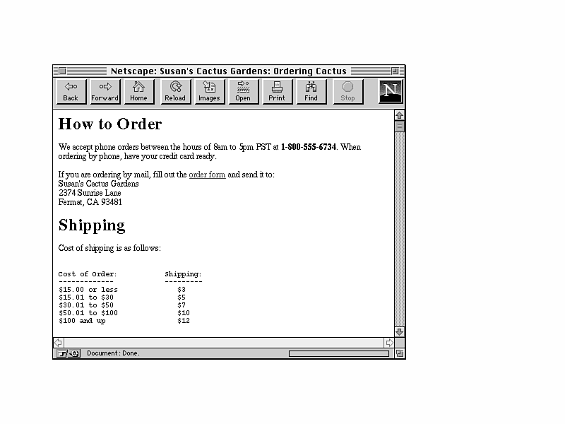
The page for ordering is just some simple text (Figure 12.17): information about where to call or send checks, tables for shipping costs, notes on when they will ship plants, and so on.
Figure 12.17. Ordering Plants.
In the section on ordering by mail, there is a link to an order form. The form itself is a PostScript file that customers will download, print out, and then fill out and send to the nursery. (It's an external file, specified in the HREF attribute to a link tag, just as you would specify any external media file.)
Why not order online? This page could easily have included an HTML form that allows readers to order their cacti online. I didn't include one here because you haven't learned about forms yet; we'll do that later in the book on Day 8, "Going Live on the Web."
And, lastly, note that the third bullet on the Susan's Cactus Gardens home page is a direct link to the order form file; it's provided here so that repeat customers won't have to take the added step of going back to the ordering, shipping, and payment page again.
In any online shopping service, the goals are to allow the reader to browse the items for sale and then to order those items. Within the browsing goal, there are several subgoals: What if the reader wants a particular item? Can it be found quickly and easily? What if someone just wants to look through the items for sale until he or she finds something interesting?
These two goals for browsing the online inventory may seem conflicting, but in this particular example they've been handled especially well through the use of multiple views of the content of the catalog. The multiple views do provide a level of indirection (an extra menu between the top-level page and the contents of the catalog itself), but that small step provides a branching in the hierarchy structure that helps each different type of customer accomplish his or her goals.
Probably the hardest part of building and maintaining a set of Web pages of this sort is maintaining the catalog itself, particularly if items need to be added or removed, or if prices change frequently. If the nursery had only one catalog view (the alphabetical one), this would not be so bad, as you could make changes directly to the catalog files. With additional views and the links between them, however, maintenance of the catalog becomes significantly more difficult.
Ideally, this sort of information could be stored in a database rather than as individual HTML files. Databases are designed to handle information like this and to be able to generate different views on request. But how do you hook up the database with the Web pages?
The Web has a mechanism for running programs on the server side—you'll learn about this on Day 10, "All About CGI Programming." This could mean that given enough programming skill (and familiarity with your database) that you could create a program to do database queries from a Web page and return a neatly formatted list of items. Then, on the Web page, when someone requested the alphabetical listing, they would get an automatically generated list that was as up to date as the database was. But to do this, you'll need a database that can talk to your Web server, which, depending on the system your Web server runs on, may or may not be technically feasible. And you need the programming skill to make it work.
An alternate solution is to keep the data in the database and then dump it to text and format it in HTML every once in awhile. The primary difficulty with that solution, of course, is how much work it would take to do the conversion each time while still preserving the cross-references to the other pages. Could the process be automated, and how much setup and daily maintenance would that involve?
With this kind of application, these are the kinds of questions and technical challenges you may have to deal with if you create Web presentations. Sometimes the problem involves more than designing, writing, and formatting information on the screen.
In this final example, we'll look at an online book called Bread & Circuses. This is a book that might very well have been published in hardcopy and has since been converted to HTML and formatted with few changes—the book-like structure has been retained in HTML, with each chapter a separate page. This is quite common on the Web, not necessarily with books, but with papers, articles, and otherwise linear forms of information. Does it work? Read on.
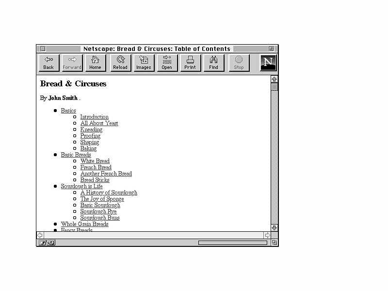
The home page for Bread & Circuses (shown in Figure 12.18) is, appropriately, a table of contents, just as it might be in a real book. Organized as lists within lists, this table of contents is essentially a large link menu with pointers to the various sections in the book.
Figure 12.18. The Bread & Circuses table of contents.
Readers who are interested in all the content the book has to offer could simply select the first link (Basics) and read all the way through from start to finish. Or, they could choose a topic and jump directly to that section in the book.
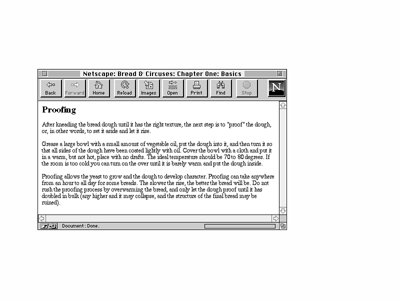
Choosing the link for Proofing takes the reader to the file for Chapter One and then scrolls down to the appropriate section in that file (shown in Figure 12.19).
Figure 12.19. The section on proofing.
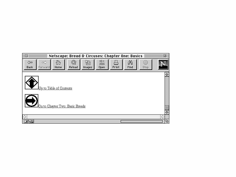
Here, the reader can read all about proofing. At the end of the section is the next section, "Shaping." And following it is the remainder of the chapter. Finally, at the end of the chapter, there are navigation links back to the table of contents, or on to the next chapter (Figure 12.20).
Figure 12.20. Navigation links.
The two navigation links allow you either to progress linearly through the book by selecting the next chapter link, or to go back to the table of contents and choose another section or chapter to read. Note in this example the placement of the navigation links only at the end of each chapter file. The table of contents makes it easy to jump into the middle of the chapter, but to jump back out again you have to scroll all the way to the bottom (or go back using your browser).
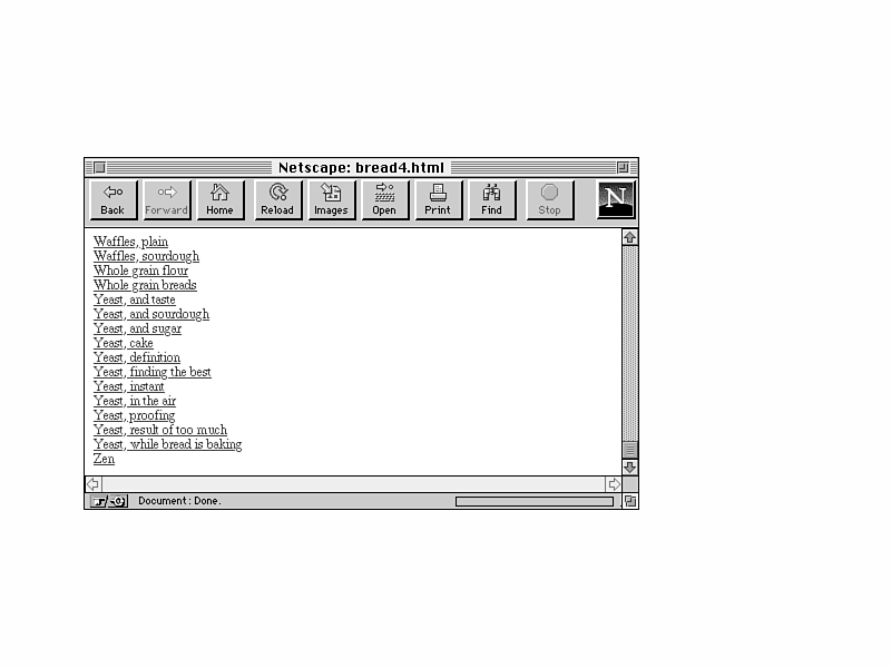
On the table-of-contents page at the bottom of the list, there's a link to an index (the same place it would be in a hardcopy book—at the end). The index is similar to the table of contents in that it provides an overview of the content and links into specific places within the book itself. Like a paper index, the online version contains an alphabetical list of major topics and words, each one linked to the spot in the text where it is mentioned (Figure 12.21).
Yeast is mentioned multiple times in the book. Because online books do not (usually) have page numbers, linking index entries to multiple locations becomes more of a chore, as you'll have to construct your index so that each entry includes some kind of location reference (not to mention having to add all those anchors inside the chapters themselves).
So is this index useful? Like the table of contents, it does help readers jump to a specific place within the content. But also like the table of contents, it's harder for readers to get back out again once they're in the book—even more so for the index because the author does not provide a navigation link at the end of the chapter directly back to the index. This makes the index useful only in limited circumstances.
The biggest problem with putting books or other linear material online is that the material is often more difficult to navigate online than it is on paper. Online, readers can't flip through the pages as quickly and easily as they can on paper, and they can't use hints such as page numbers and chapter headings—both ways in which hardcopy books make finding where you are easy. For this reason, when you convert information intended for hardcopy to HTML, it is crucial to include overview pages, such as the table of contents in this example, to enable readers to jump in and out of the content and to find what they want.
More importantly, however, you have to provide methods of jumping back out again. In this example, the table of contents made it possible to jump into the middle of the content, but jumping back out again was less easy because there were few navigation links except at the end of the chapter. And jumping back to the index involved two links: back to the table of contents and then on to the index. In hardcopy, this isn't an issue. Online, it becomes one.
This example provided both a table of contents and an index. Multiple views of the same contents are usually a good thing, as I pointed out in the previous two examples, because they let your readers choose which way they want to find what they are looking for. Watch out for views that are intended for hardcopy, however, as they might not apply overly well. For example, a typical index, with a word or citations and a list of page numbers, doesn't work overly well in a Web presentation because you don't have page numbers. Consider some other method of linking to information in your document.
When converting a linear document to the Web, there may also be the temptation to add extra non-navigational links as well, for example, to refer to footnotes or citations or just related material. However, keep in mind with linear structures as with hierarchies that the structure can often keep your reader from getting lost or confused in your material. Links to other sections in the book can be confusing and muddle the structure you've tried so hard to preserve by converting the document to HTML.
Limited forms of non-navigational links can work well, however—for example, an explicit reference to another section of the book in the text such as, "For more information about yeast, see 'yeast' in Chapter One." In this case, it is clear where the link is leading, and readers understand where they are and where they are going so they can reorient their position in the presentation.
I've presented only a couple ideas for using and structuring Web pages here; the variations on these themes are unlimited for the Web pages you will design.
Probably the best way to find examples of the sort of Web pages you might want to design and how to organize them is to go out on the Web and browse what's out there. While you're browsing, in addition to examining the layout and design of individual pages and the content they describe, keep an eye out for the structures people have used to organize their pages, and try to guess why they might have chosen that organization. ("They didn't think about it" is a common reason for many poorly organized Web pages, unfortunately.) Critique other people's Web pages with an eye for their structure and design: Is it easy to navigate them? Did you get lost? Can you easily get back to a known page from any other location in their presentation? If you had a goal in mind for this presentation, did you achieve that goal, and if not, how would you have reorganized it?
Learning from other people's mistakes and seeing how other people have solved difficult problems can help you make your own Web pages better.
Q: These Web presentations are really cool. What are their URLs?
A: As I noted at the beginning of this chapter, the Web presentations I've described here are mock-ups of potential Web presentations that could exist (and the mock-ups are on the CD-ROM that comes with this book). Although many of the designs and organizations that I have created here were inspired by existing Web pages, these pages do not actually exist on the Web.
Q: Three out of the four examples here used some sort of hierarchical organization. Are hierarchies that common, and do I have to use them? Can't I do something different?
A: Hierarchies are extremely common on the Web, but that doesn't mean that they're bad. Hierarchies are an excellent way of organizing your content, especially when the information you're presenting lends itself to a hierarchical organization.
You can certainly do something different to organize your presentation. But the simplicity of hierarchies allows them to be easily structured, easily navigated, and easily maintained. Why make more trouble for yourself and for your reader by trying to force a complicated structure on otherwise simple information?
![]()
![]()
![]()