![]()
![]()
![]()
You won't learn about any HTML tags in this chapter, or how to convert files from one strange file format to another. You're mostly done with the HTML part of Web page design; next come the intangibles, the things that separate your pages from those of someone who just knows the tags and can fling text and graphics around and call it a presentation.
Armed with the information from the last five days, you could put this book down now and go off and merrily create Web pages to your heart's content. However, armed with both that information and what you'll learn today, you can create better Web pages. Do you need any more incentive to continue reading?
This chapter includes hints for creating well-written and well-designed Web pages, and highlights dos and don'ts concerning
In the past, before every browser company was introducing their own new HTML tags, being a Web designer was easy. The only HTML tags you had to deal with were those from HTML 2.0, and the vast majority of the browsers on the Web would be able to read your pages without a problem. Now being a Web designer is significantly more complicated. Now, you've got several groups of tags to work with:
If you're finding all of this rather mind-boggling, you're not alone. Authors and developers just like you are all trying to sort out the mess and make decisions based on how they want their pages to look. The HTML extensions do give you more flexibility with layout, but they limit the audience that can view those pages the way you want them to be viewed.
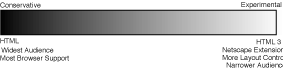
Choosing a strategy for using HTML extensions is one of the more significant design decisions you'll make as you start creating Web pages. It might be easier for you to look at the choices you have as a sort of continuum between the conservative and the experimental Web author (see Figure 11.1).
Figure 11.1. The Web author continuum.
 Don't think of these endpoints as value judgments; conservative isn't worse than experimental, or vice versa. There are advantages at both ends and significant advantages in the middle.
The conservative Web developer wants the widest possible audience for her Web pages. The conservative Web developer sticks to HTML 2.0 tags as defined by the standard. This is not to say that the conservative Web developer is boring. You can create magnificent Web content with the HTML 2.0 tags, and that content has the advantage over more experimental content in that it is supported without a hitch by the greatest number of browsers and, therefore, will reach the widest possible audience.
The experimental Web developer, on the other hand, wants the sort of control over layout that the more advanced tags gives him or her and is willing to shut out a portion of their audience to get it. The experimental Web developer's pages are designed for a single browser, tested only in a single browser, and might even have a big announcement on the pages that says, "These Pages Must Be Read Using Browser X." Using other browsers to read those pages may make the design unreadable or at least confusing—or it may be just fine.
Which kind of Web developer are you? Depending on the goals of your pages and the audi-ence you're writing for, you may not need to think about this decision. If your readers are going to be seeing your pages only on an internal network using only Netscape 2.0, then that makes things easy for you; you can use all of the tags that Netscape 2.0 supports. If you're designing for an audience that may use different kinds of browsers, however (as you do for the global Internet), you'll have to come up with a strategy for which kinds of tags you'll be using.
For the latter situation, the best position in terms of choosing between interesting design and a wide audience is probably a balance between the two kinds of Web developers. With some knowledge beforehand of the effects that HTML extensions will have on your pages, both in browsers that support them and those that don't, you can make slight modifications to your design that will enable you to take advantage of both sides. Your pages are still readable and useful in older browsers over a wider range of platforms, but they can also take advantage of the advanced features in the newer browsers.
Throughout this book so far, I've explained which tags are part of HTML 2.0, which are extensions, and which tags are available in which major browsers. I've also noted for each tag the alternatives you can use in cases where a browser may not be able to view those tags. With this information in hand, you should be able to experiment with each tag in different browsers to see what the effect of each one is on your design.
The most important strategy I can suggest for using extensions while still trying to retain compatibility with other browsers is to test your files in those other browsers. Most browsers are free or shareware and available for downloading, so all you need to do is find them and install them. If you have access to a UNIX account, it's likely that the Lynx software is installed so you can use it as well. By testing your pages you can get an idea of how different browsers interpret different tags, and eventually you'll get a feel for which extensions provide the most flexibility, which ones need special coding for alternatives in older browsers, and which tags can be used freely without complicating matters for other browsers.
Writing on the Web is no different from writing in the real world. Even though the writing you do on the Web is not sealed in hardcopy, it is still "published" and is still a reflection of you and your work. In fact, because it is online, and therefore more transient to your reader, you'll have to follow the rules of good writing that much more closely because your readers will be less forgiving.
Because of the vast quantities of information available on the Web, your readers are not going to have much patience if your Web page is full of spelling errors or poorly organized. They are much more likely to give up after the first couple of sentences and move on to someone else's page. After all, there are several million pages out there. There isn't time to waste on bad pages.
This doesn't mean that you have to go out and become a professional writer to create a good Web page. But here are a few hints for making your Web page easier to read and understand.
Unless you are writing the Great American Web Novel, your readers are not going to visit your page to linger lovingly over your words. One of the best ways you can make the writing in your Web pages effective is to write as clearly and concisely as you possibly can, present your points, and then stop. Obscuring what you want to say with extra words just makes it more difficult to figure out your point.
If you don't have a copy of Strunk and White's The Elements of Style, put this book down right now and go buy it and read it. And then reread it, memorize it, inhale it, sleep with it under your pillow, show it to all your friends, quote it at parties, and make it your life. There is no better guide to the art of good, clear writing than that book.
Even if you write the clearest, briefest, most scintillating prose ever seen on the Web, chances are good your readers will not start at the top of your Web page and carefully read every word down to the bottom.
Scanning, in this context, is the first quick look your readers give to each page to get the general gist of the content. Depending on what your users want out of your pages, they may scan the parts that jump out at them (headings, links, other emphasized words), perhaps read a few contextual paragraphs, and then move on. By writing and organizing your pages for easy "scannability," you can help your readers get the information they need as fast as possible.
To improve the scannability of your Web pages:
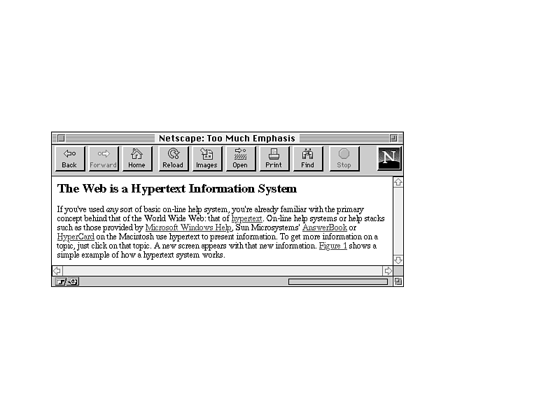
Figure 11.2 shows the sort of writing technique that you should avoid.
Figure 11.2. A Web page that is difficult to scan.
Because all the information on this page is in paragraph form, your readers have to read all three paragraphs in order to find out what they want and where they want to go next.
How would you improve this example? Try rewriting this section so that the main points can be better picked out from the text. Consider that
Figure 11.3 shows what an improvement might look like.
Figure 11.3. An improvement to the difficult Web page.
Keep in mind as you write that your reader could jump into any of your Web pages from anywhere. For example, you may structure a page so section four distinctly follows section three and has no other links to it. Then, someone you don't even know might create a link to the page starting section four. From then on, a reader could very well find himself or herself on section four without even being aware that section three exists.
Be careful to write each page so that it stands on its own. These guidelines will help:
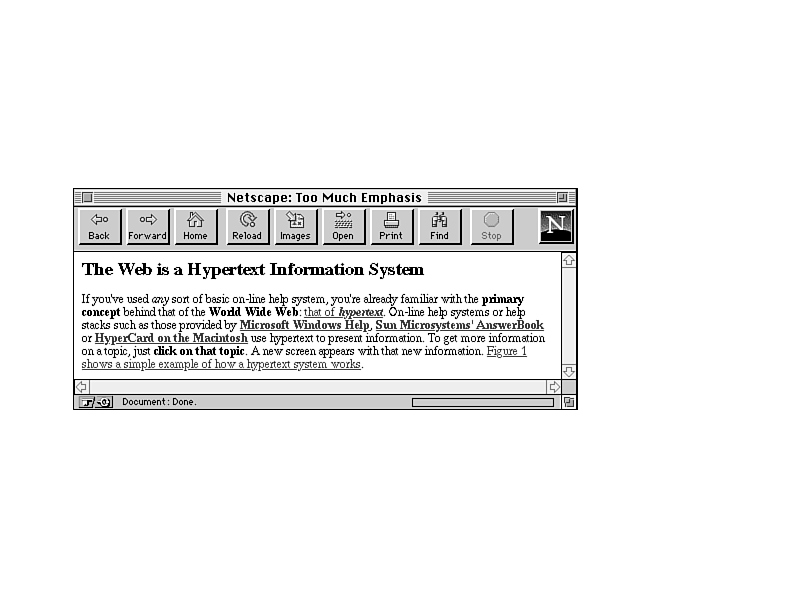
Use emphasis sparingly in your text. Paragraphs with a whole lot of boldface and italics or words in ALL CAPS are hard to read, both if you use any of them several times in a paragraph and if you emphasize long strings of text. The best emphasis is used only with small words (such as: and, this, or, BUT).
Link text is also a form of emphasis. Use single words or short phrases as link text. Do not use entire passages or paragraphs as links.
Figure 11.4 illustrates a particularly bad example of too much emphasis obscuring the rest of the text.
Figure 11.4. Too much emphasis.
By removing some of the boldface and using less text for your links, you can considerably reduce the amount of distraction in the paragraph (Figure 11.5).
Be especially careful of emphasis that moves or changes such as marquees, blinking text, or animation on your pages. Unless the animation is the primary focus of the page, use movement and sound extremely sparingly to prevent distractions from the rest of your page.
Avoid references in your text to specific features of specific browsers. For example, don't use wording like:
Spell checking and proofreading may seem like obvious suggestions, but given the number of pages I have seen on the Web that have obviously not had either, it bears mentioning.
Designing a set of Web pages and making them available on the Web is like publishing a book, producing a magazine, or releasing a product. It is, of course, considerably easier to publish Web pages than books, magazines, or other products, but just because it is easy does not mean it can be sloppy.
Thousands of people may be reading and exploring the content you provide. Spelling errors and bad grammar reflect badly on your work, on you, and on the content you are describing. Poor writing may be irritating enough that your reader won't bother to delve any deeper than your home page, even if the subject you're writing about is fascinating.
Proofread and spell check each of your Web pages. If possible, have someone else read them—other people can often pick up errors that you, the writer, can't see. Even a simple edit can greatly improve many pages and make them easier to read and navigate.
Although the design capabilities of HTML and the Web are quite limited, there's still a lot you can work with, and still quite a few opportunities for people without a sense of design to create something that looks simply awful.
Probably the best rule to follow at all times as far as designing each Web page is this: Keep the design as simple as possible. Reduce the number of elements (images, headings, rule lines), and make sure that the eye is drawn to the most important parts of the page first.
Keep that cardinal rule in mind as you read the next sections, which offer some other suggestions for basic design and layout of Web pages.
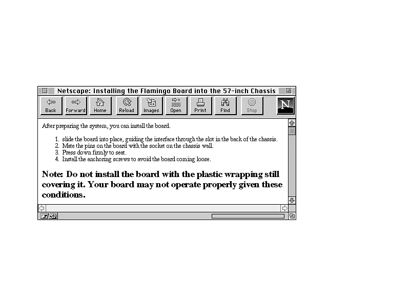
Headings are often rendered in graphical browsers in a larger or bolder font. Because of this, it's often tempting to use a heading tag to provide some sort of warning, note, or emphasis in regular text, as shown in Figure 11.6.
Figure 11.6. The wrong way to use headings.
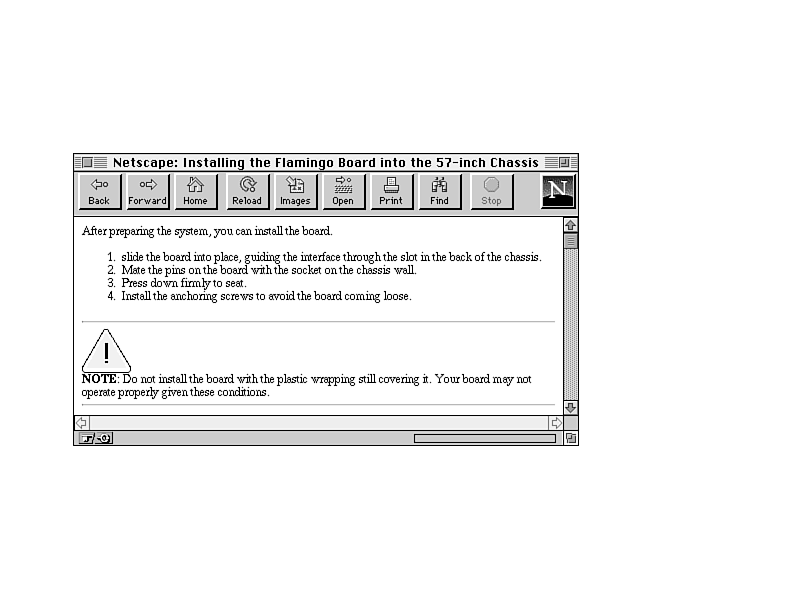
Headings work best when they're used as headings, because they stand out from the text and signal the start of a new topic. If you really want to emphasize a particular section of text, consider using a small image, a rule line, or some other way of emphasis instead. Figure 11.7 shows an example of the same text as in Figure 11.6 with a different kind of visual emphasis.
Figure 11.7. An alternative to the wrong way to use headings.
Grouping related information within a page is a task for both writing and design. By grouping related information under headings, as I suggested in the "Writing for Online" section earlier in this chapter, you improve the scannability of that information. Visually separating each section from the others helps to make each section distinct and emphasizes the relatedness of the information.
If a Web page contains several sections of information, find a way to visually separate those sections; for example, with a heading or with a rule line <HR> (see Figure 11.8).
Figure 11.8. Separate sections visually.
When you're reading a book or a magazine, each page, each section, usually has the same layout. The page numbers are where you expect them, and the first word on each page starts in the same place.
The same sort of consistent layout works equally well in Web pages. A single "look and feel" for each page in your Web presentation is comforting to your readers. After two or three pages, they will know what the elements of each page are and where to find them. With a consistent design, your readers can find the information they need and navigate through your pages without having to stop at every page and try to find where things are.
Consistent layout can include
Without links, Web pages would be really dull, and finding anything interesting on the Web would be close to impossible. The quality of your links, in many ways, can be as important as the writing and design of your actual pages. Here's some friendly advice on creating and using links.
As I've noted in this chapter and frequently in this book, link menus are a great way of organizing your content and the links on a page. By organizing your links into lists or other menu-like structures, your reader can scan their options for the page quickly and easily.
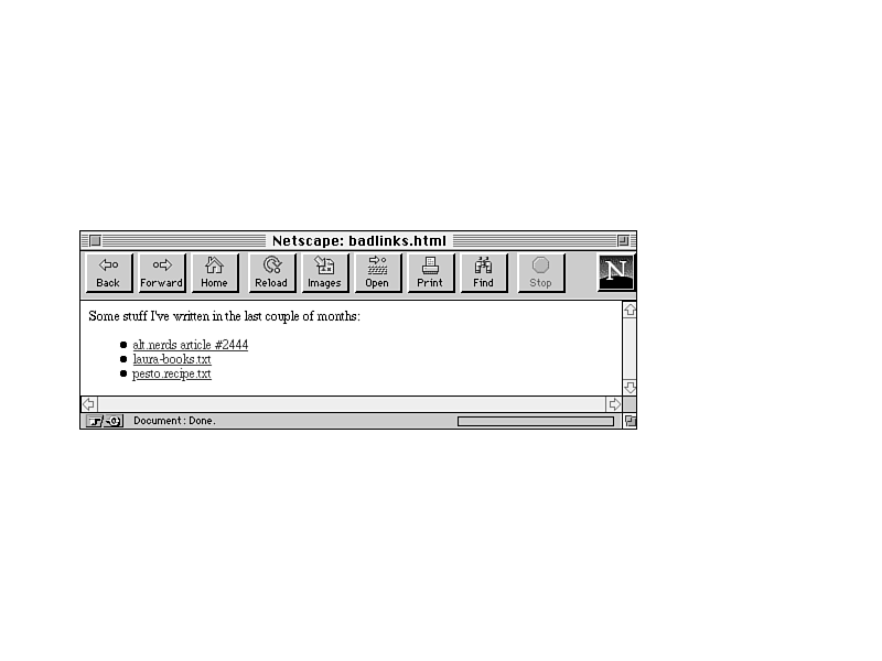
However, just organizing your links into menus often isn't enough. Make sure when you arrange your links into menus that you aren't too short in your descriptions. It's tempting to use menus of filenames or other marginally descriptive links in menus, like the menu shown in Figure 11.9.
Figure 11.9. A poor link menu.
Well, that is a menu of links, and the links are descriptive of the actual page they point to, but they don't really describe the content of that page. How do readers know what's on the other side of that link, and how can they make a decision about whether they're interested in it or not from the limited information you've given them? Of these three links, only the last (pesto.recipe) gives you a hint about what you will see when you jump to that file.
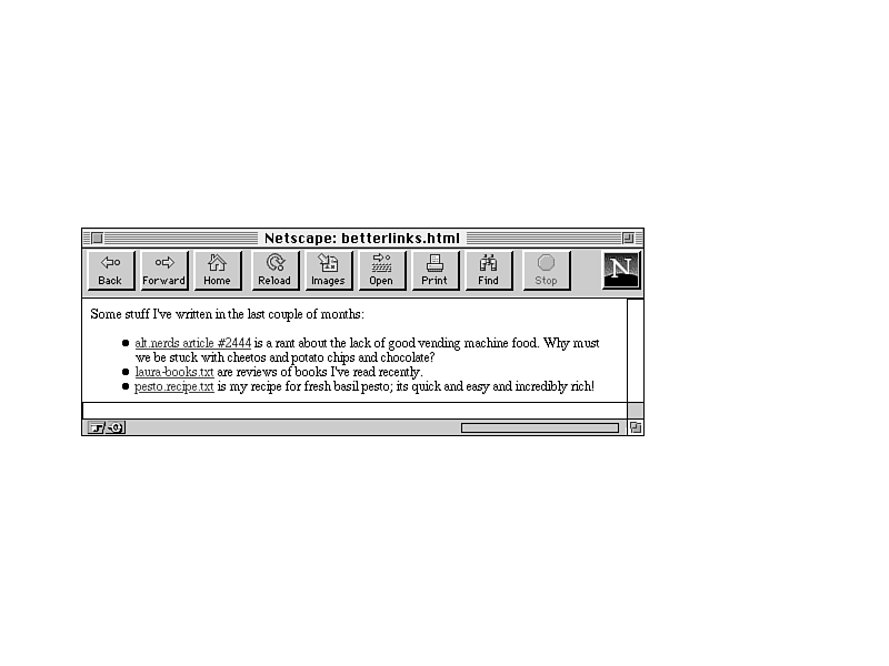
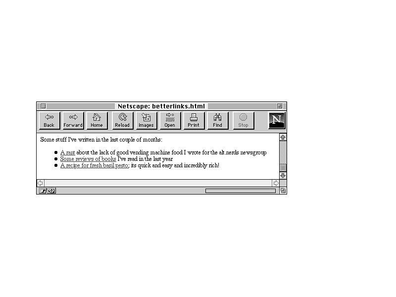
A better plan is either to provide some extra text describing the content of the file (Figure 11.10), or to avoid the filenames altogether (who cares?). Just describe the contents of the files in the menu, with the appropriate text highlighted (Figure 11.11).
Figure 11.10. A better link menu.
Figure 11.11. Another better link menu.
Either one of these forms is better than the first; both give your reader more of a clue of what's on the other side of the link.
The best way to provide links in text is to first write the text without the links as if the text weren't going to have links at all, for example, if you were writing it for hardcopy. Then, highlight the appropriate words that will serve as the link text for links to other pages. Make sure you don't interrupt the flow of the page when you include a link. The idea of links in text is that the text should stand on its own. That way, links provide additional or tangential information that your readers can choose to ignore or follow based on their own whims.
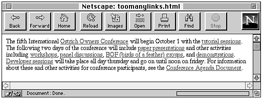
Here's another example of using links in text (shown in Figure 11.12), but one in which the text itself isn't overly relevant—it's just there to support the links. If you're using text just to describe links, consider using a link menu instead of a paragraph. It'll be easier for your readers to find the information they want. Instead of having to read the entire paragraph, they can skim for the links that interest them.
Figure 11.12. Links in text that don't work well.
Probably the easiest way to figure out if you're doing links within text properly is to print out the formatted Web page from your browser. In hardcopy, without hypertext, would the paragraph still make sense? If the page reads funny on paper, it'll read funny online as well. Some simple rephrasing of sentences can often help enormously in making the text on your pages more readable and more usable both online and when printed.
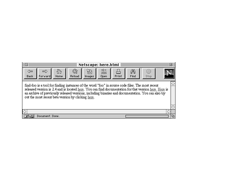
A common mistake that many Web authors make in creating links in body text is "here" syndrome. Here syndrome is the tendency to create links with a single highlighted word (here), and to describe the link somewhere else in the text. Here are a couple of examples (with underlining indicating link text):
Information about ostrich socialization is contained here.
Select this link for a tutorial on the internal combustion engine.
Because links are highlighted on the Web page, those links visually "pop out" more than the surrounding text (or "draw the eye" in graphic design lingo). Your reader will see the link first, before reading the text. Try it. Here's a picture of a particularly heinous example of "here" syndrome, in Figure 11.13. Close your eyes, and then open them quickly, pick a "here" at random, and see how long it takes you to find out what the "here" is for.
Figure 11.13. "Here" syndrome.
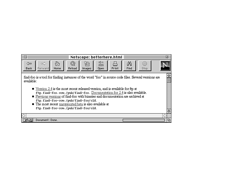
Now try the same thing with a well-organized link menu of the same information, shown in Figure 11.14.
Figure 11.14. The same page, reorganized.
Since "here" says nothing about what the link is there for, your poor reader has to search the text before and after the link itself to find out just what is supposed to be "here." In paragraphs that have lots of "here" or other nondescriptive links, it becomes difficult to match up the links with what they are supposed to link to, forcing your reader to work harder to figure things out.
So instead of a link like this:
Information about ostrich socialization is contained here.
A much better choice of wording would be something like this:
The Palo Alto Zoo has lots of information about ostrich socialization.
or just
The Palo Alto Zoo has lots of information about ostrich socialization.
Just as with graphics, every time you create a link, consider why you are linking two pages or sections. Is the link useful? Will it give your readers more information or take them closer to their goal? Is the link relevant in some way to the current content?
Each link should serve a purpose. Link for relevant reasons. Just because you mention the word "coffee" deep in a page about some other topic, you don't have to link that word to the coffee home page. It may seem cute, but if a link has no relevance to the current content, it just confuses your reader.
This section describes some of the categories of links that are useful in Web pages. If your links do not fall into one of these categories, consider why you are including them in your page.
Thanks to Nathan Torkington for his "Taxonomy of Tags," published on the www-talk mailing list, which inspired this section.
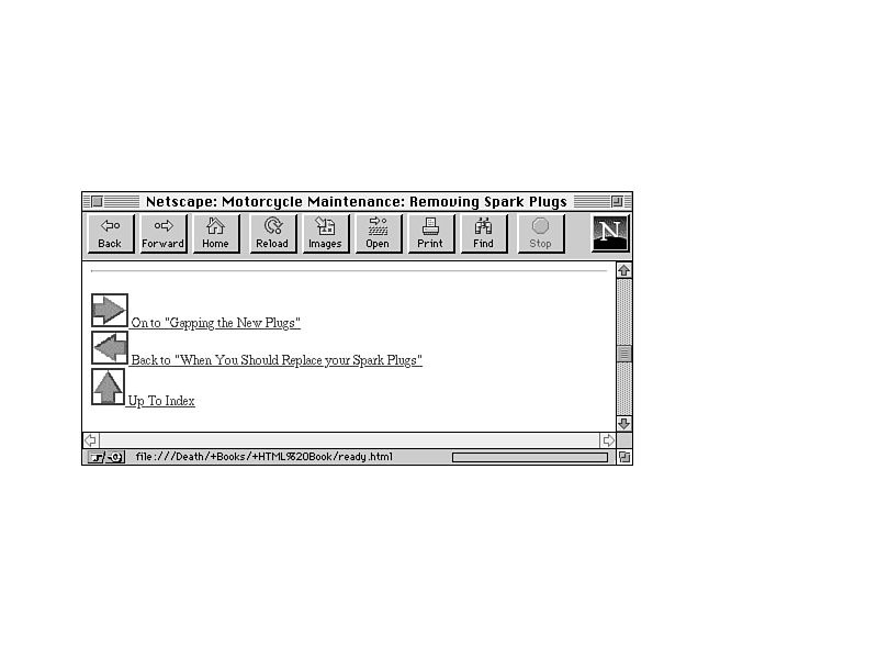
Explicit navigation links are links that indicate the specific paths one can take through your Web pages: forward, back, up, home. These links are often indicated by navigation icons (Figure 11.15).
Figure 11.15. Explicit navigation links.
Implicit navigation links (Figure 11.16) are different from explicit navigation links in that the link text implies, but does not directly indicate, navigation between pages. Link menus are the best example of this; it is apparent from the highlighting of the link text that you will get more information on this topic by selecting the link, but the text itself does not necessarily say that. Note that the major difference between explicit and implicit navigation links is this: if you print a page containing both, you should no longer be able to pick out the implicit links.
Figure 11.16. Implicit navigation links.
Implicit navigation links can also include table-of-contents-like structures or other overviews made up entirely of links.
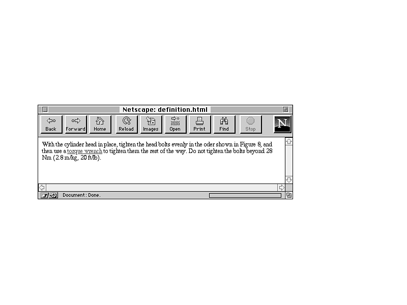
Word or concept definitions make excellent links, particularly if you are creating large networks of pages that include glossaries. By linking the first instance of a word to its definition, you can explain the meaning of that word to readers who don't know what it means while not distracting those who do (Figure 11.17).
Figure 11.17. Definition links.
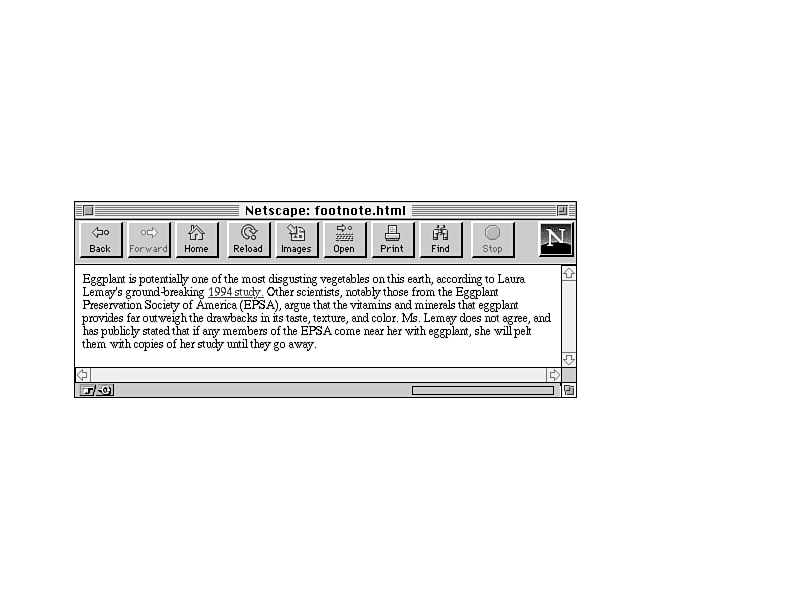
Finally, links to tangents and related information are valuable when the text content would distract from the main purpose of the page. Think of tangent links as footnotes or end notes in printed text (Figure 11.18). They can refer to citations to other works, or to additional information that is interesting but not necessarily directly relevant to the point you're trying to make.
Be careful that you don't get carried away with definitions and tangent links. It's possible to create so many tangents that your readers spend so much time linking elsewhere that they can't follow the point of your original text. Resist the urge to link every time you possibly can, and link only to relevant tangents on your own text. And avoid duplicating the same tangent—for example, linking every instance of the letters "WWW" on your page to the WWW Consortium's home page. If you are linking twice or more to the same location on one page, consider removing most of the extra links. Your readers can make the effort to select one of the other links if they are interested in the information.
On Day 4, "Images and Backgrounds," you learned all about creating and using images in Web pages. This section summarizes many of the hints you learned for using images.
Be careful about including lots of images on your Web page. Besides the fact that each image adds to the amount of time it takes to load the page, including too many images on the same page can make your page look busy and cluttered and distract from the point you are trying to get across (Figure 11.19).
Figure 11.19. Too many images.
Remember the hints I gave you in Chapter 7, "Using Images, Color, and Backgrounds." Consider why you need to use each image before you put it on the page. If it doesn't directly contribute to the content, consider leaving it off.
And of course, as soon as I mention images, I have to also mention that not all browsers can view those images. To make your pages accessible to the widest possible audience, you're going to have to take the text-only browsers into account when you design your Web pages. Here are two possible solutions that can help:
Keep in mind if you use images that each image is a separate network connection and takes time to load over a network, meaning that each image adds to the total time it takes to view a page. Try to reduce the number of images on a page, and keep your images small both in file size and in actual dimensions. In particular, keep the following hints in mind:
Many people create problems for their readers by making a couple of careless assumptions about other people's hardware. When developing Web pages, be kind and remember these two guidelines:
Using HTML extensions, you can use background colors and patterns and change the color of the text on your pages. Using this feature can be very tempting, but be very careful if you decide to do so. The ability to change the page and font colors and to provide fancy backdrops can give you the ability to quickly and easily make your pages entirely unreadable. Here are some hints for avoiding this:
When in doubt, try asking a friend to look at your pages. Because you are familiar with the content and the text, you may not realize how hard your pages are to read. Someone who hasn't read them before will not have your biases and will be able to tell you that your colors are too close or that the pattern is interfering with the text. Of course, you'll have to find a friend who will be honest with you.
In this section, I've gathered several other miscellaneous hints and advice about good habits to get into when working with groups of Web pages. These include notes on how big to make each page in your presentation and how to sign your pages.
Consider including a link back to the top level or home page on every page of your presentation. Providing this link allows readers a quick escape from the depths of your content. Using a home link is much easier than trying to navigate backwards through a hierarchy, or trying to use the "back" facility of a browser.
Each Web page works best if it covers a single topic in its entirety. Don't split topics across pages; even if you link between them, the transition can be confusing. It will be even more confusing if someone jumps in on the second or third page and wonders what is going on.
If you think that one topic is becoming too large for a single page, consider reorganizing the content so you can break that topic up into subtopics. This works especially well in hierarchical organizations. It allows you to determine exactly to what level of detail each "level" of the hierarchy should go, and exactly how big and complete each page should be.
There are no rules for how many pages you must have in your Web presentation, nor for how large each page should be. You can have one page or several thousand, depending on the amount of content you have and how you have organized it.
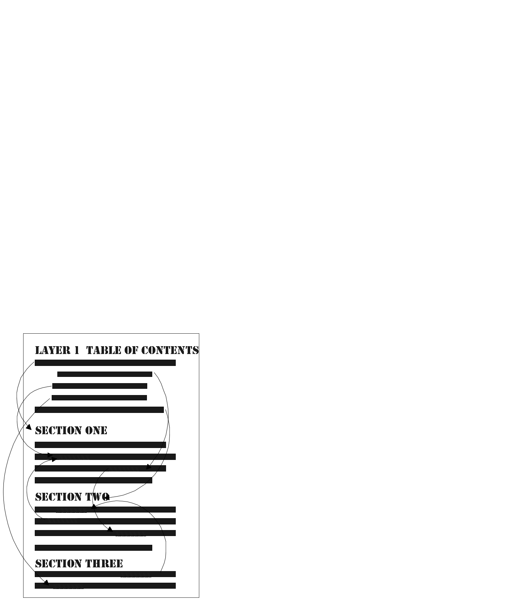
With this in mind, you may decide to go to one extreme or to another, each of which has advantages and disadvantages. For example, say you put all your content in one big page, and create links to sections within that page (as illustrated in Figure 11.20).
Advantages:
Disadvantages:
Or, on the other extreme, you could create a whole bunch of little pages with links between them (illustrated in Figure 11.21).
Figure 11.21. Lots of little pages.
Advantages:
Disadvantages:
So what is the solution? Often the content you're describing will determine the size and number of pages you need, especially if you follow the one-topic-per-page suggestion. Testing your Web pages on a variety of platforms and network speeds will let you know if a single page is too large. If you spend a lot of time scrolling around in it or if it takes more time to load than you expected, it may be too large.
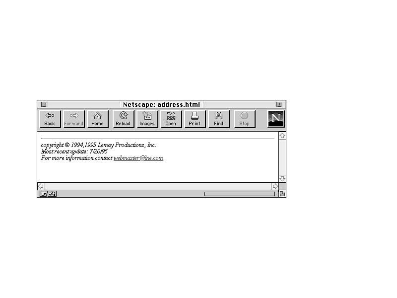
Each page should contain some sort of information at the bottom of the page that acts as the "signature." I mention this briefly in Chapter 5, "More Text Formatting with HTML," as part of the description of the <ADDRESS> tag; that particular tag was intended for just this purpose.
Here is a list of some useful information to consider putting in the ADDRESS tag on each page:
Figure 11.22 shows a nice example of an address block.
Figure 11.22. A sample address.
A nice touch to include on your Web page is to link a Mailto URL to the text containing the e-mail address of the Web master, like this:
<ADDRESS>

Laura Lemay <A HREF="mailto:lemay@lne.com">lemay@lne.com</A>

</ADDRESS>
This enables the readers of the page who have browsers that support the Mailto URL to simply select the link and send mail to the relevant person responsible for the page without having to retype the address into their mail programs.
This will work only in browsers that support Mailto URLs. But even in browsers that don't accept it, the link text will appear as usual, so there's no harm in including the link regardless.
Finally, if you don't want to clutter each page with a lot of personal contact or boilerplate copyright information, a simple solution is to create a separate page for the extra information, and then link the signature to that page, like this:
<ADDRESS>

<A HREF="copyright.html">Copyright</A> and

<A HREF="webmaster.html">contact</A> information is available.

</ADDRESS>
Even though the Web provides a way to create pages in new and exciting ways, some readers still like to read many things offline, on the bus, or at the breakfast table. These kinds of readers have real problems with hypertext pages because once you start using hypertext to organize a document, it becomes difficult to be able to tell your browser to "print the whole thing"—the browser knows only the boundaries of individual pages.
If you are using the Web to publish anything that might be readable and usable outside the Web, consider also creating a single text or PostScript version. You can then make that available as an external document for downloading. That enables your readers both to browse the document online and, if they want to, print it out for reading offline. You can even link the location of the hardcopy document to the start of the hypertext version, like this:
A <A HREF="ftp://myhome.com/pub/mydir/myfile.ps">PostScript version</A> of

this document is available via ftp at myhome.com in the directory /pub/mydir/

myfile.ps.
And, of course, a handy cross-reference for the hardcopy version would be to provide the URL for the hypertext version:
This document is also available on hypertext form on

the World Wide Web at the URL:

http://myhome.com/pub/mydir/myfile.index.html.
The main dos and don'ts for Web page design from this chapter are as follows:
Q: I've seen statistics on the Web that say between 60 percent and 90 percent of people on the Web are using Netscape. Why should I continue designing my pages for other browsers and testing my pages in other browsers when most of the world is using Netscape anyhow?
A: You can design explicitly to Netscape if you want to; your pages are your pages, and the decision is yours. But, given how easy it is to make small modifications that allow your pages to be viewed and read in other browsers without losing much of the design, why lock out 10 to 40 percent of your audience for the sake of a few tags? Remember, with estimates of the size of the Web growing all the time, 10 percent of your readers could very well be a million people or more.
Q: I'm converting existing documents into Web pages. These documents are very text-heavy and are intended to be read from start to finish instead of being quickly scanned. I can't restructure or redesign the content to better follow the guidelines you've suggested in this chapter—that's not my job. What can I do?
A: Some content is going to be like this, particularly when you're converting a document written for paper to online. Ideally, you would be able to rewrite and restructure for online presentation, but realistically you often won't be able to do anything with the content other than throw it online.
All is not lost, however. You can still improve the overall presentation of these documents by providing reasonable indexes to the content (summaries, tables of contents pages, subject indexes, and so on), and by including standard navigation links back out of the text-heavy pages. In other words, you can create an easily navigable framework around the documents themselves, which can go a long way towards improving content that is otherwise difficult to read online.
Q: I have a standard signature block that contains my name and e-mail address, revision information for the page, and a couple lines of copyright information that my company's lawyers insisted on. It's a little imposing, particularly on small pages, where the signature is bigger than the page itself!
A: If your company's lawyers agree, consider putting all your contact and copyright information on a separate page, and then linking it on every page instead of duplicating it every time. This way your pages won't be overwhelmed by the legal stuff, and if the signature changes, you won't have to change it on every single page.
![]()
![]()
![]()