


The Abstract Window Toolkit (normally referred to as the AWT) is a well-thought-out and very portable windowing library. It is a standard part of the Java environment and provides all of the basic functionality one would expect to use in a modern windowing system.
The AWT delivers on the promise made by many cross-platform windowing libraries, allowing your application to run on completely different windowing systems. Moreover, it manages to preserve the look and feel of the user’s system, so AWT-based applications won’t get a reputation for having a Java look.
The bulk of the basic AWT is subclassed from one basic class: Component (see Figure 22.1).
 FIGURE 22.1.
Awt Component class hierarchy.
The AWT has most of the graphical components that are standard in graphical user interfaces (GUIs). Thankfully, it also is relatively easy to use standard components to derive new components for extra functionality.
This chapter covers all of the core concepts of the AWT. First, an example of a simple applet that uses the AWT is provided. Next, event handling (controlling interactions between components) is covered in detail. There is a large palette of components available, and the common ones are covered next. Finally, a complete user interface is be developed using the AWT.
First, let’s look at a simple AWT applet that contains a Button as shown in Listing 22.1.
     import java.awt.*;

     import java.applet.Applet;

     public class Example1 extends Applet {

          Button hiButton;


          public void init() {

               hiButton = new Button(“Click Me!”);

               add(hiButton);

          }

     }

<applet code=Example1.class width=250 height=100></applet>
Figure 22.2 shows what is produced when the code is compiled and viewed in the AppletViewer.
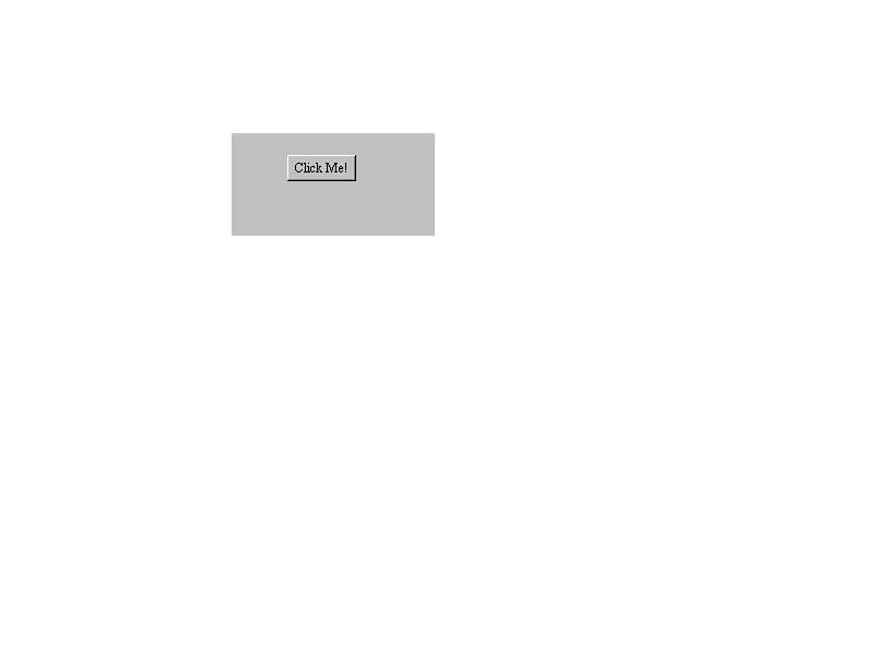 FIGURE 22.2.
A simple AWT applet.
It is not important at this point to understand exactly what every line means. Instead, try to get a general feel for what is going on. The example is doing the following:
For a program with a user interface that produces output, there is surprisingly little code here. Almost all the real work of handling the user interface is hidden behind the scenes. If you are using basic components, it’s relatively easy to keep things simple. However, if you want to extend the functionality of the basic components, the complexity of your code increases.
When a component is created, it usually is added to a container. A container is simply an area of the screen in which components (and even other containers) can be placed. This can go on endlessly: A component is added to a container, which is added to another container, and so on. We will, in fact, be doing just this in the calculator example at the end of the chapter.
This flexibility is one of the biggest advantages of programming the AWT. In an object-oriented programming environment, it makes sense to think of the user interface as actual objects and concentrate on relationships between objects. This is exactly what the AWT lets you do.
| NOTE |
|---|
| This chapter deals primarily with the AWT and applets. Features of the AWT are not limited to applet programming. Windowing is an important feature of applications as well. Our focus on applets enables us to take advantage of the fact that all applets are a subclass of Panel, which simplifies some of the concepts of programming a user interface. |
Programming any graphical interface can be a daunting task due to the number of things you need to keep track of. For this reason, the AWT is one of the most difficult parts of Java to master. However, as long as you keep in mind a few basic tenets from the outset, it’s certainly manageable.
First, every viewable item in the AWT is subclassed from Component. This provides a core set of methods that work across all components (things like setting color, and so on). Always make sure what the class being used is subclassed from. Usually, the function you are looking from is a step or two up the chain.
Second, everything in the AWT is event-driven. This means that unlike many styles of programming, you do not construct your program to proceed in a linear manner, but to respond to user actions. Although this adds a level of complexity to your programs, it also makes them much more usable.
Third, components are never placed on the page in absolute positions. Java was designed from the beginning to run on many different platforms, keeping the look and feel consistent with the operating system’s native environment. The size and precise shape of a button, for example, isn’t known to an interface designer. Therefore, all components are placed inside containers that are relative to other components. Although this seems strange at first, it turns out to be a powerful technique, and one that will make your applications more robust.
| NOTE |
|---|
| If you’ve done Windows or Macintosh programming before, many of the underlying concepts are very similar here, especially if you’ve used a class library such as OWL or MFC. The major difference is simplicity. Most concepts in the AWT are much more straightforward than in other development environments. |
An event is a communication from the outside world to the program that something has occurred. The following are a few basic event types:
One of the most important things to understand about the AWT is how events are handled. Without events, your application will not be able to respond to user actions.
Let’s add basic event handling to the example from earlier in the chapter. (See Listing 22.2.)
import java.awt.*;

     import java.applet.Applet;

     public class Example2 extends Applet {

          Button hiButton;

          public void init() {

               hiButton = new Button(“Click Me!”);

               add(hiButton);

          }

          public boolean action(Event evt, Object what) {

              if (evt.target == hiButton) {

                    hiButton.setLabel(“Clicked!”);

                    return true;

              }

              else

                    return false;

         }

     }

<applet code=Example2.class width=250 height=100></applet>
The resulting applet is shown in Figure 22.3. All that has been changed is the addition of the action() method. When a component that has an action associated with it (that is, a button) is manipulated by the user, the action() method of that component is called.
 FIGURE 22.3.
Using events handling.
In this case we are using the default Button instead of subclassing our own. The default event handler tries to handle the action event inside of the Button, but cannot find a handler that will take the event. It then passes the event up the chain of components, to the container that holds the component. It keeps doing this until it finds a handler that accepts the event or hits the top of the chain.
Let’s break the action() method down line by line:
public boolean action(Event evt, Object what) {
All event handlers have a form similar to this. They accept a parameter of type Event thatprovides detailed information about the event. Second, they return a Boolean value indicating True if the event was handled, or False if it was not.
if (evt.target == hiButton) {
Here the target of the event is being checked to see whether or not it is the button. Because evt.target and hiButton are both objects, we can check to see if they are the same object.
hiButton.setLabel(“Clicked!”);
Because the button was clicked, we change the button to reflect that.
      return true;

}

else

      return false;
Finally, if the event was handled, return true, or else return false. This is an important concept to keep in mind: The event handler keeps searching for a method that will accept the Event. Accepting the Event is signaled by returning true.
In almost all cases, you will want to use the event-handling methods that Sun has provided for you. These are summarized in Table 22.1. Remember that everything is relative to the component. For example, the mouseMove() method of a component is called when the mouse is moved inside that component.
Table 22.1. Java events.
When would you want to use other methods than action()? The answer is that when you actually want to change the behavior of a component (as opposed to just using the component as is was originally designed) action() isn’t quite enough. It only reports events that are essential to the utility of the component, such as a mouse click on a button.
Let’s add new behavior to the previous example (see Listing 22.3 and Figure 22.4).
     import java.awt.*;

     import java.applet.Applet;

     public class Example3 extends Applet {

         Button hiButton;

         public void init() {

             hiButton = new Button(“Click Me!!!”);

             add(hiButton);

         }

         public boolean mouseEnter(Event evt, int x, int y) {

             hiButton.setLabel(“Go Away!”);

             return true;

         }

         public boolean mouseExit(Event evt, int x, int y) {

             hiButton.setLabel(“Stay Away!”);

             return true;

         }

         public boolean action(Event evt, Object what) {

             if (evt.target == hiButton) {

                 hiButton.setLabel(“Clicked!”);

                 return true;

             }

             else

                 return false;

        }

    }

<applet code=Example3.class width=250 height=100></applet>
 FIGURE 22.4.
Changing the behavior of a component.
Now, whenever the mouse moves over the applet, the user is informed that perhaps clicking on the button isn’t such a good idea. This is a fundamentally different behavior than the previous example. Before, we were using a button in a completely standard manner. Here, we wished to change that functionality. This is important to remember—otherwise, you might end up subclassing components where you don’t need to, making your program slower and more difficult to understand and maintain.
Generally, a combination of action() and the other built-in event handlers will do the job nicely. For those times when you want to take complete control of the process yourself, handleEvent() is available.
handleEvent() has advantages and disadvantages. On the positive side, you have complete control. On the negative side, you have complete control. This means that you must be very careful overriding the default handleEvent() or your application can become buggy and confusing very quickly.
For example, let’s say you overrode handleEvent() in your class for whatever reason, but you had used mouseEnter() earlier in the development of the program, as shown in the following:
class MyLabel extends Label {

     MyLabel(String label) {

          super(label);

     }

     public boolean mouseEnter(Event evt, int x, int y) {

          setText(“Not Again”);

     }


     public boolean handleEvent(Event evt) {

          if (Event.id == KEY_PRESS) {

                setText(“Keypress”);

               return true;

          } else return false;

    }

}
You would expect the mouseEnter() you had written to keep working. Unfortunately that’s not the case. Because the default handleEvent() has been overridden, mouseEnter() never gets called. Luckily there is an easy solution to this problem for many cases. Add the following to your handleEvent() in place of return false;:
return super.handleEvent(evt);
This has the benefit of keeping all of the functionality of the old handleEvent() while letting you manipulate things first. Note, however, that you can also override handleEvent() to remove functionality, in which case you wouldn’t want to call the parent’s handleEvent(). It’s all up to you.
Occasionally the ability of the program to manufacture its own events comes in quite handy. Although it may seem strange to fake an event, in reality it makes the design of a program much simpler.
For example, if you were designing a calculator you might decide to write an event handler in the main container that deciphers the action events from the button, as follows:
public boolean action(Event evt, obj What) {

     if (evt.target == oneKey)

     ...     // Append 1 to the current number

     }

     ...

}
However, it might make sense to add the ability to handle keyboard input, because a user of the calculator would expect that functionality from a calculator. Although you could just copy the code from the action() handler to a new keyDown() handler, you would then have two copies of the same code in the same program to maintain and keep track of. The solution is to deliver your own event. A simple event can be created with the following form:
Event aEvent = new Event(target, id, obj);
Where target is the Object that you would like the event delivered to, id is an integer representing the event type (see Table 22.2), and obj is an arbitrary argument to append to the event if there is extra information that you would like the handler to receive.
Then, to deliver the event, you just need to call deliverEvent() as follows:
deliverEvent(aEvent);
So, in the previous example, you could add another handler that does the following:
public boolean keyDown(Event evt, int key) {

     if (key == 49) {          // If the 1 key was pressed

          deliverEvent(new Event(oneKey,Event.MOUSE_DOWN, null));

          return true;

     }

     ...

}
Now you can manage the rest of the program without worrying about handling keyboard input differently—the same event is generated whether the button is clicked or the corresponding key is pressed. Table 22.2 shows the event types available in the AWT.
Table 22.2. AWT event types.
When a user clicks a user interface component, that item becomes in a sense “selected.” This is as known as the input focus. For instance, when a text field is clicked on, the user then can type in the field because it has the input focus.
When a component receives the input focus, the gotFocus() method of that component is called, as follows:
public boolean gotFocus(Event evt, Object what) {

     ...

}
When a component loses the input focus, the lostFocus() method of that component is called, as follows:
public boolean lostFocus(Event evt, Object what) {

     ...

}
It is not uncommon for a program to desire to keep the focus. For example, if a text-entry field was being used to display output rather than to accept input, you probably would not want it to be able to receive the focus. Using a text-entry field to display output enables you to take advantage of the field’s text-handling abilities. In that case, the requestFocus() method exists, as shown in the following:
public void requestFocus() {

          ...

     }
This could be placed in the container that the text field has been used in and would bar that field from receiving the focus.
Components are the building blocks from which all programs using the AWT are built. There are many other classes to handle the components and the interactions between them, but if it’s on the screen, it’s a component.
This enables us to say a number of things about all components:
AWT components can be conceptually broken down into three major categories:
Interface components
Interface components encompass all of the standard widgets or controls normally associated with a windowing system. Examples of these include buttons, text labels, scrollbars, pick lists, and text-entry fields.
Containers
Containers encompass areas in which components can be placed. This allows groups of components to be grouped together to form a more cohesive object to be manipulated. A Panel is an example of this type of component.
Windows
Windows are a very special case of the Component class. All other components are added onto a container that already exists, whereas a Window is an actual, separate window with a completely new area to create an interface upon. Normally with applet programming, windows are not used. Dialogs and Frames are examples of this type of component.
Interface components are components specifically designed to give information to, or get information from, the user.
A Button is a standard clickable button. (See Figure 22.5.) It can be customized to either have a text label or be blank. Buttons can be used for myriad uses in an applet—whenever there needs to be confirmation from the user that they are ready to move on, a Button is the obvious choice.
 FIGURE 22.5.
The button component.
Location:
java.awt.Button
Button()
Creates a Button with no label.
Button(String lbl)
Creates a Button with the label lbl.
Core component-specific methods:
String getLabel()
Returns the label of the Button.
void setLabel(String lbl)
Sets the label of the Button to lbl.
Action:
Sends an action event when pressed.
Example:
Button aButton = new Button(“Ok”);
A Canvas is a completely generic component. It is provided as a foundation to subclass interesting graphics components. Canvases are not very useful for beginning- or intermediate-levelJava programs, but extremely useful if you need to create your own component from theground up.
Location:
java.awt.Canvas
Canvas()
Creates a Canvas.
Core component-specific methods:
void paint(Graphics g)
Paints the Canvas in the default background color.
Action:
None by default.
Example:
Canvas aCanvas = new Canvas();
A Checkbox is a small box with an optional label that the user can either click on or off (see Figure 22.6). This can be useful if you have an applet that has a variety of attributes that the user can set at once. Moreover, more than one Checkbox can be grouped together within a CheckboxGroup to allow only one attribute to be set at a time.
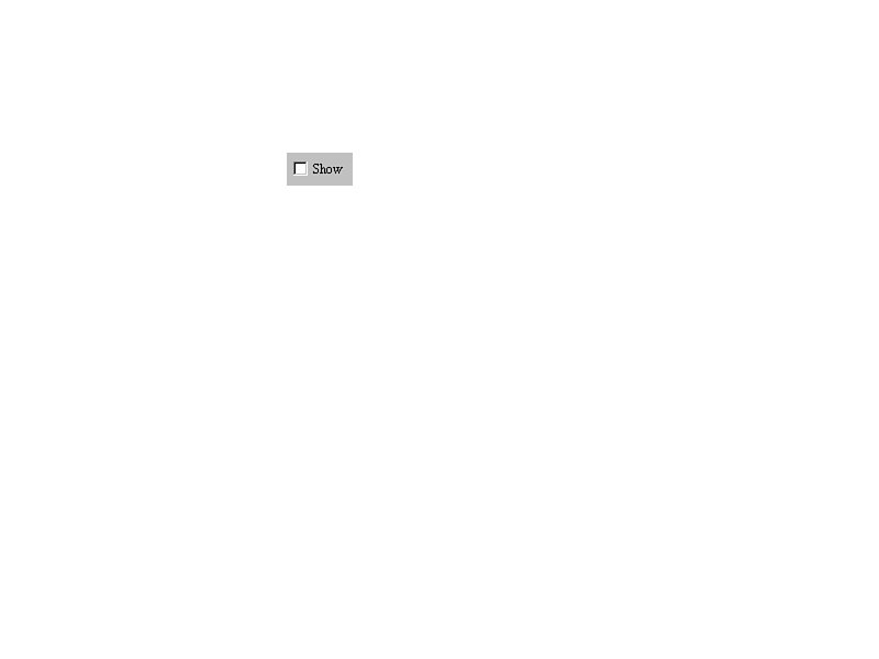 FIGURE 22.6.
The checkbox component.
Location:
java.awt.Checkbox
Checkbox()
Creates a blank Checkbox set to false.
Checkbox(String lbl)
Creates a Checkbox set to false with the label lbl.
Checkbox(String lbl, CheckboxGroup group, boolean state)
Creates a Checkbox set to state with the label lbl, contained in group CheckboxGroup.
Core component-specific methods:
String getLabel()
Returns the label of the Checkbox.
String setLabel(String lbl)
Sets the label of the Checkbox to lbl.
boolean getState()
Returns the state of the Checkbox.
void setState(boolean st)
Sets the state of the Checkbox to st.
CheckboxGroup getCheckboxGroup()
Returns the CheckboxGroup that the Checkbox belongs to, if any.
void setCheckboxGroup(CheckboxGroup g)
Sets the CheckboxGroup of the Checkbox to g.
Action:
Sends an action event when the state changes.
Example:
Checkbox aBox = new Checkbox(“Show”);
A Label is simply a piece of text that can be placed on a component (see Figure 22.7). Although a Label doesn’t do much, it can be quite useful to add text to an applet to clarify its functionality.
 FIGURE 22.7.
The Label component.
Location:
java.lang.Label
Label()
Creates an empty Label.
Label(String lbl)
Creates a Label with the text set to lbl.
Label(String lbl, int align)
Creates a Label with the text set to lbl and the alignment of the text set to one of the following:
Label.LEFT Left alignment
Label.CENTER Center alignment
Label.RIGHT Right alignment
Core component-specific methods:
int getAlignment()
Returns the alignment of the Label.
void setAlignment(int align)
Sets the alignment of the Label to align.
String getText()
Returns the text of the Label.
void setText(String lbl)
Sets the text of the Label to lbl.
Action:
None, by default.
Example:
Label aLabel = new Label(“Hello!”);
A List is a scrollable list of text items that a user can choose from (see Figure 22.8). This can be useful in circumstances where the applet you are creating can do multiple things. Forinstance, if you were writing a loan calculator, you might have a List that contained different loan lengths (12 month, 36 month, and so on). A List can allow one selection at a time or multiple selections.
 FIGURE 22.8.
The List component.
List()
Creates a new List with no visible lines, disallowing multiple selections.
List(int vlines, boolean scr)
Creates a new scrolling list with the number of visible lines set to vlines and also set to allow multiple selections based upon the Boolean scr.
Core component-specific methods:
void addItem(String item)
Add item at end of the List.
void addItem(String item, int index)
Add item at position index.
void clear()
Clears the List.
int countItems()
Returns the number of items currently in the List.
void delItem(int index)
Deletes item at index.
String getItem(int index)
Returns the item at index.
void replaceItem(String new_item, int index)
Replace item at index with new_item.
Example:
List aList = new List(); aList.addItem(“First”); aList.addItem(93"Second”);
A Scrollbar is a slideable bar that can be used for a variety of uses (see Figure 22.9). A Scrollbar is often used when it would be useful to enable the user to move quickly over a large area by sliding the scrollbar up and down. They can also be used to allow a proportional way to set a value. Additionally, a scrollbar can be oriented either horizontally or vertically.
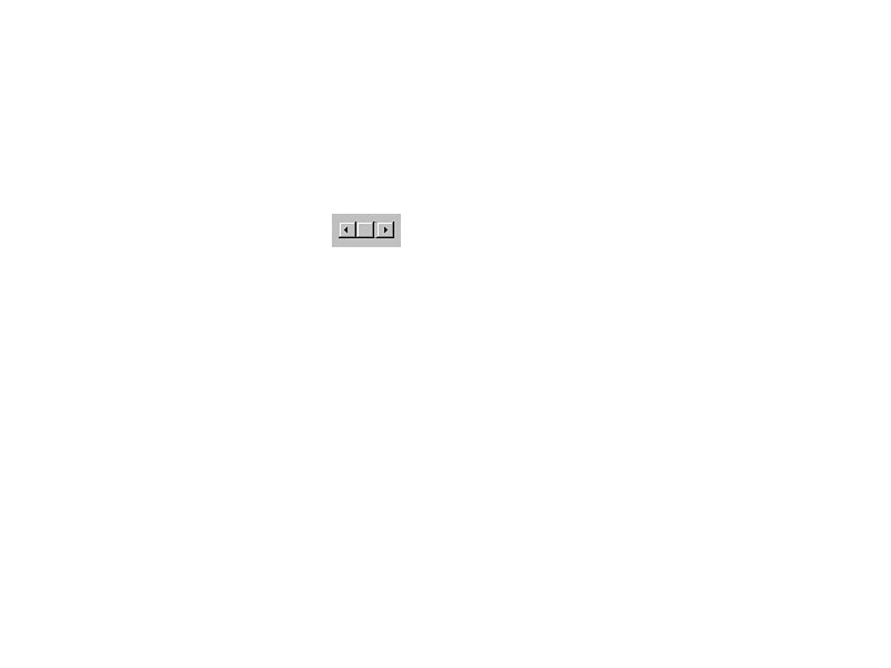 FIGURE 22.9.
The Scrollbar component.
Scrollbar()
Creates a Scrollbar oriented vertically.
Scrollbar(int orn)
Creates a Scrollbar oriented to orn, which can be one of the following:
Scrollbar.HORIZONTAL

Scrollbar.VERTICAL

Scrollbar(int orn, int val, int vis, int min, int max)
Creates a Scrollbar with orientation orn, default value val, page size vis, minimum value min, and maximum value max.
Core Component-specific methods:
int getOrientation()
Returns the orientation of the Scrollbar.
setValue(int val)
Sets the value of the Scrollbar to val.
int getMinimum()
Returns the minimum value of the Scrollbar.
int getMaximum()
Returns the maximum value of the Scrollbar.
int getVisible()
Returns the visible amount (page size) of the Scrollbar.
void setValue(int value)
Sets the value of the Scrollbar to val.
Example:
ScrollBar aScrollbar = new Scrollbar(Scrollbar.HORIZONTAL);
A TextField is a component that lets the user enter a single line of text (see Figure 22.10). This should be sufficient for almost all data entry that applets will need. Although the name implies that this component is oriented towards text, remember that numbers are text as well and a TextField does a wonderful job for entering numerical data.
 FIGURE 22.10.
The TextField component.
Constructors:
public TextField()
Creates a TextField.
public TextField(int cols)
Creates a TextField with cols number of columns.
public TextField(String txt)
Creates a TextField set to the string txt.
public TextField(String txt, int cols)
Creates a TextField set to txt with cols number of columns.
Core component-specific methods:
int getColumns()
Returns the number of columns in the TextField.
String getText()
Returns the text contained in this TextField.
void setText(String txt)
Sets the text of the TextField to txt.
Example:
TextField aTextField = new TextField(“37”, 5);
A TextArea is a text-editing component that is much like a TextField except that it allows multiple lines (see Figure 22.11). It is mainly useful for things such as comment fields or any otherapplication that needs the user to manipulate a significant amount of text.
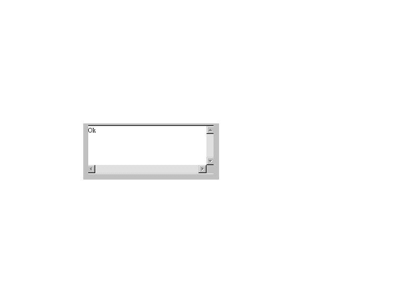 FIGURE 22.11
The TextArea component.
TextArea()
Creates a TextArea.
TextArea(int rw, int cl)
Creates a TextArea with rw number of rows and cl number of columns.
TextArea(String txt)
Creates a TextArea with the text set to txt.
TextArea(String text, int rw, int cl)
Creates a TextArea set with text set to txt, with rw number of rows and cl number of columns.
Core component-specific methods:
int getColumns()
Returns the number of columns in the TextField.
int getRows()
Returns the number of rows in the TextField.
String getText()
Returns the text contained in this TextComponent.
void setText(String txt)
Sets the text of the TextField to txt.
Example:
TextArea aTextArea = new TextArea(“Ok”, 5, 40);
Earlier it was mentioned that straightforwardness was one of the hallmarks of the design of the AWT. Here’s a good example of that straightforwardness: an applet that contains all of the components just covered—except Canvas, which by default has no real visual representation. (See Figure 22.12.) The source is provided in Listing 22.4.
     import java.awt.*;

     import java.applet.Applet;

     public class ManyComp extends Applet {

          Button aButton;

          Canvas aCanvas;

          Checkbox aBox;

          Label aLabel;

          List aList;

          Scrollbar aScrollbar;

          TextField aTextField;

          TextArea aTextArea;

          public void init() {

               aButton = new Button(“Ok”);

               aCanvas = new Canvas();

               aBox = new Checkbox(“Show”);

               aLabel = new Label(“Hello!”);

               aList = new List();

               aScrollbar = new Scrollbar(Scrollbar.HORIZONTAL);

               aTextField = new TextField(“37”, 5);

               aTextArea = new TextArea(“Ok”, 5, 40);

               aList.addItem(“First”);

               aList.addItem(“Second”);

                add(aButton);

               add(aCanvas);

               add(aBox);

               add(aLabel);

               add(aList);

               add(aScrollbar);

               add(aTextField);

               add(aTextArea);

          }


    }

<applet code=ManyComp.class width=250 height=600></applet>
 FIGURE 22.12.
An example applet with many components.
Containers are simply components that can contain other components. They are themselves components and can thus contain other containers. Think of them as a way to subdivide an area to construct the user interface into plots into which components can be placed, or even subdivided further.
There are two general types of containers: Panels and Windows. The major difference between them is that a Panel is a defined area on a window that already exists, whereas a Window is an entirely new window (see the next section). Also, the Applet class is a subclass of Panel, so an Applet can be treated just like a Panel. (See Figure 22.13.)
Let’s look at an example:
import java.awt.*;

     import java.applet.Applet;

     public class Example4 extends Applet {

          Button button1, button2;

          public void init() {

               button1 = new Button(“First”);

                   add(button1);

               button2 = new Button(“Second”);

               add(button2);

          }

     }

<applet code=Example4.class width=250 height=100></applet>
 FIGURE 22.13.
Using containers.
After the component is created, all that needs to be done is to call the add() method for the container with the specified component. If your interface is quite simple, adding components to a container in this manner might be enough. However, if you desire to have some control over the placement of the components a Layout can be used.
A Layout can be thought of as a template that is placed over a container to define how components will be added. The most common layout is BorderLayout(), which orients components according to compass points, except center which gets the space left over. All the layouts are listed in Table 22.3.
Table 22.3. Standard AWT layouts.
The Layout of a Panel is established with the setLayout() method and then new components are added using the add() method with an argument indicating placement before the component to be added, which can be one of “North,” “South,” “East,” “West,” or “Center,” demonstrated in Listing 22.5. (See Figure 22.14.)
import java.awt.*;

     import java.applet.Applet;

     public class Example5 extends Applet {

          Button button1, button2;


          public void init() {

               setLayout(new BorderLayout());

               button1 = new Button(“First”);

               add(“North”, button1);

               button2 = new Button(“Second”);

               add(“South”, button2);

           }

     }

<applet code=Example5.class width=250 height=100></applet>
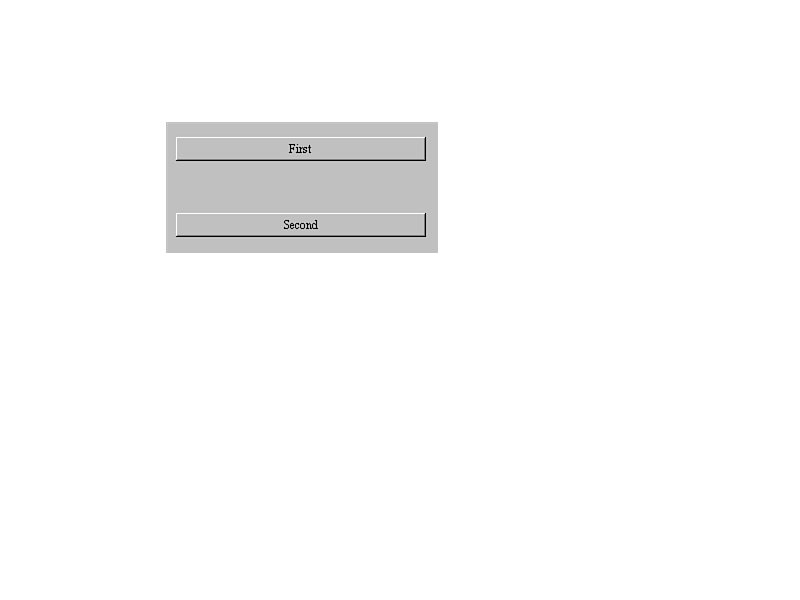 FIGURE 22.14.
Adding a Layout to an applet.
A Window is a special kind of container: A completely separate window from the base is constructed when one is created. A Frame is a subclass of Window that allows menus to be added to the window. See Listing 22.6 and Figure 22.15.
     import java.awt.*;

     import java.applet.Applet;

     public class FrameExample extends Applet {

          Frame aFrame;


          public void init() {

               aFrame = new Frame(“Example Frame”);

               aFrame.show();

          }

     }

<applet code=FrameExample.class width=250 height=100></applet>
When the Frame is created it is by default invisible. It is a good idea to resize it to the desired shape first with resize(), add the desired components (if any), then call the show() method of the Frame, which displays the Frame.
 FIGURE 22.15.
Adding a Window to an applet.
The bulk of the AWT is subclassed from the Component class. Thankfully, the Component class contains a great deal of functionality that is available to all of the subclassed components.
Unfortunately, the AWT currently does not include the concept of machine-independent sizing, so it is not possible to specify movement or sizing in real world measurements (inches, centimeters, and so on). In current implementations of Java you can expect the coordinates used to correspond to machine pixels.
To change the size of a component, use the resize() method:
void resize(int width, int height)
To move the component use the move() method:
void move(int x, int y)
Color in Java is abstracted into the Color class, which has a number of static variables to represent color (see Table 22.4), along with the ability to specify an arbitrary color with an instance of the Color object, as follows:
Color aColor = new Color(int r, int g, int b)
r, g, and b, are the red, green, and blue components specified in a 24-bit palette.
| TIP |
|---|
| Remember that static variables do not require an instance of the class to use them, so the color black can be generated just by using Color.black. |
Table 22.4. Standard Java color variables.
black
blue
cyan
darkGray
gray
green
lightGray
magenta
orange
pink
red
white
yellow
The foreground color of a component can be set with the setForeground method, as follows:
setForeground(Color.green)
The background color can be set with the setBackground method, as follows:
void setBackground(Color.black)
A component can effectively be turned on or turned off by setting it enabled or disabled. To disable a component, use the enable method as follows:
enable()
To enable the component, use the disable method as follows:
disable()
Suppose we wanted to create simple calculator applet. It would make sense to build the user interface first, then add functionality step by step. Thus, let’s start with the main Applet. A calculator would definitely require a display, so let’s add that first, as follows:
import java.awt.*;

import java.applet.Applet;

     public class Calculator extends Applet {

          Label display;

          public void init() {

               setLayout(new BorderLayout());

               display = new Label(“0”, 10);

               add(“North”, display);

          }

    }
A BorderLayout makes sense here because the display will always be at the top of the screen. Adding the keyboard is a bit trickier. There will need to be 10 number buttons and 4 operation keys grouped together. This calls for a few more panels with the appropriate keys added. This is implemented in Listing 22.7.
     public class Calculator extends Applet {

          Label display;

          Panel bottom;

          Panel num_panel;

          Panel func_panel;

          Button number[] = new Button[10];

          Button function[] = new Button[6];


          public void init() {

               setLayout(new BorderLayout());

               display = new Label(“0”, Label.RIGHT);

               add(“North”, display);


               bottom = new Panel();

               bottom.setLayout(new BorderLayout());

               num_panel = new Panel();

               num_panel.setLayout(new GridLayout(4,3));

               for (int x=9; x>=0; x--) {

                    number[x] = new Button((new String()).valueOf(x));

                    num_panel.add(number[x]);

               }

               function[4] = new Button(“.”);

               num_panel.add(function[4]);

               function[5] = new Button(“=”);

               num_panel.add(function[5]);

               bottom.add(“Center”, num_panel);

               func_panel = new Panel();

               func_panel.setLayout(new GridLayout(4,1));

               function[0] = new Button(“+”);

               function[1] = new Button(“-”);

               function[2] = new Button(“*”);

               function[3] = new Button(“/”);


               for (int x=0; x<4; x++)

                    func_panel.add(function[x]);

               bottom.add(“East”, func_panel);

               add(“Center”, bottom);

          }

     }

<applet code=Calculator.class width=135 height=140></applet>
Figure 22.16 shows the applet. The original panel has been subdivided twice. At the top of the applet is the label for the display; below that is a panel for all of the keys. However, this panel must be again subdivided to group the number and function keys separately. Thus, a number panel and a function panel are added.
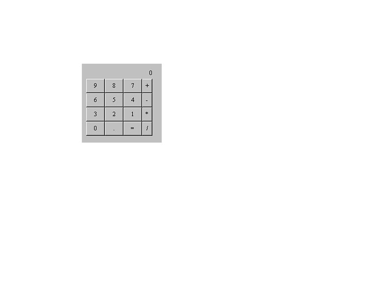 FIGURE 22.16.
A calculator user interface.
Because the lower panels contain keys, it makes sense to use a layout that is conducive to this. The GridLayout fits the purpose perfectly: It allows a grid to be specified and then components are added left to right and top to bottom until it is full.
The function panel then is added to the “East” (right) side of the lower panel, leaving the rest of the space to the number keys. The number keys are specified to be “Center,” and thus use up all of the space remaining in the panel.
This provides a mock-up of how the final calculator will work and gives an idea of user-interface considerations that need to be considered and also design decisions that are integral to the whole applet. For example, should all of the processing be contained in the main applet class, or should the panels become separate classes to isolate functionality and promote code reuse? These and other issues will be discussed in Chapter 24, “Programming Applets,” where the calculator applet is completed.
In this chapter the most important topics of the AWT have been covered. The two most important things to remember are components and events. First, all user interface items (Button, Checkbox, and so on) are called components and are subclassed from the Component class. This gives a core set of functionality to all interface components in the AWT.
Second, when the user interacts with a component in the AWT, an Event is generated and is sent to that component. Think of an Event as the language the AWT uses to communicate.
The AWT is certainly a complex topic, and building user interfaces in it is not trivial. However, because it leverages Java’s strong support for object-oriented programming, it is certainly manageable.