|
|
Using Swing Components |
Use Swing'sJColorChooserclass to provide users with a palette of colors to choose from. A color chooser is a component that you can place anywhere within your program's GUI. The
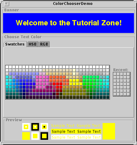
JColorChooserAPI also makes it easy to bring up a dialog (modal or not) that contains a color chooser.Here's a picture of an application that uses a color chooser to set the text color in a banner:
[PENDING: add call-outs to various parts of color chooser in previous figure]
The source code for the program is in
ColorChooserDemo.java.The color chooser consists of everything within the border labelled Choose Text Color. This is what a standard color chooser looks like in the Java Look and Feel. It contains two parts, a tabbed pane and a preview panel. The three tabs in the tabbed pane each select a different chooser panel. The preview panel displays the currently selected color.
Here's the code from the example that creates a
JColorChooserinstance and adds it to the demo's window:The constructor used to create the color chooser takes afinal JLabel banner = new JLabel("Welcome to the Tutorial Zone!", JLabel.CENTER); banner.setForeground(Color.yellow); ... final JColorChooser tcc = new JColorChooser(banner.getForeground()); ... getContentPane().add(tcc, BorderLayout.CENTER);Colorargument, which specifies the initially selected color in the chooser. If left unspecified, the color chooser initially displaysColor.white.A color chooser uses an instance of
ColorSelectionModelHere's the code that registers and implements the change listener:
This change listener gets the currently selected color from the color chooser and uses it to set the banner's text color. See How to Write a Change Listener for general information about change listeners and change events.tcc.getSelectionModel().addChangeListener( new ChangeListener() { public void stateChanged(ChangeEvent e) { Color newColor = tcc.getColor(); banner.setForeground(newColor); } } );A basic color chooser, like the one used in the example program, is sufficient for many programs. However, the color chooser API allows you to customize a color chooser by providing it with a preview panel of your own design, by adding your own chooser panels to it, or by removing existing chooser panels from the color chooser. Additionally, the
JColorChooserclass provides two methods that make it easy to use a color chooser within a dialog.This section discusses these topics:
- ColorChooserDemo: Take 2
- Showing a Color Chooser in a Dialog
- Removing or Replacing the Preview Panel
- Creating a Custom Chooser Panel
- The Color Chooser API
- Examples that Use Color Choosers
ColorChooserDemo: Take 2
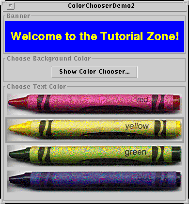
Now turn your attention toColorChooserDemo2, a modified version of the previous demo program that uses more of theJColorChooserAPI.Here's a picture of
ColorChooserDemo2:In addition to the main source file,ColorChooserDemo2.java, you also needCrayonPanel.javaand the four crayon images (red.gif,yellow.gif,green.gif, andblue.gif) to run this program.This program adds a button for bringing up a color chooser in a dialog, which you can use to set the banner's background color. See Showing a Color Chooser in a Dialog for code and details.
Additionally, this program customizes the banner's text color chooser in these ways:
Removing or Replacing the Preview Panel covers the first customization. Creating a Custom Chooser Panel discusses the last two.
- Removes the preview panel
- Removes all of the default chooser panels
- Adds a custom chooser panel
Showing a Color Chooser in a Dialog
TheJColorChooserclass provides two class methods to make it easy to use a color chooser in a modal dialog. The new demo program uses one of these methods,showDialog, to display the background color chooser when the user clicks the Show Color Chooser... button. Here's the single line of code from the example that brings up the background color chooser in a modal dialog:The dialog disappears under three conditions: the user chooses a color and clicked the OK button, the user cancels the operation with the Cancel button, or the user dismisses the dialog with a frame control. If the user chooses a color, theColor newColor = JColorChooser.showDialog(ColorChooserDemo2.this, "Choose Background Color", banner.getBackground());showDialogmethod returns the new color. If the user cancels the operation or dismisses the window, the method returnsnull. Here's the code from the example that updates the banner's background color according to the value returned byshowDialog:if (newColor != null) { banner.setBackground(newColor); }JColorChooserprovides another method to help you use a color chooser in a dialog. ThecreateDialogmethod creates and returns a dialog, letting you specify action listeners for the OK and Cancel buttons in the dialog window. UseJDialog'sshowmethod to display the dialog created by this method. For an example that uses this method, see Specifying Other Editors on the How to Use Tables page.Replacing or Removing the Preview Panel
By default, the color chooser displays a preview panel. The example program removes the text color chooser's preview panel with this line of code:This effectively removes the preview panel because a plaintcc.setPreviewPanel(new JPanel());JPanelhas no size and no default view.To provide a custom preview panel, you also use
setPreviewPanel. The component you pass into the method should inherit fromJComponent, specify a reasonable size, and provide a customized view of the current color. To get notified when the user changes the color in the color chooser, the preview panel must register as a change listener on the color chooser's color selection model as described previously.Creating a Custom Chooser Panel
The default color chooser provides three chooser panels:You can extend the default color chooser by adding chooser panels of your own design with
- Swatches -- for choosing a color from a collection of swatches.
- HSB -- for choosing a color using the Hue-Saturation-Brightness color model.
- RGB -- for choosing a color using the Red-Green-Blue color model.
addChooserPanelor you can limit it by removing chooser panels withremoveChooserPanel.If you want to remove all of the default chooser panels and add one or more of your own, you can do this with a single call to
setChooserPanels.ColorChooserDemo2uses this method to replace the default chooser panels with an instance ofCrayonPanel, a custom chooser panel. Here's the call tosetChooserPanelsfrom that example:The code is straighforward: it creates an array containing the//Override the chooser panels with our own AbstractColorChooserPanel panels[] = { new CrayonPanel() }; tcc.setChooserPanels(panels);CrayonPanel. Next the code callssetChooserPanelsto set the contents of the array as the color chooser's chooser panels.
CrayonPanelis a subclass ofAbstractColorChooserPanel
void buildChooser()- Creates the GUI that comprises the chooser panel. The example creates four toggle buttons -- one for each crayon -- and adds them to the chooser panel.
void updateChooser()- This method is called whenever the chooser panel is displayed. The example's implementation of this method selects the toggle button that represents the currently selected color.
public void updateChooser() {
    Color color = getColorFromModel();
    if (color.equals(Color.red)) {
        redCrayon.setSelected(true);
    } else if (color.equals(Color.yellow)) {
        yellowCrayon.setSelected(true);
    } else if (color.equals(Color.green)) {
        greenCrayon.setSelected(true);
    } else if (color.equals(Color.blue)) {
        blueCrayon.setSelected(true);
    }
}
String getDisplayName()- Returns the display name of the chooser panel. The name is used on the tab for the chooser panel. Here's the example's
getDisplayNamemethod:public String getDisplayName() { return "Crayons"; }Icon getSmallDisplayIcon()- Returns a small icon to represent this chooser panel. This is currently unused. Future versions of the color chooser might use this icon or the large one to represent this chooser panel in the display. The example's implementation of this method returns
null.
Icon getLargeDisplayIcon()- Returns a large icon to represent this chooser panel. This is currently unused. Future versions of the color chooser might use this icon or the small one to represent this chooser panel in the display. The example's implementation of this method returns
null. In addition to these overridden methods,CrayonPanelhas one constructor that just callssuper().The Color Chooser API
The following tables list the commonly usedJColorChooserconstructors and methods. The API for using color choosers falls into these categories:
- Creating and Displaying a Color Chooser
- Customizing the Color Chooser's UI
- Setting or Getting the Current Color
Creating and Displaying a Color Chooser Method Purpose JColorChooser()
JColorChooser(Color)
JColorChooser(ColorSelectionModel)Create a color chooser. The default constructor creates a color chooser with an initial color of Color.white. Use the second constructor to specify a different initial color. TheColorSelectionModelargument, when present, provides the color chooser with a color selection model.Color showDialog(Component, String, Color)Create and show a color chooser in a modal dialog. The Componentargument is the dialog's parent, theStringargument specifies the dialog's title, and theColorargument specifies the chooser's initial color.JDialog createDialog(Component, String, boolean, JColorChooser, ActionListener, ActionListener)Create a dialog for the specified color chooser. As with showDialog, theComponentargument is the dialog's parent and theStringargument specifies the dialog's title. The other arguments are as follows: thebooleanspecifies whether the dialog is modal, theJColorChooseris the color chooser to displayin the dialog, the firstActionListeneris for the OK button, and the second is for the Cancel button.
Customizing the Color Chooser's UI Method Purpose void setPreviewPanel(JComponent)
JComponent getPreviewPanel()Set or get the component used to preview the color selection. To remove the preview panel, use new JPanel()as an argument. To specify the default preview panel, usenull.void setChooserPanels(AbstractColorChooserPanel[])
AbstractColorChooserPanel[] getChooserPanels()Set or get the chooser panels in the color chooser. void addChooserPanel(AbstractColorChooserPanel)
AbstractColorChooserPanel removeChooserPanel(AbstractColorChooserPanel)Add a chooser panel to the color chooser or remove a chooser panel from it.
Setting or Getting the Current Color Method Purpose void setColor(Color)
void setColor(int red, int green, int blue)
void setColor(int)
Color getColor()Set or get the currently selected color. The three integer version of the setColormethod interprets the three integers together as an RGB color. The single integer version of thesetColormethod divides the integer into four 8-bit bytes and interprets the integer as an RGB color as follows:
void setSelectionModel(ColorSelectionModel)


    ColorSelectionModel getSelectionModel()
Set or get the selection model for the color chooser. This object contains the current selection and fires change events to registered listeners whenever the selection changes. Examples that Use Color Choosers
This table shows the examples that useJColorChooserand where those examples are described.
Example Where Described Notes ColorChooserDemo.javaThis page Uses a basic color chooser. ColorChooserDemo2.javaThis page Uses one customized color chooser and one created with showDialog.TableDialogEditDemo.javaHow to Use Tables Shows how to use a color chooser as a custom cell editor in a table. The color chooser used by this example is created with createDialog.
|
|
Using Swing Components |