
by Mark Wutka
As you learned in Chapter 29, the AWT is a platform-independent user interface toolkit. In addition to the raw graphics functions presented in Chapter 29, the AWT contains a higher-level set of tools that includes buttons, lists, scroll bars, and other common components.
The AWT contains a number of familiar user interface elements. Figure 29.1 shows a Java applet with a sample of some of the components of the AWT.
The AWT features a number of familiar components.
Figure 29.2 shows you a portion of the AWT’s inheritance hierarchy.
The AWT inherits all of its user interface components from Component.
Components are the building blocks of the AWT. The end-user interacts directly with these components. The components provided by the AWT are:
You need more than just components to create a good user interface. The components need to be organized into manageable groups. That’s where containers come in. Containers contain components. You cannot use a component in the AWT unless it is contained within a container. A component without a container is like a refrigerator magnet without a refrigerator. The containers defined in the AWT are:
Even if you don’t create a container in your applet, you are still using one. The Applet class is a subclass of the Panel class.
Even though a container is a place where your user interface (UI) components can be stored neatly, you still need a way to organize the components within a container. That’s where the layout managers come in. Each container is given a layout manager that decides where each component should be displayed. The layout managers in the AWT are:
Although buttons are simple mechanisms, they are some of the workhorses of any graphical interface. You find buttons on toolbars, dialog boxes, windows, and even in other components, such as scroll bars.
The only decision you must make when creating a button is whether you want the button to be labeled. There are no other options for buttons.
To create an unlabeled button, use the empty constructor:
public Button()
Creating a labeled button is an equally simple task:
public Button(String label)
Once you have created a button, you need to add it to a container. Because your applet is already a container, you can add a button directly to your applet:
Button myButton = new Button(“Press Me”);
add(myButton);
To change the label of a button, use setLabel:
public void setLabel(String newLabel)
To get the label for a button, use getLabel:
public String getLabel()
Now that you are able to create a button and add it to your applet, it’s time to learn how to make the button do something.
All the components within the AWT have an action method that is called when an action is taken on the component. In the case of the button, action is called when the button is pressed. The action method is similar to some of the event-handling methods you may have come across already, such as keyDown or mouseDown.
The format of the action method in all components is:
public boolean action(Event event, Object whatAction)
where event is the event that has occurred in the component, and whatAction indicates what has occurred.
For buttons, whatAction is the label of the button that has been pressed. The event parameter contains other information specific to the action, such as the component where (event.target) and when (event.when) the action occurred.
Now that you know how to create a button and check for an action, you can create a button applet. A very simple example is an applet with buttons that change its background color. One way to do this is to put the name of the color in the button label. Then, in the action method, you look at the label of the button that was pressed and set the applet’s background color based on the label. For example, the button to turn the background blue could be labeled Blue. The action method would set the background to blue if the button’s label was blue. The applet in listing 29.1 demonstrates how to do this.
Listing 29.1 Source code for Button1Applet.java.
import java.applet.*;
import java.awt.*;
// Example 29.1 - Button1Applet
//
// This applet creates two buttons named "Red" and "Blue". When a
// button is pressed, the background color of the applet is set to
// the color named by that button's label.
//
public class Button1Applet extends Applet
{
public void init()
{
add(new Button("Red"));
add(new Button("Blue"));
}
public boolean action(Event evt, Object whatAction)
{
// Check to make sure this is a button action, if not,
// return false to indicate that the event has not been handled.
if (!(evt.target instanceof Button))
{
return false;
}
String buttonLabel = (String) whatAction;
if (buttonLabel == "Red")
{
setBackground(Color.red);
}
else if (buttonLabel == "Blue")
{
setBackground(Color.blue);
}
repaint(); // Make the change visible immediately
return true;
}
}
You learn a better way to design this applet in the section “Object-Oriented Thinking” later in this chapter.
Figure 29.3 shows you the Button1Applet in operation.
The buttons in Button1Applet change the applet’s
background color.
Labels are the simplest of the AWT components. They are text strings that are used only for decoration. Because they are components, labels have an action method, but because they are “display-only,” their action method never gets called.
There are three different ways to create a label. The simplest is to create an empty label:
public Label()
Of course, an empty label isn’t going to do you much good because there is nothing to see. You can create a label with some text by passing the text to the constructor:
public Label(String labelText)
Labels can be left-justified, right-justified, or centered. The variables Label.LEFT, Label.RIGHT, and Label.CENTER can be used to set the alignment of a label when you create it:
public Label(String labelText, int alignment)
Here is an example of how to create a right-justified label:
Label myLabel = new Label(“This is a right-justified label”, Label.RIGHT);
You can change the text of a label with setText:
public void setText(newLabelText)
You can also get the text of a label with getText:
public String getText()
You can change the alignment of a label with setAlignment:
public void setAlignment(int alignment) throws IllegalArgumentException
You can also get the alignment of a label with getAlignment:
public int getAlignment()
Figure 29.4 shows you a sample label.
Labels are simply text strings.
Checkboxes are similar to buttons except that they are used as “yes-no” or “on-off” switches. Every time you click a checkbox, it changes from “off” to “on” or from “on” to “off.” A close cousin to the checkbox is the radio button. Radio buttons are also “on-off” switches, but they are arranged in special mutually exclusive groups where only one button in a group can be on at a time. Imagine what a radio would sound like if more than one station could be on at a time!
A checkbox contains two parts—a label and a state. The label is the text that is displayed next to the checkbox itself, while the state is a boolean variable that indicates whether the box is checked. By default, the state of a checkbox is false, or “off.”
The Checkbox class has three constructors:
public Checkbox()
creates a checkbox with no label.
public Checkbox(String label)
creates a labeled checkbox.
public Checkbox(String label, CheckboxGroup group,
boolean initialState)
creates a labeled checkbox that is checked if initialState is true. The group parameter indicates what checkbox group this checkbox belongs to. The CheckboxGroup class allows you to group checkboxes into mutually-exclusive radio buttons. If you are creating a checkbox and not a radio button, pass null as the group.
You may check to see if a checkbox has been checked by using getState:
public boolean getState()
For example:
if (myCheckbox.getState()) {
// The box has been checked
} else {
// The box has not been checked
}
A radio button is just a special case of a checkbox. No RadioButton class exists. Instead, you create a set of radio buttons by creating checkboxes and putting them in the same checkbox group. The constructor for CheckboxGroup takes no arguments:
public CheckboxGroup()
Once you have created a checkbox group, you add checkboxes to the group by passing the group to the checkbox constructor. In other words, instead of adding existing checkboxes to a group explicitly, you create new checkboxes that belong to the group.
The following code fragment creates a checkbox group, then creates some checkboxes that belong to the group, and then adds them to the applet:
CheckboxGroup myCheckBoxGroup = new CheckboxGroup();
add(new Checkbox(“Favorite language is Java”, myCheckboxGroup, true));
add(new Checkbox(“Favorite language is Visual Cobol”, myCheckboxGroup, false));
add(new Checkbox(“Favorite language is Backtalk”, myCheckboxGroup, false));
You can find out which radio button is selected by either calling getState on each checkbox or calling getCurrent on the CheckboxGroup. The getCurrent method returns the checkbox that is currently selected:
public Checkbox getCurrent()
The action method for a checkbox or radio button is called whenever it is clicked. The whichAction parameter of the action method will be an instance of a Boolean class that is true if the checkbox was clicked on, or false if the checkbox was clicked off.
If you create an action method for a radio button, you should not rely on the whichAction parameter to contain the correct value. If a radio button is clicked when it is already on, the whichAction contains a false value, even though the button is still on. You are safer just using the getState method to check the state of the radio button or the checkbox.
You can also use the getLabel method to determine which checkbox has been checked. The following code fragment shows an action method that responds to a box being checked and retrieves the current state of the box:
public boolean action(Event evt, Object whichAction)
{
if (evt.target instanceof Checkbox) // make sure this is a checkbox
{
Checkbox currentCheckbox = (Checkbox)evt.target;
boolean checkboxState = currentCheckbox.getState();
if (currentCheckbox.getLabel() == “Check me if you like Java”)
{
if (checkboxState)
{
// Code to handle “Check me if you like Java” being set to on
}
else
{
// Code to handle “Check me if you like Java” being set to off
}
return true; // the event has been handled
}
}
return false; // the event has not been handled
}
Figure 29.5 shows you some checkboxes and a group of three radio buttons.
Checkboxes are squared boxes with checks in them. Radio buttons are rounded and checked with dots.
The Choice class provides a pop-up menu of text string choices. The current choice is displayed as the menu title.
To create a choice pop-up menu, you must first create an instance of the Choice class. Because there are no options for the choice constructor, the creation of a choice should always look something like this:
Choice myChoice = new Choice();
Once you have created the choice, you can add string items using the addItem method:
public synchronized void addItem(String item)
throws NullPointerException
For example:
myChoice.addItem(“Moe”);
myChoice.addItem(“Larry”);
myChoice.addItem(“Curly”);
You may also change which item is currently selected either by name or index:
public synchronized void select(int pos)
throws IllegalArgumentException
public void select(String str)
If you want Curly to be selected, for instance, you could select him by name:
myChoice.select(“Curly”); // Make “Curly” become selected item
You could also select Curly by his position in the list. Because he was added third and the choices are numbered starting at 0, Moe would be 0, Larry would be 1, and Curly would be 2:
myChoice.select(2); // Make the third list entry become selected
The getSelectedIndex method will return the position of the selected item:
public int getSelectedIndex()
Again, if Curly was selected, getSelectedIndex would return 2. Similarly, the getSelectedItem method returns the string name of the selected item:
public String getSelectedItem()
If Curly was selected, getSelectedItem would return Curly.
If you have an index value for an item and you want to find out the name of the item at that index, you can use getItem:
public String getItem(int index)
Figure 29.6 shows a choice in its usual form, while figure 29.7 shows a choice with its menu of choices pulled down.
The choice box displays its current selection.
The button on the right of a choice pops up a menu of the possible choices.
The action method for a choice is called whenever a choice is made, even if it is the same choice. The whatAction parameter contains the name of the selected item. The following code fragment gives an example action method for a choice where the selection is stored in a String variable within the applet:
String currentStooge;
public boolean action(Event event, Object whatAction)
{
// Check to make sure this is a choice object, if not
// indicate that the event has not been handled.
if (!(event.target instanceof Choice))
{
return false;
}
Choice whichChoice = (Choice) event.target;
// See if this is an action for myChoice
if (whichChoice == myChoice)
{
currentStooge = (String) whatAction;
return true; // the event has been handled
}
return false; // it must have been a different Choice
}
The List class allows you to create a scrolling list of values that may be selected either individually or many at a time. You may add and delete items from the list at any time, and even change which items are selected. The AWT handles all the scrolling for you.
You have two options when creating a list. The default constructor for the List class allows you to create a list that does not allow multiple selections:
public List()
You may also set the number of list entries that are visible in the list window at any one time as well as determine whether to allow multiple selections:
public List(int rows, boolean allowMultipleSelections)
The following code fragment creates a list with 10 visible entries and multiple selections turned on:
List myList = new List(10, true); // True means allow multiple selections
Once you have created the list, you can add new entries with the addItem method:
public synchronized void addItem(String item)
For example:
myList.addItem(“Moe”);
myList.addItem(“Larry”);
myList.addItem(“Curly”);
You may also add an item at a specific position in the list:
public synchronized void addItem(String item, int index)
The list positions are numbered from 0, so if you add an item at position 0, it goes to the front of the list. If you try to add an item at position -1 or at a position higher than the number of positions, the item will be added to the end of the list. The following code adds Shemp to the beginning of the list and Curly Joe to the end:
myList.addItem(“Shemp”, 0); // Add Shemp at position 0
myList.addItem(“Curly Joe”, -1); // Add Curly Joe to the end of the list
The List class provides a number of different methods for changing the contents of the list. The replaceItem method replaces an item at a given position with a new item:
public synchronized void replaceItem(String newValue, int position)
myList.replaceItem(“Dr. Howard”, 0);
// Replace the first item in the list with “Dr. Howard”
You can delete an item in the list with deleteItem:
public synchronized void delItem(int position)
The deleteItems method deletes a whole range of items from the list:
public synchronized void delItems(int start, int end)
The following code removes items from the list starting at position 2, up to and including position 5:
myList.deleteItems(2, 5);
// Delete from position 2 up to and including position 5
You can delete all of the items in the list with the clear method:
public synchronized void clear()
The getSelectedIndex method returns the index number of the currently selected item or -1 if no item is selected:
public synchronized int getSelectedIndex()
You can also get the selected item directly with getSelectedItem:
public synchronized String getSelectedItem()
For lists with multiple selections turned on, you can get all of the selections with getSelectedIndexes:
public synchronized int[] getSelectedIndexes()
The getSelectedItems returns all of the selected items:
public synchronized String[] getSelectedItems()
You select any item by calling the select method with the index of the item you want selected:
public synchronized void select(int index)
If the list does not allow multiple selections, the previously selected item will be deselected.
You may deselect any item by calling the deselect method with the index of the item you want deselected:
public synchronized void deselect(int index)
The isSelected method tells you whether the item at a particular index is selected:
public synchronized boolean isSelected(int index)
For example:
if (myList.isSelected(0))
{
// the first item in the list is selected
}
You may turn multiple selections on and off with the setMultipleSelections method:
public void setMultipleSelections(boolean allowMultiples)
The allowsMultipleSelections method returns true if multiple selections are allowed:
public boolean allowsMultipleSelections()
For example:
if (myList.allowsMultipleSelections())
{
// multiple selections are allowed
}
Sometimes you may want to make sure a particular item is visible in the list window. You can do just that by passing the index of the item you want to make visible to makeVisible:
public void makeVisible(int index)
For example, suppose the list was positioned on item 0, but you wanted to make sure item 15 was showing in the window instead. You would call:
myList.makeVisible(15); // Make item 15 in the list visible
Unlike the previous user interface components you have encountered, the List class does not make use of the action method. Instead, you must use the handleEvent method to catch list selection and deselection events. The handleEvent method is called whenever you select or deselect an item in a list. The format of handleEvent is:
public boolean handleEvent(Event event)
When an item on a list is selected, event.id will be equal to Event.LIST_SELECT, and event.arg will be an instance of an integer whose value is the index of the selected item. The deselect event is identical to the select event except that event.id is Event.LIST_DESELECT. LIST_SELECT and LIST_DESELECT are declared in the Event class as static variables, as are all other event types.
The applet in listing 29.2 sets up a List containing several values and uses a label to inform you whenever an item is selected or deselected:
Listing 29.2 Source code for ListApplet.java.
// Example 29.2 - ListApplet
//
// This applet creates a scrolling list with several choices and
// informs you of selections and deselections using a label.
//
import java.applet.*;
import java.awt.*;
public class ListApplet extends Applet
{
Label listStatus;
List scrollingList;
public void init()
{
// First, create the List
scrollingList = new List(3, true);
// Now add a few items to the list
scrollingList.addItem("Moe");
scrollingList.addItem("Larry");
scrollingList.addItem("Curly");
scrollingList.addItem("Shemp");
scrollingList.addItem("Curly Joe");
// Set Shemp to be selected
scrollingList.select(3);
// Finally, add the list to the applet
add(scrollingList);
// Now create a label to show us the last event that occurred
listStatus = new Label("You selected entry Shemp");
add(listStatus);
}
public boolean handleEvent(Event evt)
{
String selectionString;
Integer selection;
// Since we are handling events in the applet itself,
// we need to check to make sure the event is for the scrollingList.
if (evt.target == scrollingList)
{
// Check to see if this is a selection event
if (evt.id == Event.LIST_SELECT)
{
// selection is the index of the selected item
selection = (Integer) evt.arg;
// use getItem to get the actual item.
selectionString = "You selected entry "+
scrollingList.getItem(
selection.intValue());
// Update the label
listStatus.setText(selectionString);
}
else if (evt.id == Event.LIST_DESELECT)
{
// If this is a deselection, get the deselected item
// selection is the index of the selected item
selection = (Integer) evt.arg;
// use getItem to get the actual item.
selectionString = "You deselected entry "+
scrollingList.getItem(
selection.intValue());
// Update the label
listStatus.setText(selectionString);
}
}
return true;
}
}
Figure 29.8 shows the output from ListApplet.
The ListApplet program lets you select and deselect list items.
The AWT provides two different classes for entering text data—TextField and TextArea. The TextField class handles only a single line of text, while the TextArea handles multiple lines. Both of these classes share many similar methods because both are derived from a common class called TextComponent.
The easiest way to create a text field is with the empty constructor:
public TextField()
The empty constructor will create an empty text field with an unspecified number of columns. If you want to control how many columns are in the text field, you can do so with:
public TextField(int numColumns)
Sometimes you may want to initialize the text field with some text when you create it:
public TextField(String initialText)
Rounding out these combinations is a method for creating a text field that is initialized with text and has a fixed number of columns:
public TextField(String initialText, int numColumns)
It should come as no surprise to you that the methods for creating text areas are similar to those for text fields. In fact, they are identical, except that when giving a fixed size for a text area, you must give both columns and rows. You can create an empty text area with an unspecified number of rows and columns by using the empty constructor:
public TextArea()
You can initialize an area that contains some text with:
public TextArea(String initialText)
You can give a text area a fixed number of rows and columns with:
public TextArea(int numRows, int numColumns)
Finally, you can create a text area that has some initial text and a fixed size with:
public TextArea(String initialText, int numRows, int numColumns)
The TextComponent abstract class implements a number of useful methods that may be used on either TextArea or TextField classes.
You will probably want to put text into the component at some point. You can do that with setText:
public void setText(String newText)
You will certainly want to find out what text is in the component. You can use getText to do that:
public String getText()
You can find out what text has been selected (highlighted with the mouse) by using getSelectedText:
public String getSelectedText()
You can also find out where the selection starts and ends. The getSelectionStart and getSelectionEnd methods return integers that indicate the position within the entire text where the selection starts and ends:
public int getSelectionStart()u>
public int getSelectionEnd()
For instance, if the selection started at the very beginning of the text, getSelectionStart would return 0:
int selectionStart, selectionEnd;
selectionStart = myTextField.getSelectionStart();
selectionEnd = myTextField.getSelectionEnd();
You can also cause text to be selected with the select method:
public void select(int selectionStart, int selectionEnd)
If you want to select the entire text, you can use selectAll as a shortcut:
public void selectAll()
You can also use setEditable to control whether the text in the component can be edited (if not, it is read-only):
public void setEditable(boolean canBeEdited)
The isEditable method will return true if the component is editable or false if it is not:
public boolean isEditable()
Text fields have some features that text areas do not. The TextField class allows you to set an echo character that is printed instead of the character that was typed. Echo characters are useful when making fields for entering passwords where you might make ‘*’ the echo character. That way, you don’t see the password on the screen—only a line of asterisks. Setting up an echo character is as easy as calling setEchoCharacter:
public void setEchoChar(char ch)
One of the most common uses of setEchoChar would be printing *’s for a password. The following code fragment sets the echo character to an asterisk:
myTextField.setEchoCharacter(‘*’); // Print *s in place of what was typed
You can find out the echo character for a field with getEchoChar:
public char getEchoChar()
The echoCharIsSet method will return true if an echo character is set for the field or false if not:
public boolean echoCharIsSet()
Finally, you can find out how many columns are in the text field (how many visible columns, not how much text is there) by using the getColumns method:
public int getColumns()
Text areas also have their own special features. Text areas are usually used for editing text, so they contain some methods for inserting, appending, and replacing text. You can add text to the end of the text area with appendText:
public void appendText(String textToAdd)
You can also insert text at any point in the current text with insertText. For instance, if you add text at position 0, you will add it to the front of the area:
public void insertText(String newText, int position)
You can also use replaceText to replace portions of the text:
public void replaceText(String str, int start, int end)
Here is an example that uses the getSelectionStart and getSelectionEnd functions from TextComponent to replace selected text in a TextArea with “[CENSORED]”:
myTextArea.replaceText(“[CENSORED]”, myTextArea.getSelectionStart(),
myTextArea.getSelectionEnd());
Finally, you can find out the number of columns and the number of rows in a text area with getColumns and getRows:
public int getColumns()
public int getRows()
Like the List class, the TextArea class does not use the action method. However, in this case, you probably do not need to use the handleEvent method, either. The events you would get for the TextArea would be keyboard and mouse events, and you want the TextArea class to handle those itself. What you should do instead is create a button for users to press when they have finished editing the text. Then you can use getText to retrieve the edited text.
The TextField class uses the action method only when of the user presses return. You may find this useful, but again, you could create a button for the user to signal that they finished entering the text (especially if a number of text fields must be filled out).
Listing 29.3 creates two text fields—a text area with an echo character defined, and a text area that displays the value of the text entered in one of the text fields:
Listing 29.3 Source code for TextApplet.java.
import java.awt.*;
import java.applet.*;
// TextApplet
// This applet creates some text fields and a text area
// to demonstrate the features of each.
//
public class TextApplet extends Applet
{
protected TextField inputField;
protected TextField passwordField;
protected TextArea textArea;
public void init()
{
inputField = new TextField(); // unspecified size
add(inputField);
passwordField = new TextField(10); // 10 columns
passwordField.setEchoCharacter('*'); // print '*' for input
add(passwordField);
textArea = new TextArea(5, 40); // 5 rows, 40 cols
textArea.appendText(
"This is some initial text for the text area.");
textArea.select(5, 12); // select "is some"
add(textArea);
}
// The action method looks specifically for something entered in the
// password field and displays it in the textArea
public boolean action(Event evt, Object whichAction)
{
// Check to make sure this is an event for the passwordField
// if not, signal that the event hasn't been handled
if (evt.target != passwordField)
{
return false; // Event not handled
}
// Now, change the text in the textArea to "Your password is: "
// followed by the password entered in the passwordField
textArea.setText("Your password is: "+
passwordField.getText());
return true; // Event has been handled
}
}
Figure 29.9 shows the text fields and text area set up by the TextApplet example. Notice how small the first text field is because its size was left unspecified.
Text fields and text areas allow the entry of text.
The Scrollbar class provides a basic interface for scrolling that can be used in a variety of situations. The controls of the scroll bar manipulate a position value that indicates the scroll bar’s current position. You can set the minimum and maximum values for the scroll bar’s position as well as its current value. The scroll bar’s controls update the position in three ways:
The arrow buttons at either end of the scroll bar update the scroll bar position with a line update. You can tell the scroll bar how much to add to the position (or subtract from it). For a line update, the default is 1.
A page update is performed whenever the mouse is clicked on the gap between the slider button and the scrolling arrows. You may also tell the scroll bar how much to add to the position for a page update.
The absolute update is performed whenever the slider button is dragged in one direction or another. You have no control over how the position value changes for an absolute update, except that you are able to control the minimum and maximum values.
An important aspect of the Scrollbar class is that it is only responsible for updating its own position. It is unable to cause any other component to scroll. If you want the scroll bar to scroll a canvas up and down, you must add code to detect when the scroll bar changes and update the canvas as needed.
You can create a simple vertical scroll bar with the empty constructor:
public Scrollbar()
You can also specify the orientation of the scroll bar as either Scrollbar.HORIZONTAL or Scrollbar.VERTICAL:
public Scrollbar(int orientation)
You can create a scroll bar with a predefined orientation, position, page increment, minimum value, and maximum value:
public Scrollbar(int orientation, int position, int pageIncrement,
int minimum, int maximum)
The following code creates a vertical scroll bar with a minimum value of 0, a maximum value of 100, a page size of 10, and a starting position of 50:
Scrollbar myScrollbar = new Scrollbar(Scrollbar.VERTICAL, 50, 10, 0, 100);
You can set the scroll bar’s line increment with setLineIncrement:
public void setLineIncrement(int increment)
You can query the current line increment with getLineIncrement:
public int getLineIncrement()
You can set the page increment with setPageIncrement:
public void setPageIncrement()
You can also query the page increment with getPageIncrement.
public int getPageIncrement()
You can find out the scroll bar’s minimum and maximum position values with getMinimum and getMaximum:
public int getMinimum()
public int getMaximum()
The setValue method sets the scroll bar’s current position:
public void setValue()
You can query the current position with getValue:
public int getValue()
The getOrientation method will return Scrollbar.VERTICAL if the scroll bar is vertical, or Scrollbar.HORIZONTAL is returned if it is horizontal:
public int getOrientation()
You can also set the position, page increment, minimum value, and maximum value with setValues:
public void setValue(int position, int pageIncrement,
int minimum, int maximum)
The following code sets the position to 75, the page increment to 25, the minimum value to 0, and the maximum value to 500:
myScrollbar.setValues(75, 25, 0, 500);
Like the List class, the Scrollbar class does not make use of the action method. You must use the handleEvent method to determine when a scroll bar has moved. The possible values of evt.id for events generated by the Scrollbar class are:
You may not care which of these events is received. In many cases, you may only need to know that the scroll bar position is changed. You would call the getValue method to find out the new position.
The IntScrollbar class introduced later in this chapter in the section “Using Observables” demonstrates how to create your own custom scroll bar.
The Canvas class is a component with no special functionality. It is mainly used for creating custom graphic components. You create an instance of a Canvas with:
Canvas myCanvas = new Canvas();
However, you will almost always want to create your own special subclass of Canvas that does whatever special function you need. You should override the Canvas paint method to make your Canvas do something interesting.
The Listing 29.4 creates a CircleCanvas class that draws a filled circle in a specific color:
Listing 29.4 Source code for CircleCanvas.java.
import java.awt.*;
// Example 29.4 CircleCanvas class
//
// This class creates a canvas that draws a circle on itself.
// The circle color is given at creation time, and the size of
// the circle is determined by the size of the canvas.
//
public class CircleCanvas extends Canvas
{
Color circleColor;
// When you create a CircleCanvas, you tell it what color to use.
public CircleCanvas(Color drawColor)
{
circleColor = drawColor;
}
public void paint(Graphics g)
{
int circleDiameter, circleX, circleY;
Dimension currentSize = size();
// Use the smaller of the height and width of the canvas.
// This guarantees that the circle will be drawn completely.
if (currentSize.width < currentSize.height)
{
circleDiameter = currentSize.width;
}
else
{
circleDiameter = currentSize.height;
}
g.setColor(circleColor);
// The math here on the circleX and circleY may seem strange. The x and y
// coordinates for fillOval are the upper-left coordinates of the rectangle
// that surrounds the circle. If the canvas is wider than the circle, for
// instance, we want to find out how much wider (i.e. width - diameter)
// and then, since we want equal amounts of blank area on both sides,
// we divide the amount of blank area by 2. In the case where the diameter
// equals the width, the amount of blank area is 0.
circleX = (currentSize.width - circleDiameter) / 2;
circleY = (currentSize.height - circleDiameter) / 2;
g.fillOval(circleX, circleY, circleDiameter, circleDiameter);
}
}
The CircleCanvas is only a component, not a runnable applet. Later in this chapter in the section “Grid Bag Layouts,” you use this new class in an example of using the GridBagLayout layout manager.
The Component class defines a large number of methods that are common to all AWT components and containers. Almost all of the methods deal with either displaying the component or receiving input events.
You can control many simple things in a component, such as the foreground and background colors, the font, and whether the component is even shown. The setForeground and setBackground methods change the foreground and background colors of the component:
public void setForeground(Color c)
public void setBackground(Color c)
While setForeground and setBackground are defined for all components, they may not always work at the moment as advertised under some Java implementations. Many Java implementations actually rely on the underlying windowing system to draw the components, and they may not be able to change the foreground and background colors for components easily.
You can query the foreground and background colors of any component with getForeground and getBackground:
public Color getForeground()
public Color getBackground()
The hide and show methods control whether or not a component is visible on the screen:
public void hide()
keeps a component from being displayed. The component still exists, however.
public void show()
makes a component display itself. This method is important for frames because they are hidden by default.
public void show(boolean showComponent)
If showComponent is true, the component is displayed. If showComponent is false, the component is hidden.
The setFont method changes a component’s font. This method is only useful for components that display text:
public void setFont(Font f)
You can query a component’s current font with getFont:
public Font getFont()
The Component class also gives you access to the font metrics for a font:
public FontMetrics getFontMetrics(Font font)
The size and position is usually dictated to a component by the layout manager. The component can return its preferred and minimum size, but the layout manager still makes the decision on the actual size. The layout manager also decides a component’s position (its x and y coordinates). Once the layout manager decides the position and size of a component, it invokes methods in the component to resize and position it.
The minimumSize method returns the minimum width and height a component must be given, while preferredSize returns the preferred width and height:
public Dimension minimumSize()
public Dimension preferredSize()
The size method returns a component’s actual width and height:
public Dimension size()
The move method sets the x and y coordinates for the upper left-hand corner of the component’s display area:
public void move(int x, int y)
These coordinates are relative to the parent component’s space. For example, if a component was moved to 0,0 and its parent was located on the screen at 100,150, the component would really be drawn at 100,150.
If you want to query a component’s position relative to its parent’s display area, use the location method:
public Point location()
The locate method finds the component that contains a particular x,y point:
public Component locate(int x, int y)
If the point is not within this component, the locate method returns null. If the point is within this component and the component contains subcomponents, it looks for a child component that contains the point. If one is found, locate returns that component. If not, it returns the current component. Note that locate only searches one level deep into the children. Once you get a child component, you can repeat the search.
The following method finds the component on the screen that occupies a particular x,y coordinate. If locate returns a container, it searches through that containers components until it finds the correct component.
public Component findComponent(int x, int y)
{
// Find out which component this x,y is inside
Component whichComp = locate(x, y);
// If the component is a container, descend into the container and
// find out which of its components contains this x,y
while (whichComp instanceof Container) {
// If we have to search within a container, adjust the x,y to be relative
// to the container.
x -= whichComp.location().x;
y -= whichComp.location().y;
omponent nextComp = whichComp.locate(x, y);
// if locate returns the component itself, we're done
if (nextComp == whichComp) break;
whichComp = nextComp;
}
return whichComp;
}
You may already be familiar with the key methods for component rendering (drawing on the screen). They are repaint, update, and paint:
public void repaint()
requests that this image be repainted as soon as possible. This will result in an eventual call to update, but maybe not immediately.
public void repaint(int x, int y, int width, int height)
repaints only the portion of the component within the rectangle specified by the parameters.
public void repaint(long tm)
requests that the component be repainted within tm milliseconds.
public void repaint(long tm, int x, int y, int width, int height)
requests that a specific portion of the component be repainted within tm milliseconds.
public void update(Graphics g)
initiates a repaint of the component onto graphics context g. The default update method erases the graphics context and calls the paint method.
public void paint(Graphics g)
redraws the component onto graphics context g.
When components are laid out by a layout manager, they are marked as being valid. That is, they have been examined and laid out. If a component changes size or some other aspect that requires the current layout to be altered, the component can be marked invalid by the invalidate method:
public void invalidate()
Invalidating a component marks it as changed. The next time the validate method in the component or its parent is called, the component layout is performed again. The format of the validate method is:
public void validate()
The validate method also makes use of the layout method in each child component of this component:
public void layout()
The default layout method for a component does nothing. However, in a container, the layout method causes the layout manager to recompute the position of each contained component.
You can get a reference to the parent container of your component by using the getParent method:
public Container getParent()
You can get a reference to the parent frame of an applet by tracing back through the applet’s parent containers until you find a frame. You can get unpredictable results this way, but sometimes you can have fun with it. The following loop tries to find an applet’s parent frame:
Container parent = getParent();
// Trace back up getting parents until there
// are no more parents or we hit a Frame
//
while ((parent != null) && !(parent instanceof Frame))
{
parent = parent.getParent();
}
// At this point, parent will either be null or it will
// be the parent frame for the applet
As you saw in the previous chapter, the handleEvent method notifies a component of incoming input. The handleEvent method is actually part of longer chain of event handling methods:
public void deliverEvent(Event evt)
sends an event to this component. This is the initial entry point for an event in the event-handling chain. This method passes the event on to the postEvent method.
public boolean postEvent(Event evt)
passes the event on to the handleEvent method. If the handleEvent method returns false, this method passes the event on to the parent component using the parent’s postEvent method. If postEvent returns true, the event has been handled successfully.
public boolean handleEvent(Event evt)
examines the event and calls one of the following methods based on the event type: mouseEnter, mouseExit, mouseMove, mouseDrag, mouseDown, mouseUp, keyDown, keyUp, action, gotFocus, lostFocus.
You can keep a component from receiving input events by disabling it with the disable method:
public void disable()
To enable it again, call the enable method:
public void enable()
The isEnabled method will return true if a component is enabled:
public boolean isEnabled()
In addition to all of these wonderful components, the AWT provides several useful containers:
All containers share the property that they contain other components. You place a component in a container by calling one of the add methods in the container:
public synchronized Component add(Component newComponent)
adds newComponent to the end of the container. A container is like an array or a vector in that each component contained in it has a specific position or index value.
public synchronized Component add(Component newComponent, int pos)
adds newComponent at position pos in the container. The components from position pos to the end are all shifted up in position. In other words, this method does not replace the component at pos; it inserts the new component right before it.
public synchronized Component add(String name, Component newComponent)
adds newComponent to the end of the container. The component is also added to the container’s layout manager as a component named name. Some layout managers, like the BorderLayout, require each component to have a specific name in order to be visible. Other layout managers ignore the name if they do not require it.
The remove method removes a component from a container:
public synchronized void remove(Component comp)
The removeAll method removes all of the components from a container:
public synchronized void removeAll()
You can get the nth component in the container using the getComponent method, or you can get all of the components with getComponents:
public synchronized Component getComponent(int n)
throws ArrayIndexOutOfBoundsException
public synchronized Component[] getComponents()
The countComponents method returns the total number of components stored in this container:
public int countComponents()
Because panels are only used for organizing components, there are very few things you can actually do to a panel. You create a new panel with:
Panel myPanel = new Panel();
You can then add the panel to another container. For instance, you might want to add it to your applet:
add(myPanel);
You can also nest panels—one panel containing one or more other panels:
Panel mainPanel, subPanel1, subPanel2;
subPanel1 = new Panel(); // create the first sub-panel
subPanel2 = new Panel(); // create the second sub-panel
mainPanel = new Panel(); // create the main panel
mainPanel.add(subPanel1); // Make subPanel1 a child (sub-panel) of mainPanel
mainPanel.add(subPanel2); // Make subPanel2 a child of mainPanel
You can nest panels as many levels deep as you like. For instance, in the previous example, you could have made subPanel2 a child of subPanel1 (obviously with different results).
Listing 29.5 shows how to create panels and nest sub-panels within them:
Listing 29.5 Source code for PanelApplet.java.
import java.awt.*;
import java.applet.*;
// PanelApplet
//
// The PanelApplet applet creates a number of panels and
// adds buttons to them to demonstrate the use of panels
// for grouping components.
public class PanelApplet extends Applet
{
public void init()
{
// Create the main panels
Panel mainPanel1 = new Panel();
Panel mainPanel2 = new Panel();
// Create the sub-panels
Panel subPanel1 = new Panel();
Panel subPanel2 = new Panel();
// Add a button directly to the applet
add(new Button("Applet Button"));
// Add the main panels to the applet
add(mainPanel1);
add(mainPanel2);
// Give mainPanel1 a button and a sub-panel
mainPanel1.add(new Button("Main Panel 1 Button"));
mainPanel1.add(subPanel1);
// Give mainPanel2 a button and a sub-panel
mainPanel2.add(new Button("Main Panel 2 Button"));
mainPanel2.add(subPanel2);
// Give each sub-panel a button
subPanel1.add(new Button("Sub-panel 1 Button"));
subPanel2.add(new Button("Sub-panel 2 Button"));
}
}
Figure 29.10 shows the output from PanelApplet.
Panels, like other containers, help group components together.
Frames are powerful features of the AWT. They enable you to create separate windows for you application. For instance, you might want your application to run outside the main window of a Web browser. You can also use frames to build stand-alone graphical applications.
You can create a frame that is initially invisible and has no title with the empty constructor:
public Frame()
You can give the frame a title when you create it, but it will still be invisible:
public Frame(String frameTitle)
Once you have created a frame, you will probably want to see it. Before you can see the frame, you must give it a size. Use the resize method to set the size:
myFrame.resize(300, 100); // Make the frame 300 pixels wide, 100 high
You can use the show method to make it visible:
myFrame.show(); // Show yourself, Frame!
You can send a frame back into hiding with the hide method. Even though the frame is invisible, it still exists:
myFrame.hide();
As long as a frame exists, invisible or not, it is consuming some of the resources in the windowing system it is running on. If you have finished with a frame, you should get rid of it with the dispose method:
public synchronized void dispose()
You can change the title displayed at the top of the frame with setTitle:
public void setTitle(String newTitle)
For example:
myFrame.setTitle(“With Frames like this, who needs enemies?”);
The getTitle method will return the frame’s title:
public String getTitle()
The Frame class has a number of different cursors. You can change the frame’s cursor with setCursor:
public void setCursor(int cursorType)
The available cursors are: Frame.DEFAULT_CURSOR, Frame.CROSSHAIR_CURSOR, Frame.TEXT_CURSOR, Frame.WAIT_CURSOR, Frame.HAND_CURSOR, Frame.MOVE_CURSOR, Frame.N_RESIZE_CURSOR, Frame.NE_RESIZE_CURSOR, Frame.E_RESIZE_CURSOR, Frame.SE_RESIZE_CURSOR, Frame.S_RESIZE_CURSOR, Frame.SW_RESIZE_CURSOR, Frame.W_RESIZE_CURSOR, and Frame.NW_RESIZE_CURSOR.
The getCursorType method will return one of these values indicating the current cursor type:
public int getCursorType()
If you do not want to allow your frame to be resized, you can call setResizable to turn resizing on or off:
public void setResizable(boolean allowResizing)
The isResizable method will return true if a frame can be resized:
public boolean isResizable()
You can change a frame’s icon with setIconImage:
public setIconImage(Image image)
You can create applets that can run either as an applet or as a standalone application. All you need to do is write a main method in the applet that creates a frame and then an instance of the applet that belongs to the frame. Listing 29.6 shows an applet that can run either as an applet or as a standalone application.
Listing 29.6 Source code for StanaloneApplet.java.
import java.awt.*;
import java.applet.*;
// StandaloneApplet is an applet that runs either as
// an applet or a standalone application. To run
// standalone, it provides a main method that creates
// a frame, then creates an instance of the applet and
// adds it to the frame.
public class StandaloneApplet extends Applet
{
public void init()
{
add(new Button("Standalone Applet Button"));
}
public static void main(String args[])
{
// Create the frame this applet will run in
Frame appletFrame = new Frame("Some applet");
// Create an instance of the applet
Applet myApplet = new StandaloneApplet();
// Initialize and start the applet
myApplet.init();
myApplet.start();
// The frame needs a layout manager
appletFrame.setLayout(new FlowLayout());
// Add the applet to the frame
appletFrame.add(myApplet);
// Have to give the frame a size before it is visible
appletFrame.resize(300, 100);
// Make the frame appear on the screen
appletFrame.show();
}
}
You can attach a MenuBar class to a frame to provide drop-down menu capabilities. You can create a menu bar with:
MenuBar myMenuBar = new MenuBar();
Once you have created a menu bar, you can add it to a frame by using the setMenuBar method:
myFrame.setMenuBar(myMenuBar);
Once you have a menu bar, you can add menus to it by using the add method:
public synchronized Menu add(Menu newMenu)
The following code fragment creates a menu called “File” and adds it to the menu bar:
Menu fileMenu = new Menu(“File”);
myMenuBar.add(fileMenu);
Some windowing systems allow you to create menus that stay up after you release the mouse button. These are referred to as tear-off menus. You can specify that a menu is a tear-off menu when you create it:
public Menu(String menuLabel, boolean allowTearoff)
In addition to adding submenus, you will want to add menu items to your menus. Menu items are the parts of a menu that the user actually selects. Menus, on the other hand, are used to contain menu items as well as submenus. For instance, the File menu on many systems contains menu items such as New, Open, Save, and Save As. If you created a menu structure with no menu items, the menu structure would be useless. There would be nothing to select. You may add menu items to a menu in two ways. You can simply add an item name with:
fileMenu.add(“Open”); // Add an “Open” option to the file menu
You can also add an instance of a MenuItem class to a menu:
MenuItem saveMenuItem = new MenuItem(“Save”);
// Create a “Save” menu item
fileMenu.add(saveMenuItem); // Add the “Save” option to the file menu
You can enable and disable menu items by using enable and disable. When you disable a menu item, it still appears on the menu, but it usually appears in gray (depending on the windowing system). You cannot select menu items that are disabled. The format for enable and disable is:
saveMenuItem.disable(); // Disables the save option from the file menu
saveMenuItem.enable(); // Enables the save option again
In addition to menu items, you can add submenus and menu separators to a menu. A separator is a line that appears on the menu to separate sections of the menu. To add a separator, just call the addSeparator method:
public void addSeparator()
To create a submenu, just create a new instance of a menu and add it to the current menu:
Menu printSubmenu = new Menu(“Print”);
fileMenu.add(printSubmenu);
printSubmenu.add(“Print Preview”);
// Add print preview as option on Print menu
printSubmenu.add(“Print Document”);
// Add print document as option on Print menu
You can also create special checkbox menu items. These items function like the checkbox buttons. The first time you select one, it becomes checked or “on.” The next time you select it, it becomes unchecked or “off.” To create a checkbox menu item:
public CheckboxMenuItem(String itemLabel)
The getState method returns true if a checkbox menu item is checked:
public boolean getState()
You can set the current state of a checkbox menu item with setState:
public void setState(boolean newState)
Normally, menus are added to a menu bar in a left-to-right fashion. Many windowing systems, however, create a special “help” menu that is on the far right of a menu bar. You can add such a menu to your menu bar with the setHelpMenu method:
public synchronized void setHelpMenu(Menu helpMenu)
Whenever a menu item is selected, it generates an action. The whichAction parameter to the action method will be the name of the item selected:
public boolean action(Event evt, Object whichAction)
{
// First, make sure this event is a menu selection
if (evt.target instanceof MenuItem)
{
if ((String)whichAction == “Save”)
{
// Handle save option
}
}
return true;
}
Listing 29.7 shows an application that sets up a simple File menu with New, Open, and Save menu items; a checkbox called Auto-Save; and a Print submenu with two menu items on it:
Listing 29.7 Source code for MenuApplication.java.
import java.awt.*;
import java.applet.*;
public class MenuApplication extends Object
{
public static void main(String[] args)
{
// Create the frame and the menubar
Frame myFrame = new Frame("Menu Example");
MenuBar myMenuBar = new MenuBar();
// Add the menubar to the frame
myFrame.setMenuBar(myMenuBar);
// Create the File menu and add it to the menubar
Menu fileMenu = new Menu("File");
myMenuBar.add(fileMenu);
// Add the New and Open menuitems
fileMenu.add(new MenuItem("New"));
fileMenu.add(new MenuItem("Open"));
// Create a disabled Save menuitem
MenuItem saveMenuItem = new MenuItem("Save");
fileMenu.add(saveMenuItem);
saveMenuItem.disable();
// Add an Auto-Save checkbox, followed by a separator
fileMenu.add(new CheckboxMenuItem("Auto-Save"));
fileMenu.addSeparator();
// Create the Print submenu
Menu printSubmenu = new Menu("Print");
fileMenu.add(printSubmenu);
printSubmenu.add("Print Preview");
printSubmenu.add("Print Document");
// Must resize the frame before it can be shown
myFrame.resize(300, 200);
// Make the frame appear on the screen
myFrame.show();
}
}
Figure 29.11 shows the output from the MenuApplication program with the Print Document option in the process of being selected.
The AWT provides a number of popular menu features including checked menu items, disabled menu items, and separators.
Dialogs are pop-up windows that are not quite as flexible as frames. You can create a dialog as either modal or non-modal. The term modal means that the dialog box blocks input to other windows while it is being shown. This is useful for dialogs where you want to stop everything and get a crucial question answered, such as, “Are you sure you want to quit?” An example of a “non-modal” dialog box might be a control panel that changes settings in an application while the application continues to run.
You must first have a frame in order to create a dialog. A dialog cannot belong to an applet. However, an applet may create a frame to which the dialog can then belong. You must specify whether a dialog is modal or non-modal at creation time and cannot change its “modality” once it has been created:
public Dialog(Frame parentFrame, boolean isModal)
The following example creates a dialog whose parent is myFrame and is modal:
Dialog myDialog = new Dialog(myFrame, true); // true means model dialog
You can also create a dialog with a title:
public Dialog(Frame parentFrame, String title, boolean isModal)
Once you have created a dialog, you can make it visible using the show method:
myDialog.show();
The Dialog class has several methods in common with the Frame class:
void setResizable(boolean);
boolean isResizable();
void setTitle(String);
String getTitle();
In addition, the isModal method will return true if the dialog is modal:
public boolean isModal()
Listing 29.8 shows the OKDialog class, which provides an OK dialog box that displays a message and waits for you to click OK. You normally must supply a frame for the dialog box, but you don’t create a frame when running an applet. To allow applets to use the dialog box, this class provides a static createOKDialog method that first creates a frame for the dialog box. The frame is saved as a static variable, so other dialog boxes can use the same frame.
Listing 29.8 Source code for OKDialog.java.
import java.awt.*;
// Example 29.6 - OK Dialog class
//
// OKDialog - Custom dialog that presents a message and waits for
// you to click on the OK button.
//
// Example use:
// Dialog ok = new OKDialog(parentFrame, "Click OK to continue");
// ok.show(); // Other input will be blocked until OK is pressed
// As a shortcut, you can use the static createOKDialog that will
// create its own frame and activate itself:
// OKDialog.createOKDialog("Click OK to continue");
//
public class OKDialog extends Dialog
{
protected Button okButton;
protected static Frame createdFrame;
public OKDialog(Frame parent, String message)
{
super(parent, true); // Must call the parent's constructor
// This Dialog box uses the GridBagLayout to provide a pretty good layout.
GridBagLayout gridbag = new GridBagLayout();
GridBagConstraints constraints = new GridBagConstraints();
// Create the OK button and the message to display
okButton = new Button("OK");
Label messageLabel = new Label(message);
setLayout(gridbag);
// The message should not fill, it should be centered within this area, with
// some extra padding. The gridwidth of REMAINDER means this is the only
// thing on its row, and the gridheight of RELATIVE means there should only
// be one thing below it.
constraints.fill = GridBagConstraints.NONE;
constraints.anchor = GridBagConstraints.CENTER;
constraints.ipadx = 20;
constraints.ipady = 20;
constraints.weightx = 1.0;
constraints.weighty = 1.0;
constraints.gridwidth = GridBagConstraints.REMAINDER;
constraints.gridheight = GridBagConstraints.RELATIVE;
gridbag.setConstraints(messageLabel, constraints);
add(messageLabel);
// The button has no padding, no weight, taked up minimal width, and
// Is the last thing in its column.
constraints.ipadx = 0;
constraints.ipady = 0;
constraints.weightx = 0.0;
constraints.weighty = 0.0;
constraints.gridwidth = 1;
constraints.gridheight = GridBagConstraints.REMAINDER;
gridbag.setConstraints(okButton, constraints);
add(okButton);
// Pack is a special window method that makes the window take up the minimum
// space necessary to contain its components.
pack();
}
// The action method just waits for the OK button to be clicked and
// when it is it hides the dialog, causing the show() method to return
// back to whoever activated this dialog.
public boolean action(Event evt, Object whichAction)
{
if (evt.target == okButton)
{
hide();
if (createdFrame != null)
{
createdFrame.hide();
}
}
return true;
}
// Shortcut to create a frame automatically, the frame is a static variable
// so all dialogs in an applet or application can use the same frame.
public static void createOKDialog(String dialogString)
{
// If the frame hasn't been created yet, create it
if (createdFrame == null)
{
createdFrame = new Frame("Dialog");
}
// Create the dialog now
OKDialog okDialog = new OKDialog(createdFrame, dialogString);
// Shrink the frame to just fit the dialog
createdFrame.resize(okDialog.size().width,
okDialog.size().height);
// Show the dialog
okDialog.show();
}
}
The DialogApplet in listing 29.9 pops up an OK dialog whenever a button is pressed.
Listing 29.9 Source code for DialogApplet.java.
import java.awt.*;
import java.applet.*;
// DialogApplet
//
// Dialog applet creates a button, and when you press
// the button it brings up an OK dialog. The input
// to the original button should be blocked until
// the OK button in the dialog is pressed.
public class DialogApplet extends Applet
{
protected Button launchButton;
public void init()
{
launchButton = new Button("Give me an OK");
add(launchButton);
}
public boolean action(Event event, Object whichAction)
{
// Make sure this action is for the launchButton
if (event.target != launchButton)
{
return false;
}
// Create and display the OK dialog
OKDialog.createOKDialog(
"Press OK when you are ready");
// Signal that we've handled the event
return true;
}
}
Figure 29.12 shows the DialogApplet with the OK dialog popped up.
The OKDialog class creates a popup dialog box with an OK button.
If you haven’t noticed already, when you add components to a container you don’t have to tell the container where to put a component. By using layout managers, you tell the AWT where you want your components to go relative to the other components. The layout manager figures out exactly where to put them. This helps you make platform-independent software. When you position components by absolute coordinates, it can cause a mess when someone running Windows 95 in 640 [ts] 480 resolution tries to run an applet that is designed to fit on a 1280 [ts] 1024 X-terminal.
The AWT provides five different types of layout managers:
A FlowLayout class treats a container as a set of rows. The heights of the rows are determined by the height of the items placed in the rows. The FlowLayout starts adding new components from left to right. If it cannot fit the next component onto the current row, it drops down to the next row and starts again from the left. It also tries to align the rows using either left-justification, right-justification, or centering. The default alignment for a FlowLayout is centered, which means that when it creates a row of components, it will try to keep it centered with respect to the left and right edges.
The empty constructor for the FlowLayout class creates a flow layout with a centered alignment:
public FlowLayout()
You may also specify the alignment when you create the flow layout:
public FlowLayout(int alignment)
The different types of FlowLayout alignment are FlowLayout.LEFT, FlowLayout.RIGHT, and FlowLayout.CENTER.
You may also give the FlowLayout horizontal and vertical gap values. These values specify the minimum amount of horizontal and vertical space to leave between components. These gaps are given in units of screen pixels:
public FlowLayout(int alignment, int hgap, int vgap)
To create a right-justified FlowLayout with a horizontal gap of 10 pixels and a vertical gap of five pixels:
myFlowLayout = new FlowLayout(FlowLayout.RIGHT, 10, 5);
Figure 29.13 shows five buttons arranged in a flow layout.
The flow layout places components from left to right.
A GridLayout class divides a container into a grid of equally sized cells. When you add components to the container, the GridLayout places them from left to right starting in the top left cells. When you create a GridLayout class, you must tell it how many rows or columns you want. If you give it a number of rows, it will compute the number of columns needed. If, instead, you give it a number of columns, it will compute the number of rows needed. If you add six components to a GridLayout with two rows, it will create three columns. The format of the GridLayout constructor is:
public GridLayout(int numberOfRows, int numberOfColumns)
If you create a GridLayout with a fixed number of rows, you should use 0 for the number of columns. If you have a fixed number of columns, use 0 for the number of rows.
You may also specify a horizontal and vertical gap:
public GridLayout(int rows, int cols, int hgap, int vgap)
The following code creates a GridLayout with four columns, a horizontal gap of eight, and a vertical gap of 10:
GridLayout myGridLayout = new GridLayout(0, 4, 8, 10);
Figure 29.14 shows five buttons arranged in a grid layout.
The grid layout allocates equally sized areas for each component.
A BorderLayout class divides a container into five areas named “North,” “South,” “East,” “West,” and “Center.” When you add components to the container, you must use a special form of the add method that includes one of these five area names. These five areas are arranged like the points on a compass. A component added to the “North” area is placed at the top of the container, while a component added to the “West” area is placed on the left side of the container.
The BorderLayout class does not allow more than one component in an area. You may optionally specify a horizontal and vertical gap. To create a BorderLayout without specifying a gap, use the empty constructor:
public BorderLayout()
You can also specify the horizontal and vertical gap with:
public BorderLayout(int hgap, int vgap)
To add myButton to the “West” area of the BorderLayout:
myBorderLayout.add(“West”, myButton);
Listing 29.10 shows a BorderLayoutApplet that creates a BorderLayout, attaches it to the current applet, and adds some buttons to the applet.
Listing 29.10 Source code for BorderLayoutApplet.java.
import java.applet.*;
import java.awt.*;
// Example 29.8 - BorderLayoutApplet
//
// This applet creates a BorderLayout and attaches it
// to the applet. Then it creates buttons and places
// in all possible areas of the layout.
public class BorderLayoutApplet extends Applet
{
public void init()
{
// First create the layout and attach it to the applet
setLayout(new BorderLayout());
// Now create some buttons and lay them out
add("North", new Button("Larry"));
add("South", new Button("Curly Joe"));
add("East", new Button("Curly"));
add("West", new Button("Shemp"));
add("Center", new Button("Moe"));
}
}
Figure 29.15 shows five buttons arranged in a border layout.
The border layout places components at the “North”, “South”, “East”, and “West” compass points, as well as in the “Center”.
The GridBagLayout class, like the GridLayout, divides a container into a grid of equally sized cells. Unlike the GridLayout, however, the GridBagLayout class decides how many rows and columns it will have and allows a component to occupy more than one cell, if necessary. The total area that a component occupies is called its display area. Before you add a component to a container, you must give the GridBagLayout a set of “suggestions” on where to put the component. These suggestions are in the form of a GridBagConstraints class. The GridBagConstraints class has a number of variables to control the placement of a component:
When you want to add a component to a container using a GridBagLayout, you create the component, then create an instance of GridBagConstraints, and set the constraints for the component. For instance:
GridBagLayout myGridBagLayout = new GridBagLayout();
setLayout(myGridBagLayout);
// Set the applet’s Layout Manager to myGridBagLayout
Button myButton = new Button(“My Button”);
GridBagConstraints constraints = new GridBagConstraints();
constraints.weightx = 1.0;
constraints.gridwidth = GridBagConstraints.RELATIVE;
constraints.fill = GridBagConstraints.BOTH;
Next, you set the component’s constraints in the GridBagLayout with:
myGridLayout.setConstraints(myButton, constraints);
Now you may add the component to the container:
add(myButton);
The applet in listing 29.11 uses the GridBagLayout class to arrange a few instances of CircleCanvas (created in the section “Canvases” earlier in this chapter).
Listing 29.11 Source code for CircleApplet.java.
import java.applet.*;
import java.awt.*;
// Example 29.9 CircleApplet
//
// This circle demonstrates the CircleCanvas class we
// created. It also shows you how to use the GridBagLayout
// to arrange the circles.
public class CircleApplet extends Applet
{
public void init()
{
GridBagLayout gridbag = new GridBagLayout();
GridBagConstraints constraints = new GridBagConstraints();
CircleCanvas newCircle;
setLayout(gridbag);
// We'll use the weighting to determine relative circle sizes. Make the
// first one just have a weight of 1. Also, set fill for both directions
// so it will make the circles as big as possible.
constraints.weightx = 1.0;
constraints.weighty = 1.0;
constraints.fill = GridBagConstraints.BOTH;
// Create a red circle and add it
newCircle = new CircleCanvas(Color.red);
gridbag.setConstraints(newCircle, constraints);
add(newCircle);
// Now, we want to make the next circle twice as big as the previous
// one, so give it twice the weight.
constraints.weightx = 2.0;
constraints.weighty = 2.0;
// Create a blue circle and add it
newCircle = new CircleCanvas(Color.blue);
gridbag.setConstraints(newCircle, constraints);
add(newCircle);
// We'll make the third circle the same size as the first one, so set the
// weight back down to 1.
constraints.weightx = 1.0;
constraints.weighty = 1.0;
// Create a green circle and add it.
newCircle = new CircleCanvas(Color.green);
gridbag.setConstraints(newCircle, constraints);
add(newCircle);
}
}
Figure 29.16 shows the three circle canvases from the GridBagApplet.
The GridBagApplet creates three circle canvases.
Insets are not layout managers. They are instructions to the layout manager about how much space to leave around the edges of the container. In other words, insets define an empty area between the edge of a container and the components it contains. If you have an inset of 20 pixels on the left side of a container, no component will be placed closer than 20 pixels to the left edge of the container.
Insets are described by an instance of the Insets class. This class has instance variables for the left, top, right, and bottom inset values. The layout manager determines the inset values for a container by calling the container’s insets method, which returns an instance of an Insets class.For example, if you want to leave a 20-pixel gap between the components in your applet and the applet border, you should create an insets method in your applet:
public Insets insets()
{
return new Insets(20, 20, 20, 20);
// Inset by 20 pixels all around
}
The constructor for the Insets class takes four inset values in the order top, left, bottom, and right.
Figure 29.17 shows what the GridBagApplet would look like if it used the above insets method. The gap between the circles is not from the Insets class but from the fact that the circles are smaller. The gaps on the top, bottom, left, and right are created by the Insets class.
Insets create a gap between components and the edges of their containers.
You aren’t required to use a layout manager at all, although it is recommended. There are cases where you need to place components explicity at certain coordinates. If you set the layout manager in a container to null, you can explicitly set the sizes and positions of the components using the move and resize methods in each component.
Sun is developing a complete development environment for Java applications called Solstice Workshop, which includes a robust set of class libraries. These libraries will include a set of classes called the Admin View Module (AVM), which will address some of the shortcomings of the AWT. It does not replace the AWT; it complements the AWT. The AVM will include such useful features as:
These features will be fully integrated with the rest Solstice Workshop to enable you to develop robust applications very quickly without writing too much code.
Now that you have a good understanding of the various parts of the AWT, it’s time to delve into a more esoteric area—object-oriented design.
You may have heard all of the talk about how wonderful object-oriented languages are, and that’s not all hype. However, just because a language is object-oriented does not mean that the programs written in it are. Take a look again at the first applet in this chapter:
public class Button1Applet extends Applet
{
public void init()
{
add(new Button("Red"));
add(new Button("Blue"));
}
public boolean action(Event evt, Object whatAction)
{
String buttonLabel = (String) whatAction;
if (buttonLabel == "Red")
{
setBackground(Color.red);
}
else if (buttonLabel == "Blue")
{
setBackground(Color.blue);
}
repaint(); // Make the change visible immediately
return true;
}
}
This applet is not a good example of object-oriented design. The main problem with the applet is that it is very authoritarian. It puts these poor buttons out there and takes all the responsibility on itself to handle the actions when the buttons are pressed. What you should strive for in object-oriented design is just the opposite. You want to create objects that handle as much as possible on their own. You want to get to the point where you create a new application just by using a set of existing objects. Your application becomes nothing more than the glue holding the objects together. While that isn’t so easy to reach, you can try to minimize the amount of work you do every time you sit down to write a program.
Another important feature of object-oriented programs is they are easy to modify. How easy is this applet to modify? If you want to add 10 more colors, what do you do? You must add 10 more buttons. Of course, then you have to go into the action method and add more else ifs to check for the other colors. That seems like a lot of work.
Try looking at the original description of the applet through object-oriented eyes. As you will recall, the applet was described as “an applet with buttons that change its background color.” The key phrase here is “buttons that change the background color.” You want to give that responsibility to the buttons—not heap it onto the applet. What you really want is intelligent buttons. If you had a button that changed the applet background by itself, all the applet would have to do is create buttons. It wouldn’t even have an action method!
What does it take create such a button? You need be able to give the button a name and a color. The button also needs to know what applet it belongs to in order to change the background.
Take a second to look at this new button. You were planning for the button to set the background color for an applet. Why restrict it to just an applet? All components have a setBackground method. Why not lethe button set the background on any component? For that matter, why just background? Why can’t the button set either the foreground or the background? Listing 29.12 shows a ColorButton class that changes the background color of a component.
Listing 29.12 Source code for ColorButton.java.
import java.awt.*;
// Example 29.10 - ColorButton class
public class ColorButton extends Button
{
// Set up some values to indicate whether we want to set
// the foreground or background.
public static final int FOREGROUND = 1;
public static final int BACKGROUND = 2;
// Need a placeholder for which component to set the color on
protected Component whichComponent;
// Need to remember which color to set
protected Color color;
// Need to remember whether to set foreground or background
protected int whichColorToChange;
// The constructor for this button will take a label, a color value
// and a whichColor flag telling whether to set foreground or
// background, and the Component it is supposed to modify.
public ColorButton(String label, Color colorToChoose,
int whichColor, Component comp)
{
super(label); // Do the regular button creation first
color = colorToChoose;
whichColorToChange = whichColor;
whichComponent = comp;
}
public boolean action(Event evt, Object whichAction)
{
// See whether we are supposed to change the foreground or the background
if (whichColorToChange == FOREGROUND)
{
whichComponent.setForeground(color);
}
else
{
whichComponent.setBackground(color);
}
whichComponent.repaint(); // redraw component
return true;
}
}
You’re probably thinking, “This looks like a whole lot more work than I had to do before! Why is this any better?” Think of object-oriented programming as an investment. You have to put in a little more up front, but you save a lot more later on. The next time you need a button to change the color on a component, you have the ColorButton ready to go. Now, how does using this new ColorButton affect the applet? Listing 29.13 shows the revised applet.
Listing 29.13 Source code for Button2Applet.java.
import java.applet.*;
import java.awt.*;
// Example 29.11 - Button2Applet
//
// This applet uses the ColorButton to change its background color.
//
public class Button2Applet extends Applet
{
public void init()
{
add(new ColorButton("Red", Color.red,
ColorButton.BACKGROUND, this));
add(new ColorButton("Blue", Color.blue,
ColorButton.BACKGROUND, this));
}
}
As promised, the applet no longer has an action method. Now look what happens when you add 10 more colors—you add 10 more buttons. That’s it. You don’t have to change the action method, because there isn’t one.
You can go one step further with this by using something called the Command pattern.
Creating smart buttons that call a specific method is nice, but it is still not modular enough. Every time anyone creates a spiffy new button that you want to use, you have to create your own special subclass of the spiffy button that contains your special code.
You can improve the modularity of your buttons and other AWT components by using a design pattern called the Command pattern.
A Command object sits between the AWT component and your method while invoking your method on behalf of the AWT component. This is known as adding an extra layer of abstraction. Listing 29.14 shows a typical Command interface.
Listing 29.14 Source code for Command.java.
public interface Command
{
public void doCommand();
}
To support the Command interface in a button, all you need to do is make the button’s action method invoke the doCommand method in a command object. Listing 29.15 shows a button that supports the Command interface.
Listing 29.15 Source code for CommandButton.java.
import java.awt.*;
public class CommandButton extends Button
{
// Need a reference to the command interface this
// button will invoke
protected Command whichCommand;
// The constructor for this button will take a label, and a
// Command instance. When the button is pressed, it will
// invoke the doCommand method in the Command instance.
public CommandButton(String label, Command whichCommand)
{
super(label); // Do the regular button creation first
this.whichCommand = whichCommand;
}
public boolean action(Event evt, Object whichAction)
{
// Invoke the command method
whichCommand.doCommand();
return true;
}
}
This CommandButton will work for a wide variety of applications. All you need now is to create Command objects that act as the glue between the CommandButton and your applet.
Going back to the ColorButton example, if we want to make a command object that changes the background color on a component, all we need to do is tell it the component and the color. Its doCommand method will then invoke the setBackground method on the component when it is called. Listing 29.16 shows an object that implements the Command interface. Its doCommand method changes the background on a component.
Listing 29.16 Source code for SetBGCommand.java.
import java.awt.*;
// This object implements a Command interface.
// When doCommand is invoked, it sets the background
// color on a particular component
public class SetBGCommand extends Object implements Command
{
protected Component whichComponent;
protected Color whichColor;
public SetBGCommand(Component whichComponent, Color whichColor)
{
this.whichComponent = whichComponent;
this.whichColor = whichColor;
}
public void doCommand()
{
whichComponent.setBackground(whichColor);
whichComponent.repaint();
}
}
Now the color button applet just creates some CommandButtons and SetBGCommand objects. Listing 29.17 shows an improved ColorButton applet that takes advantage of the CommandButton.
Listing 29.17 Source code for Button3Applet.java.
import java.applet.*;
import java.awt.*;
//
// This applet uses the CommandButton and a SetBGCommand command
// object to change its background color.
//
public class Button3Applet extends Applet
{
public void init()
{
// Now, create the command button and the SetBGCommand instance
// it will invoke
add(new CommandButton("Red",
new SetBGCommand(this, Color.red)));
add(new CommandButton("Blue",
new SetBGCommand(this, Color.blue)));
}
}
This is another one of the many cases in object-oriented programming where you must write a little more code for a simple application. The trick is, the next time you go to write an application, you can reuse more of the code. For example, the next time you need a button to do something, you don’t have to rewrite the CommandButton object. It can stay just like it is. All you need to do is create an object that implements the Command interface to take advantage of the button.
When someone implements a spiffy new button, you may have to create a subclass of it like SpiffyCommandButton, but then all of your command objects will work with the new spiffy button.
You don’t have to stop at buttons when using the command interface, either. You can make your menu items work with the Command interface, too. Listing 29.18 shows a subclass of MenuItem that supports the Command interface.
Listing 29.18 Source code for CommandMenuItem.java.
import java.awt.*;
// This is a menu item that supports the command
// interface. Whenever an ACTION_EVENT is posted
// to it, it invokes the doCommand method.
public class CommandMenuItem extends MenuItem
{
// The Command interface to invoke
protected Command whichCommand;
public CommandMenuItem(String label, Command whichCommand)
{
super(label);
this.whichCommand = whichCommand;
}
public boolean postEvent(Event evt)
{
// If we get an ACTION_EVENT event, call doCommand
if (evt.id == Event.ACTION_EVENT)
{
whichCommand.doCommand();
return true;
}
// Otherwise, let the super class handle the postEvent
return super.postEvent(evt);
}
}
Now suppose you want to write a simple application with a menu that changes the background color of the frame. We already have a command object to change the background color, and now we have a menu item class that works with command objects. Putting them together is very simple. Listing 29.19 shows a simple application that uses the CommandMenuItem in conjunction with the SetBGCommand object to create a menu that changes the background color of the frame.
Listing 29.19 Source code for MenuAppl2.java
import java.awt.*;
import java.applet.*;
public class MenuAppl2 extends Object
{
public static void main(String[] args)
{
// Create the frame and the menubar
Frame myFrame = new Frame("Menu Example");
MenuBar myMenuBar = new MenuBar();
// Add the menubar to the frame
myFrame.setMenuBar(myMenuBar);
// Create the File menu and add it to the menubar
Menu colorMenu = new Menu("Colors");
myMenuBar.add(colorMenu);
// Add the options for the different colors
colorMenu.add(new CommandMenuItem("Red",
new SetBGCommand(myFrame, Color.red)));
colorMenu.add(new CommandMenuItem("Blue",
new SetBGCommand(myFrame, Color.blue)));
// Must resize the frame before it can be shown
myFrame.resize(300, 200);
// Make the frame appear on the screen
myFrame.show();
}
}
You can use the command pattern in a variety of places while taking full advantage of existing code. This is the essence of object-oriented programming.
| Previous Chapter | Next Chapter |
|Table of Contents | Book Home Page |
| Que Home Page | Digital Bookshelf | Disclaimer |
To order books from QUE, call us at 800-716-0044 or 317-361-5400.
For comments or technical support for our books and software, select Talk to Us.
© 1996, QUE Corporation, an imprint of Macmillan Publishing USA, a Simon and Schuster Company
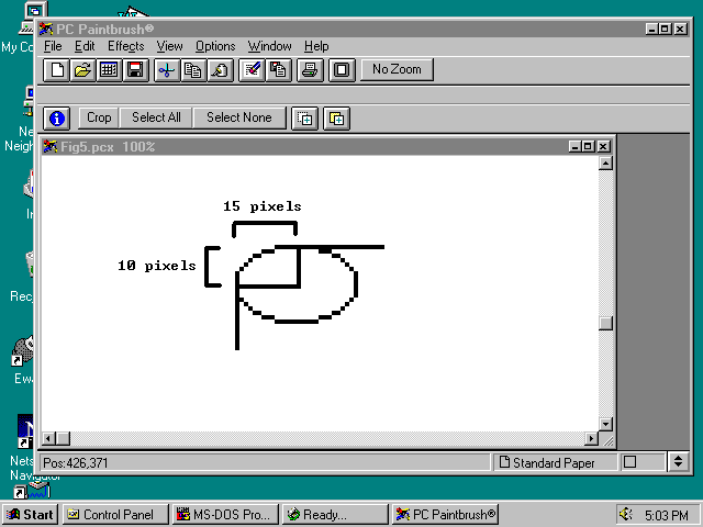
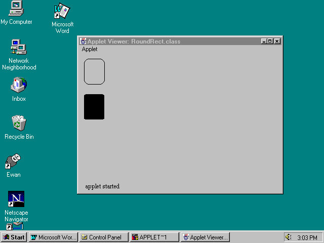
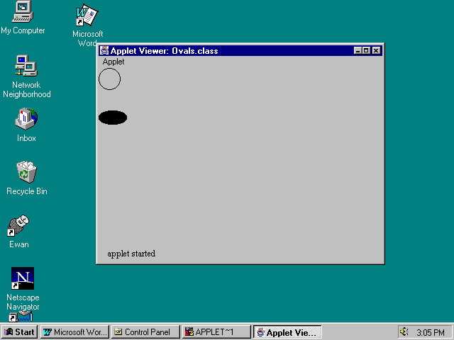
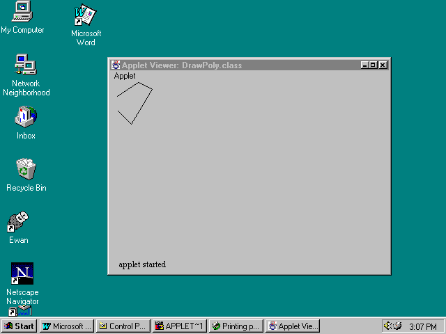
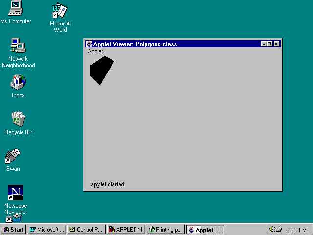
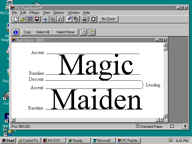
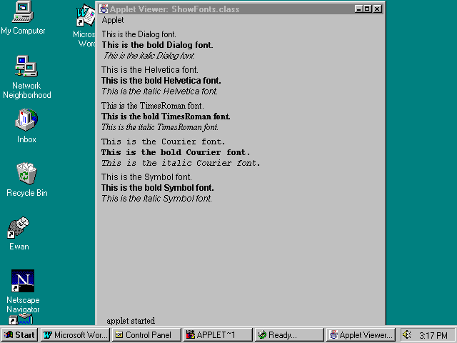